
Objective
The Mio's Pizzeria website redesign refreshes and reimagines the existing site, focusing on user experience and interface design. The goal was to create a more visually appealing and user-friendly platform that enhances the customer’s online experience.
Research
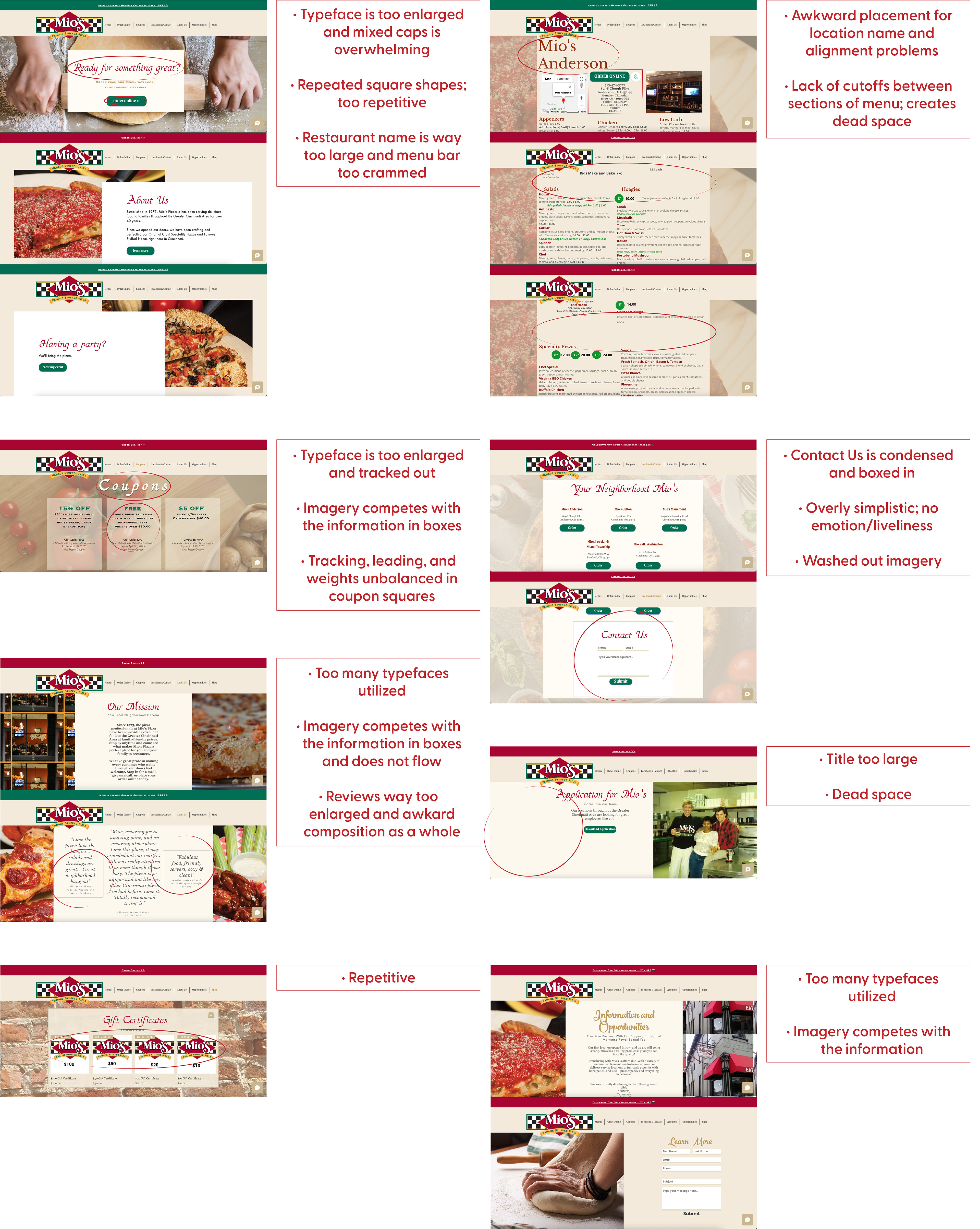
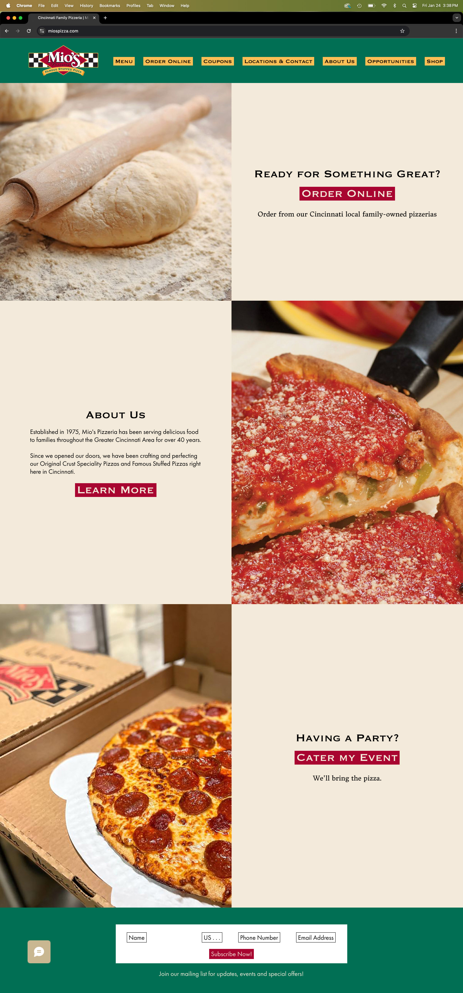
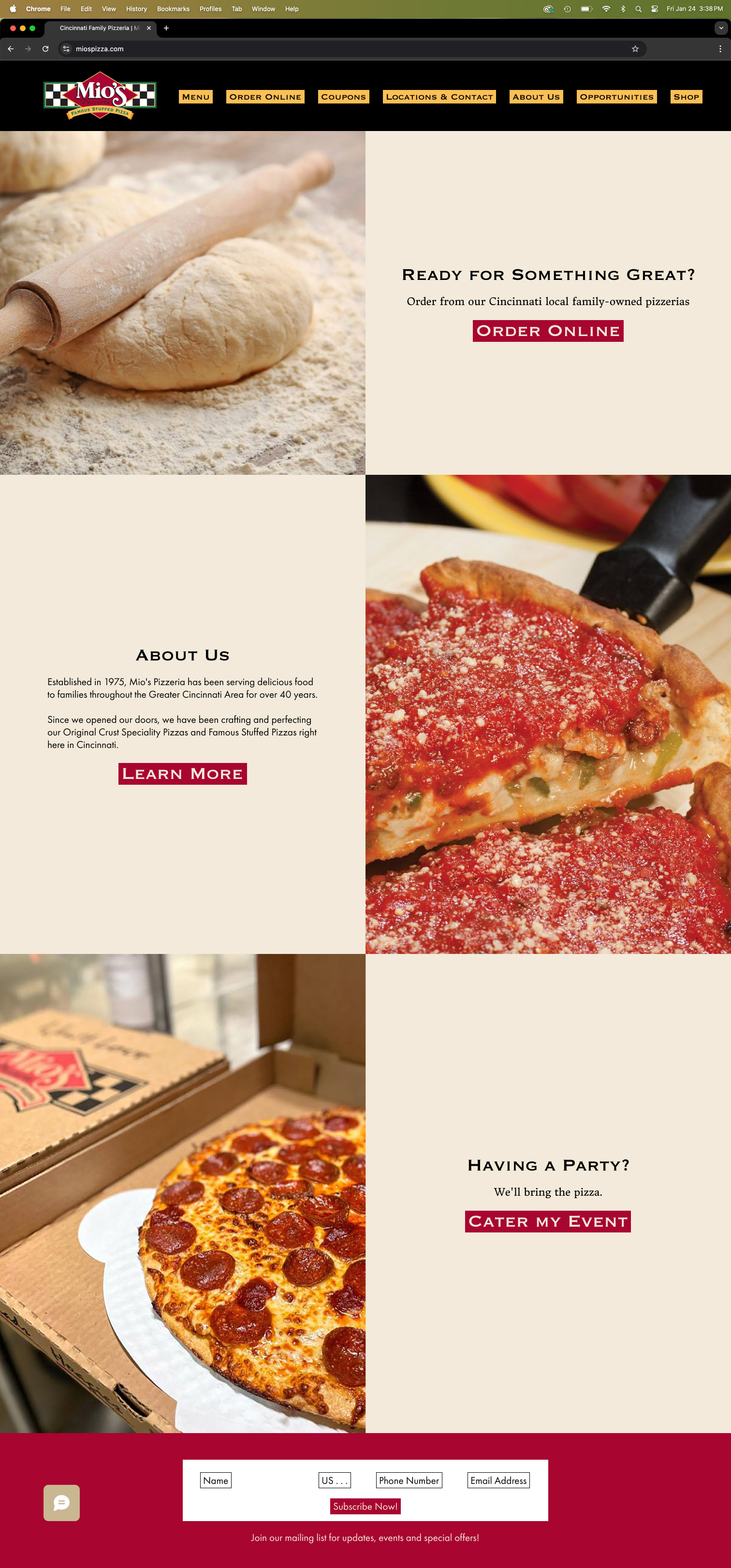
I began by exploring Mio’s current website, analyzing what worked well, areas for improvement, and the overall user experience. I found there was an excessive use of typefaces, along with inconsistencies in size, weight, tracking, and leading that needed refinement.
Sketches
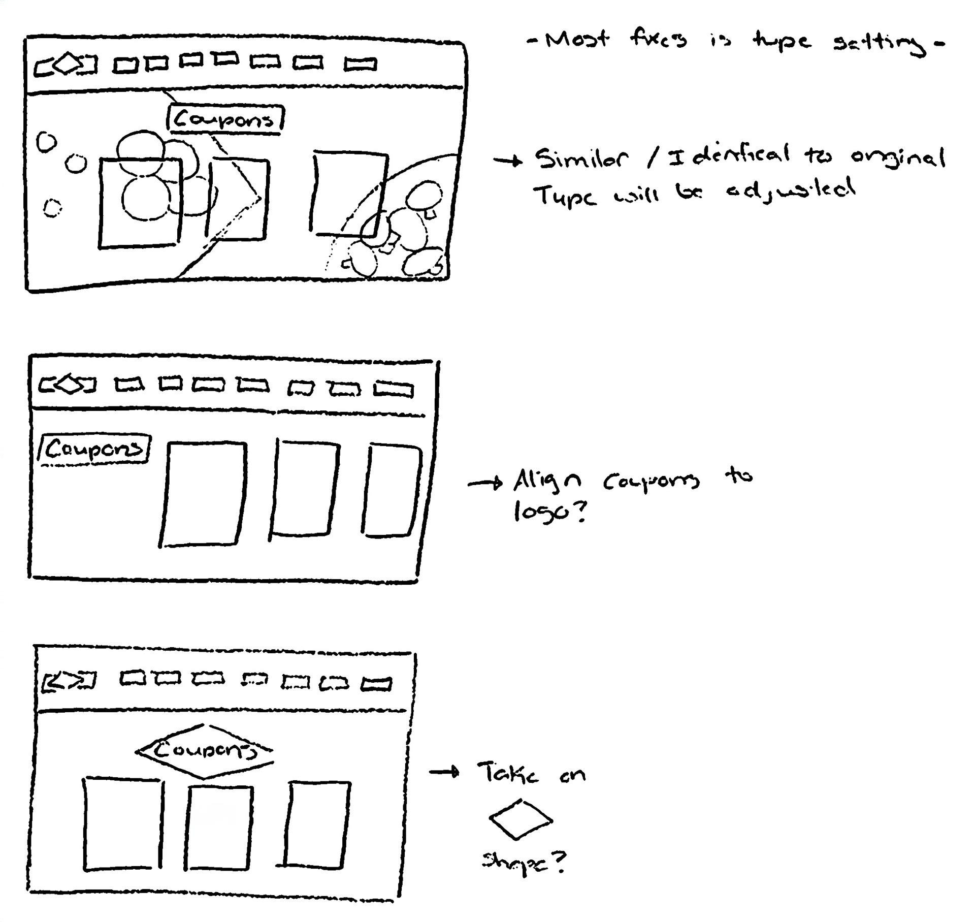
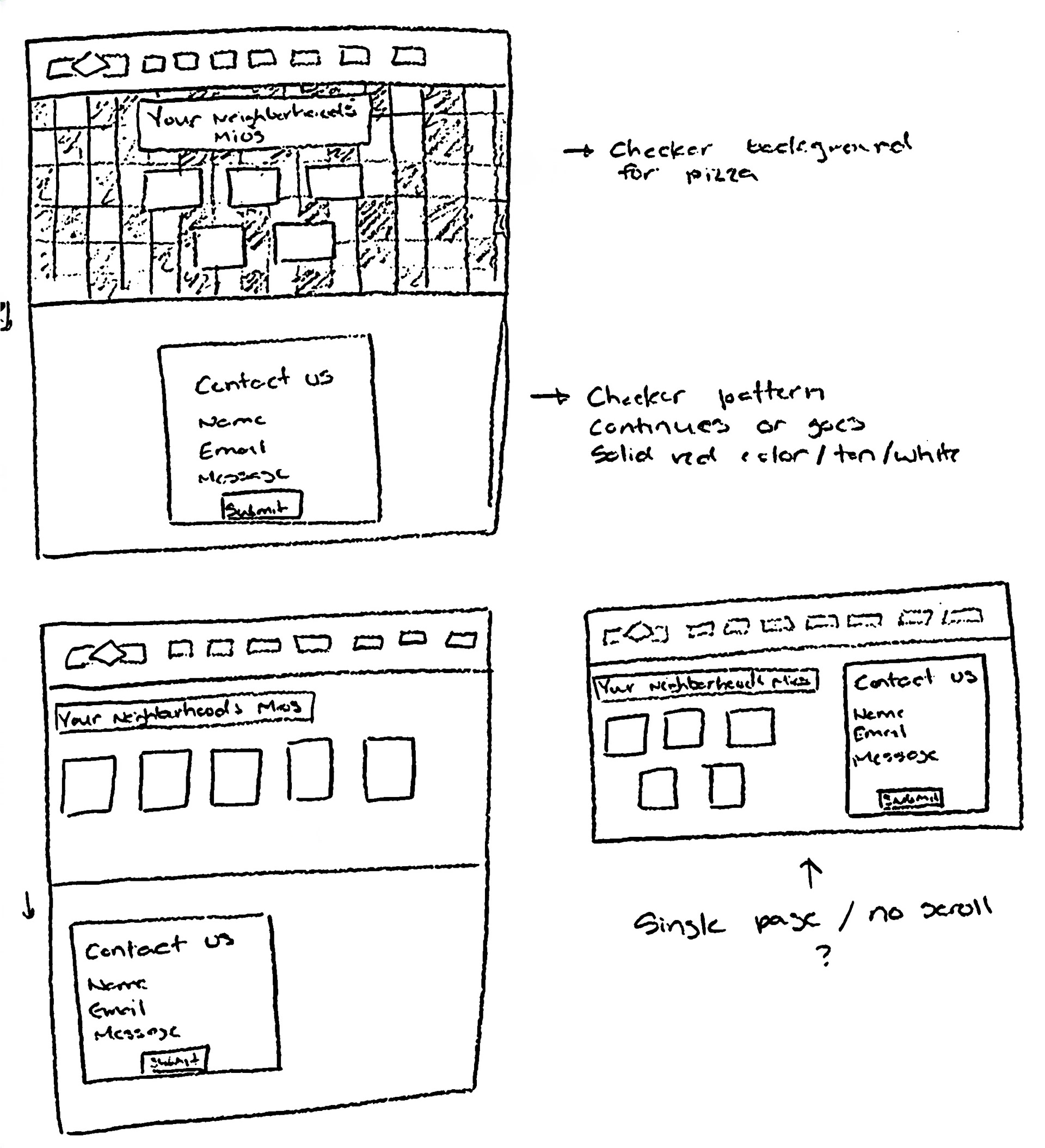
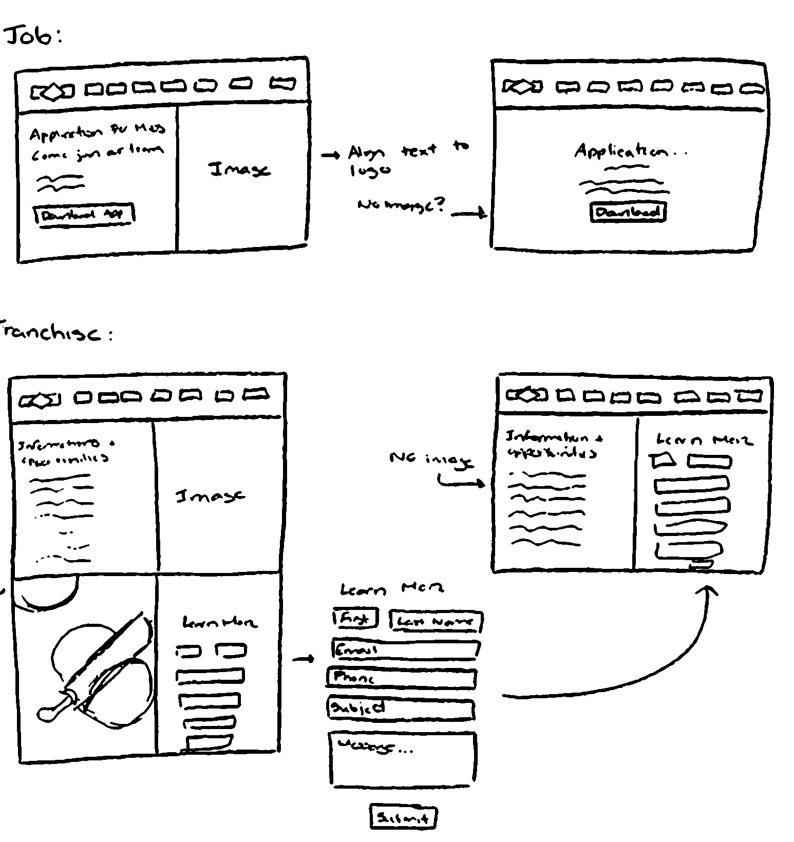
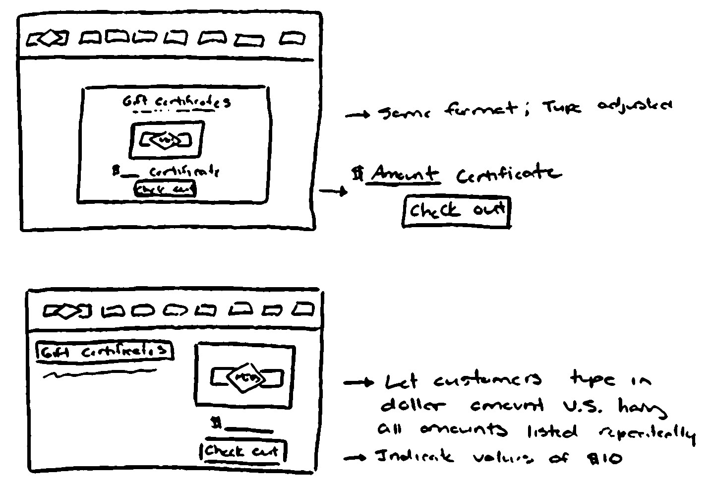
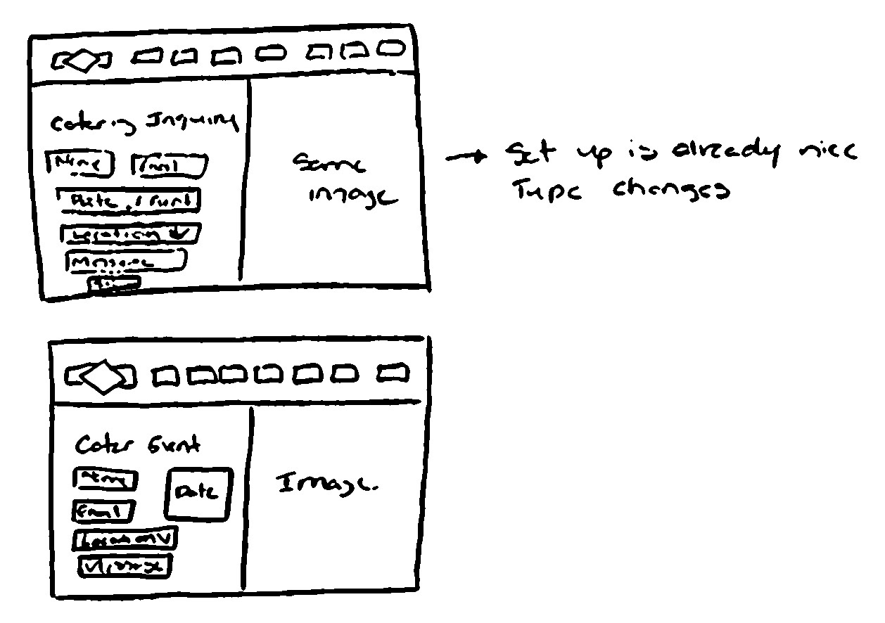
Experimented with sketching various button styles and unique design elements for each page, ensuring they aligned with the overall brand identity. Explored different layouts and compositions, testing how typography, imagery, and interactive elements could work together to create a cohesive and user-friendly experience.


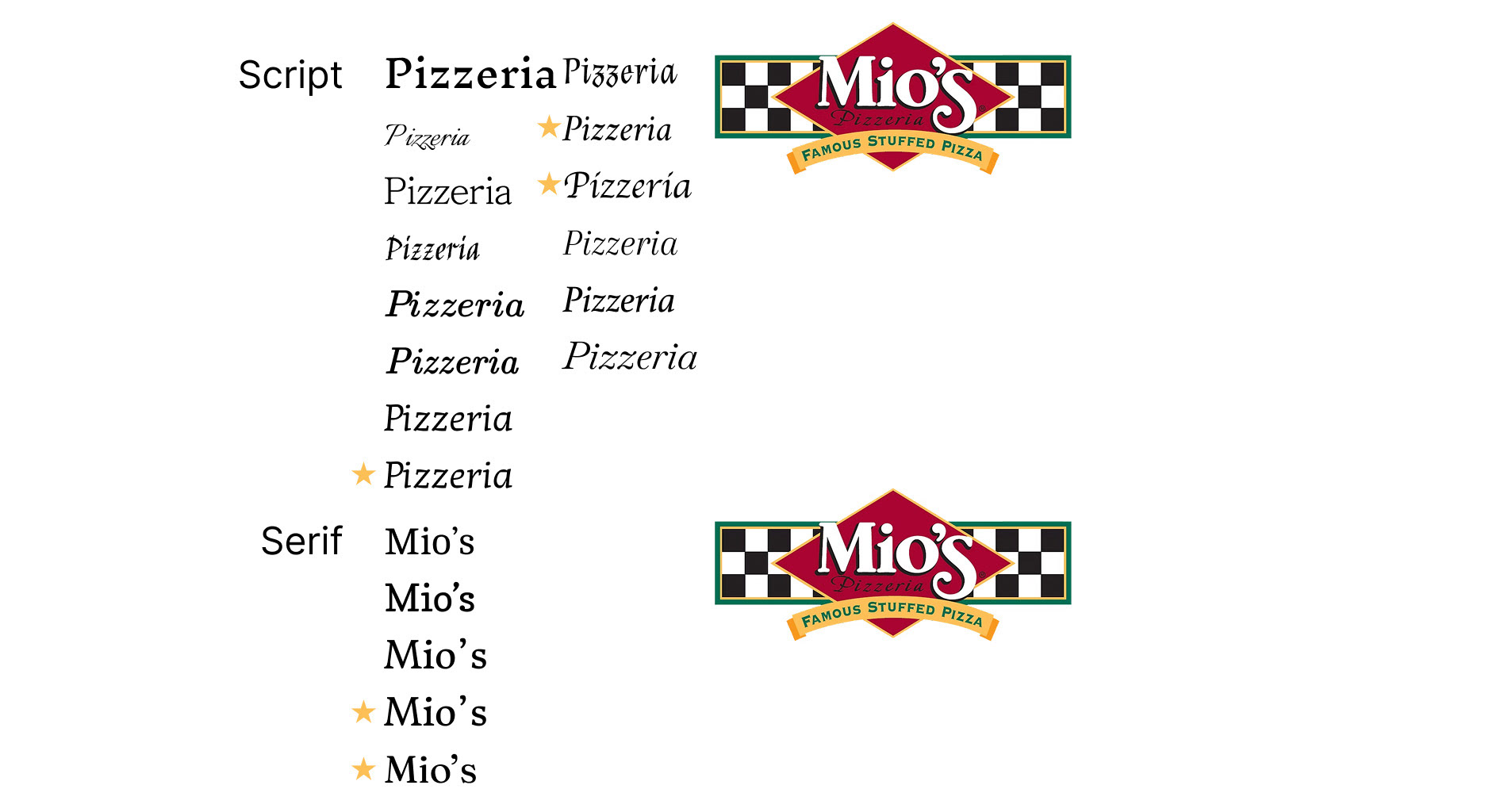
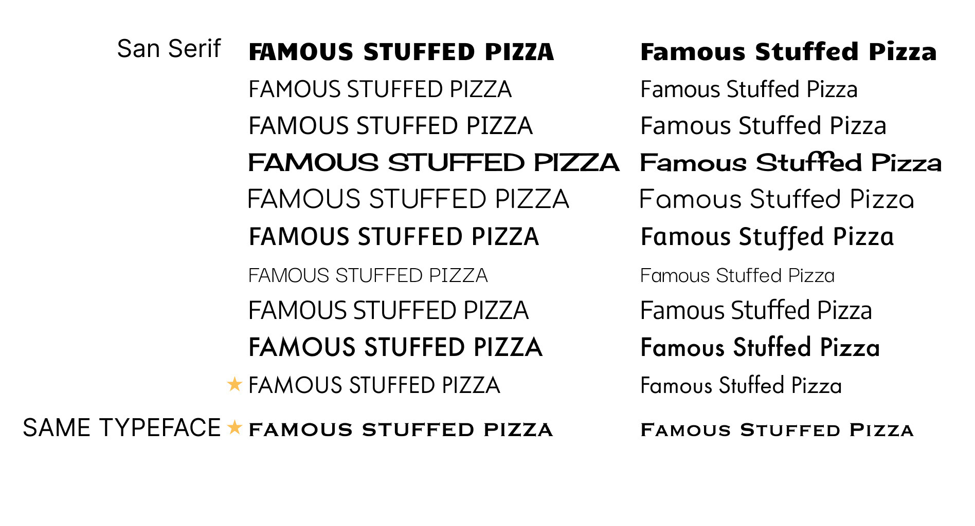
Typeface Exploration
Explored typefaces that closely resembled the original logo to maintain visual consistency across the site. The goal was to create a cohesive look and feel while supporting readability and overall brand recognition. This helped tie the updated design back to Mio’s existing identity.
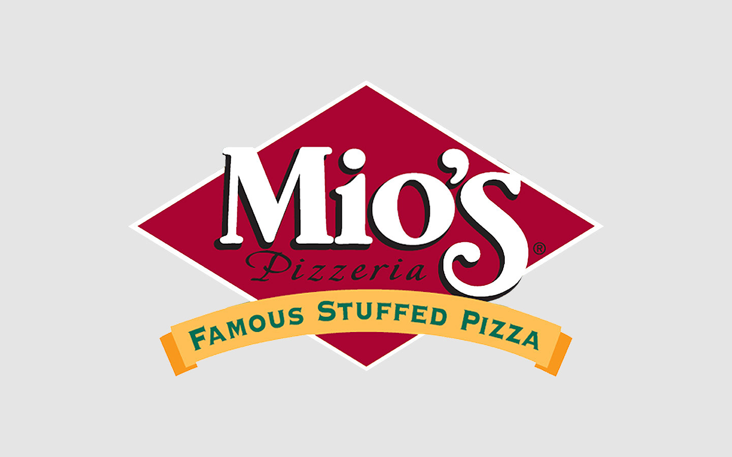
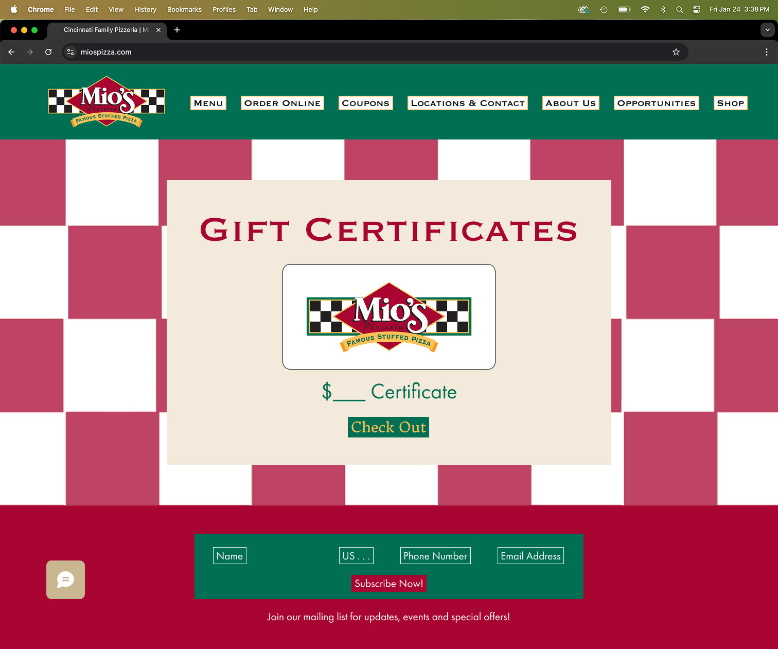
Logo Adjustment
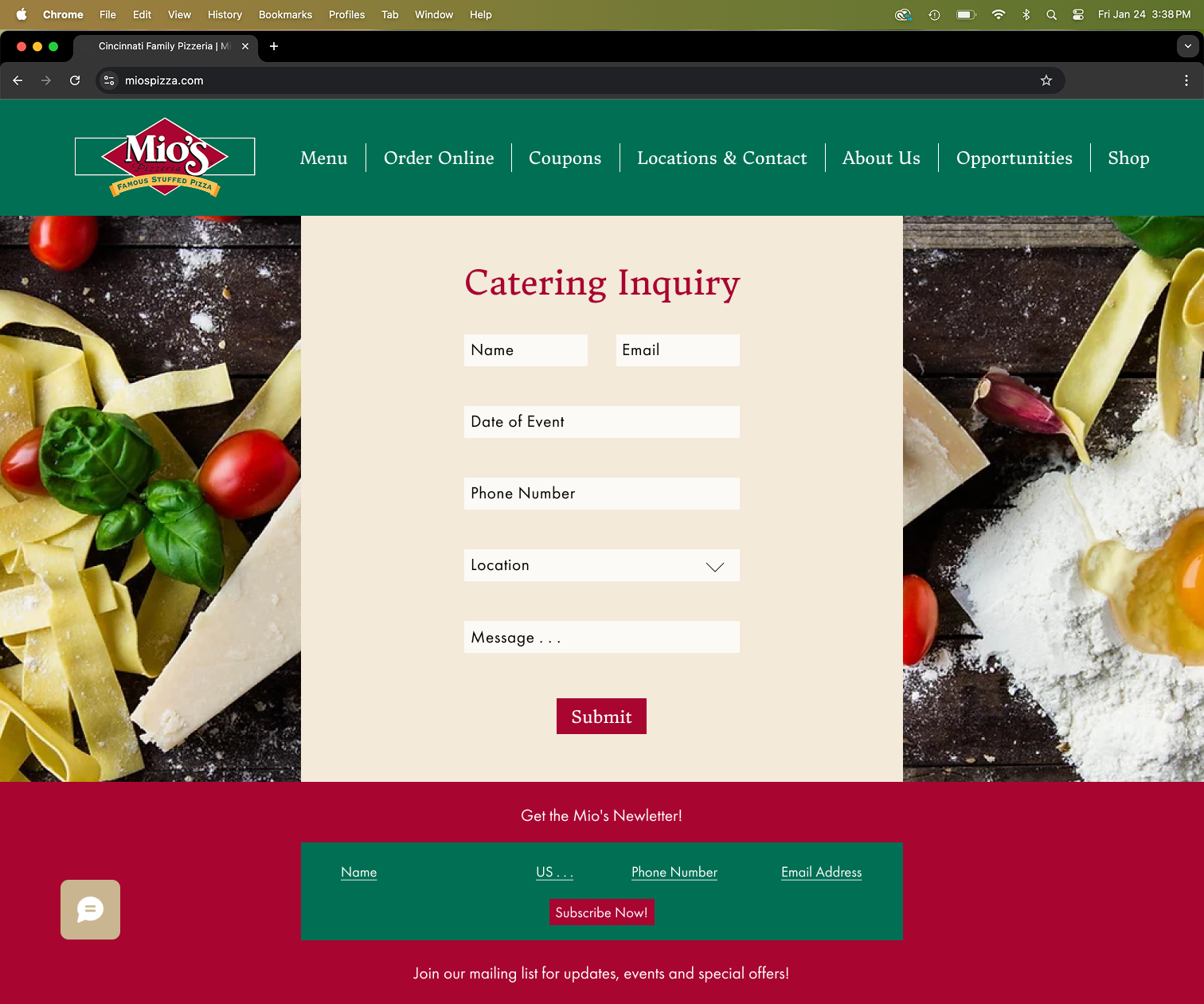
Chose to simplify the logo by removing the busy checkerboard pattern, which felt visually overwhelming in the new design context. This adjustment helped modernize the logo while preserving the key elements that contribute to the brand’s overall recognition. The result is a cleaner, more versatile mark that still feels true to Mio’s identity.


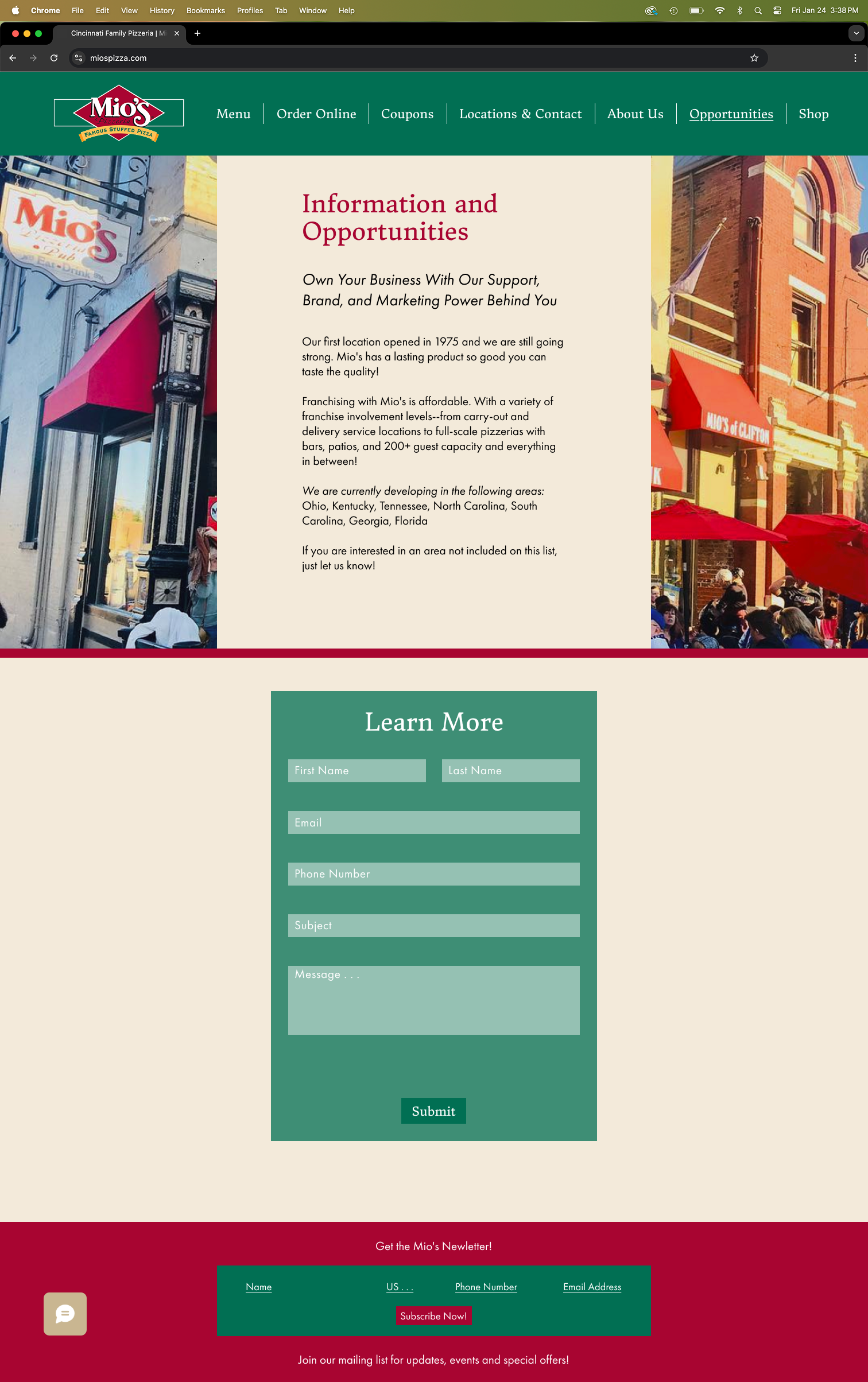
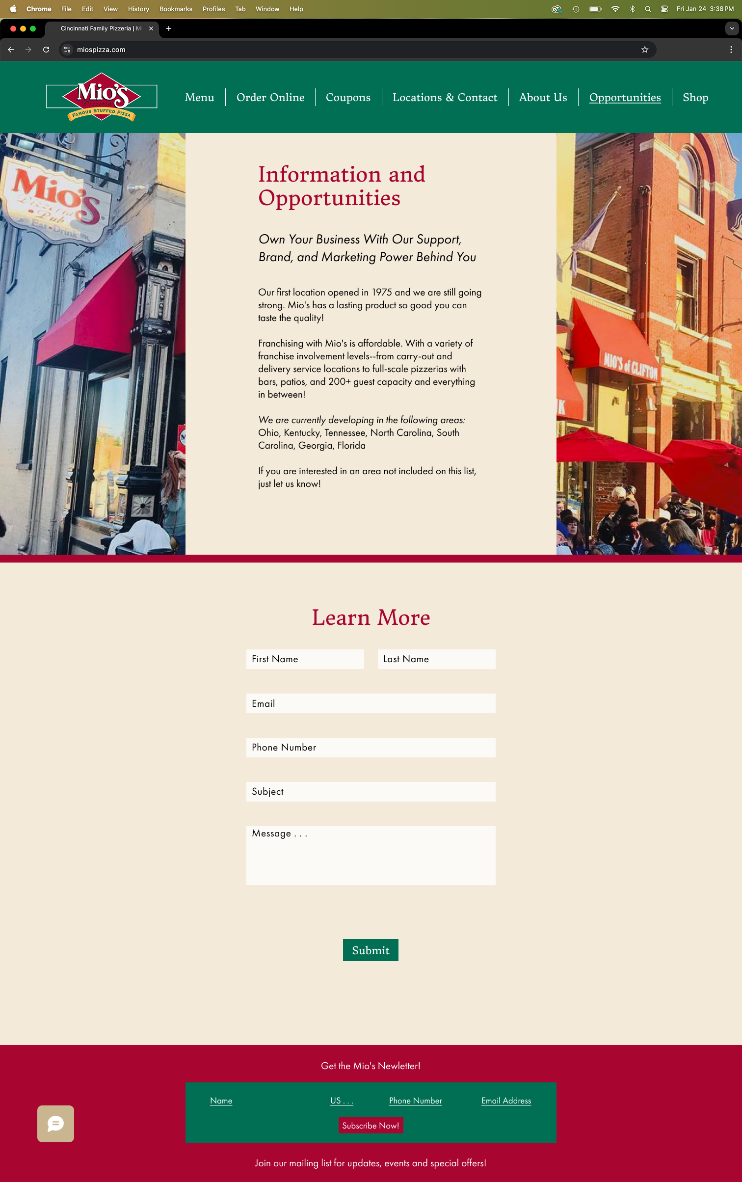
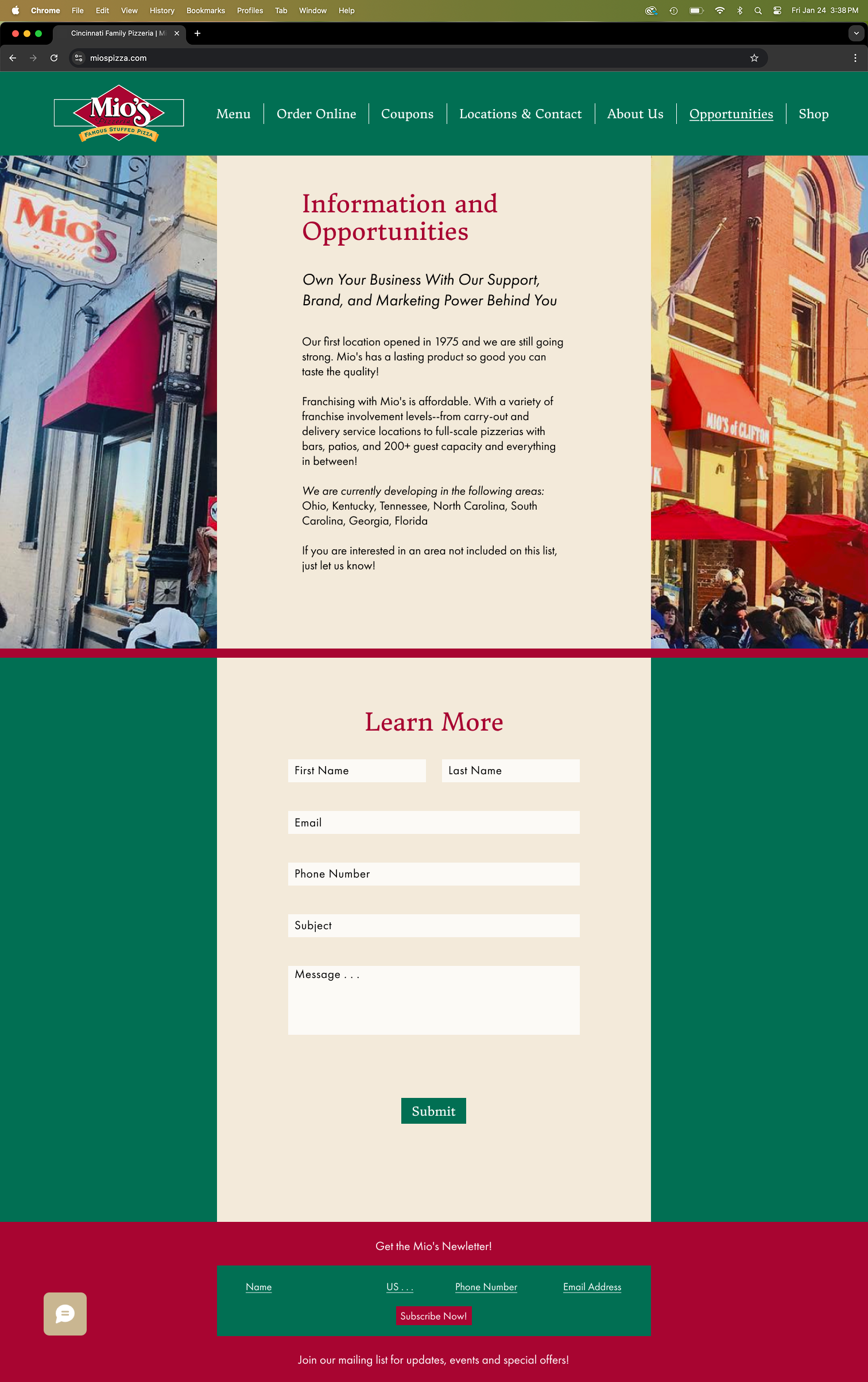
Digitalization
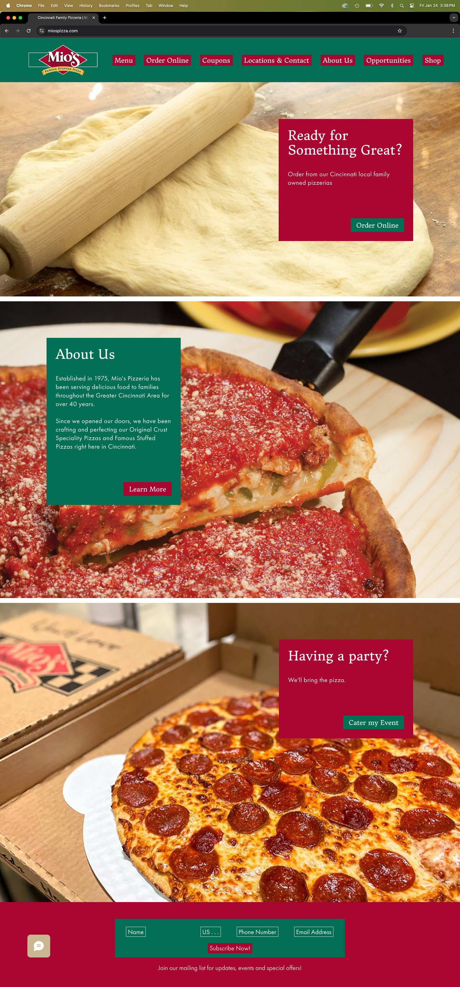
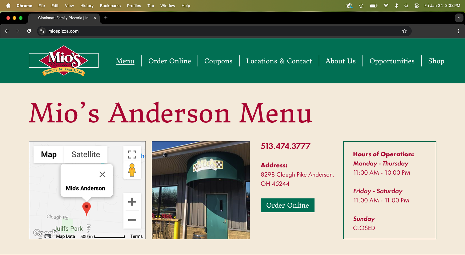
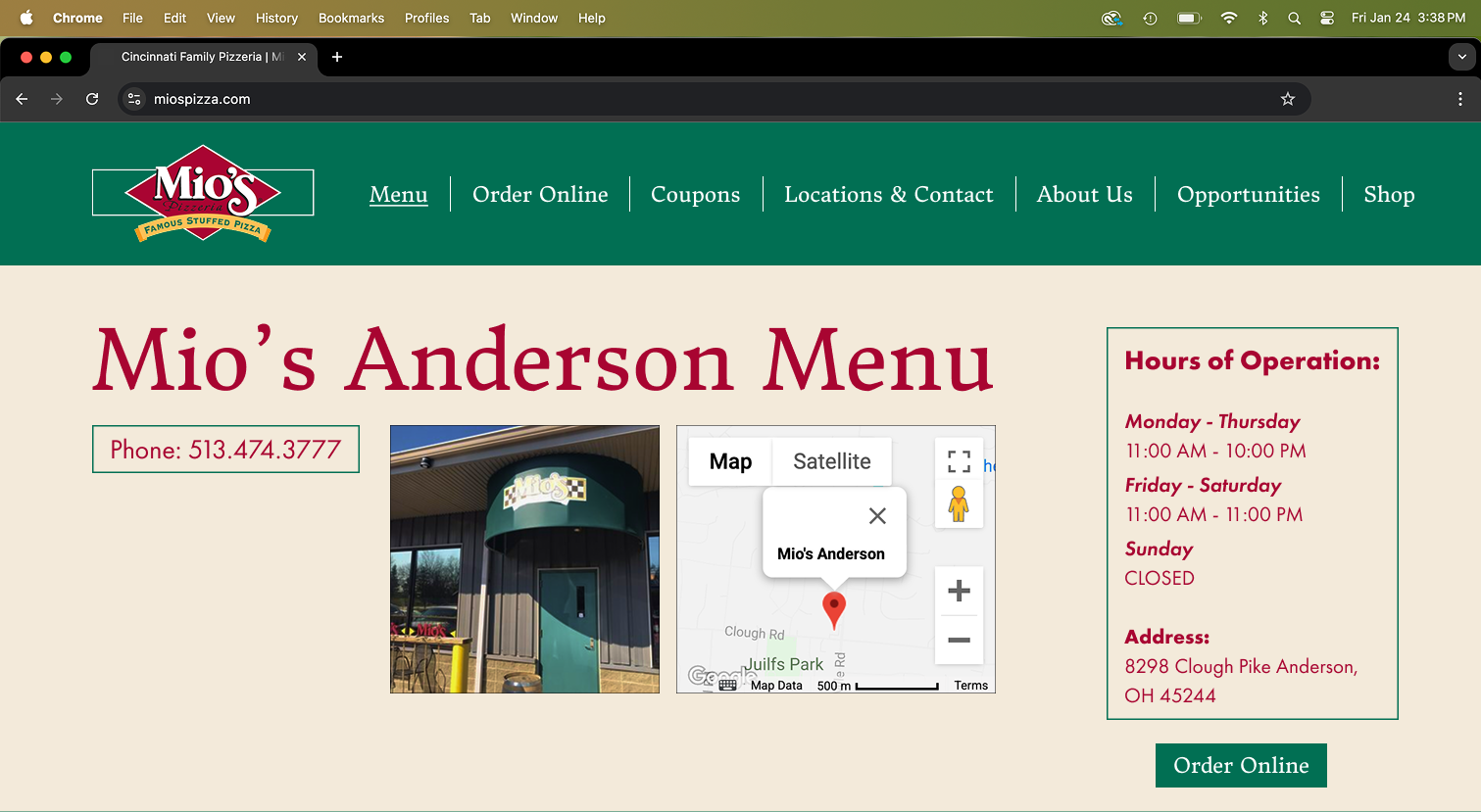
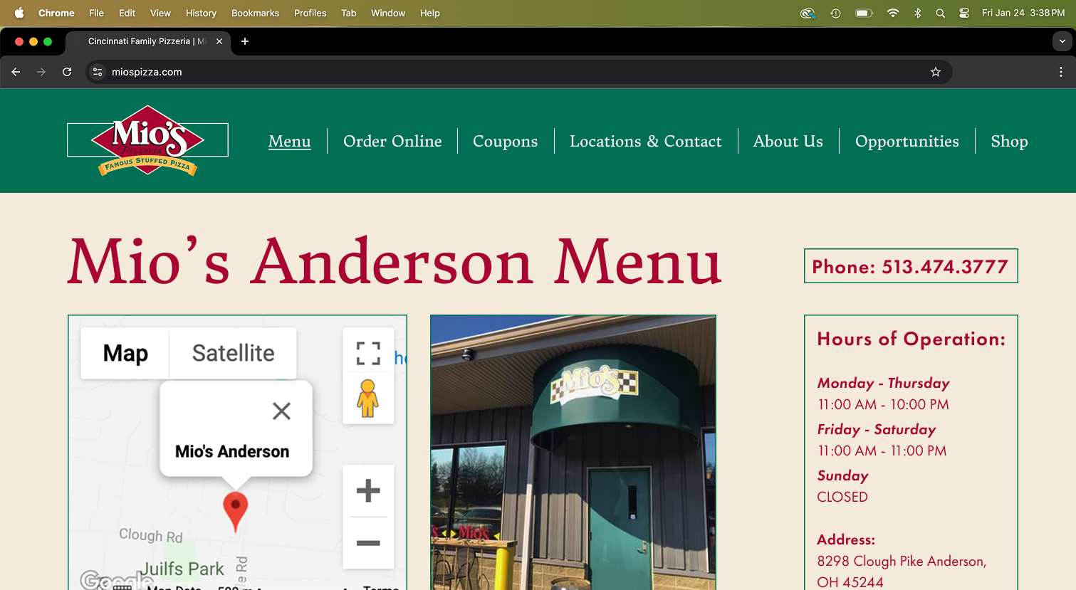
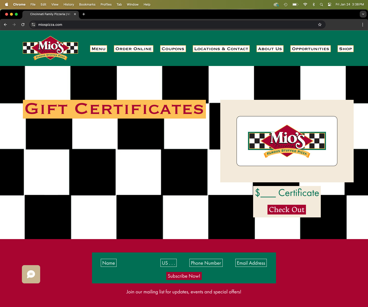
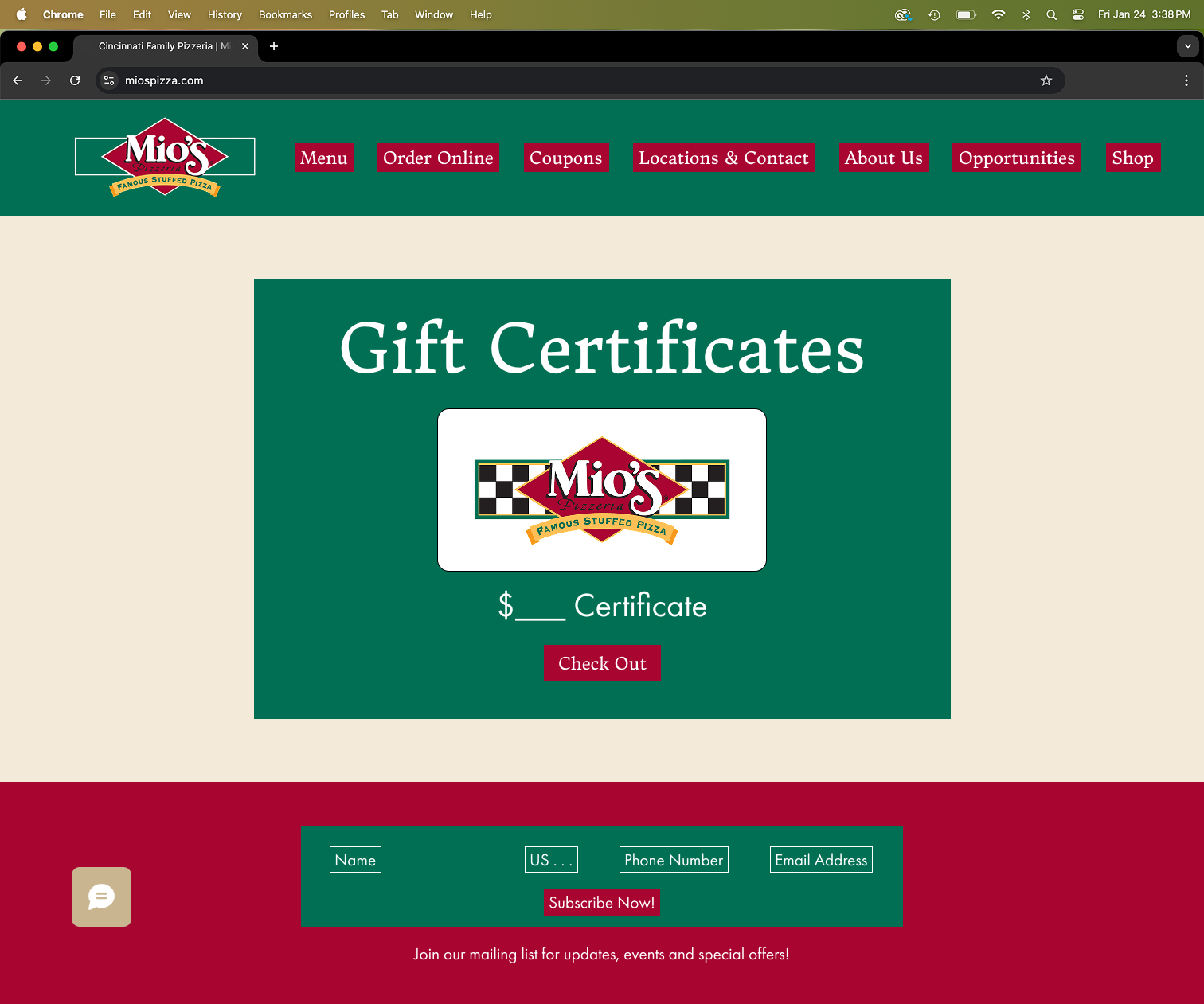
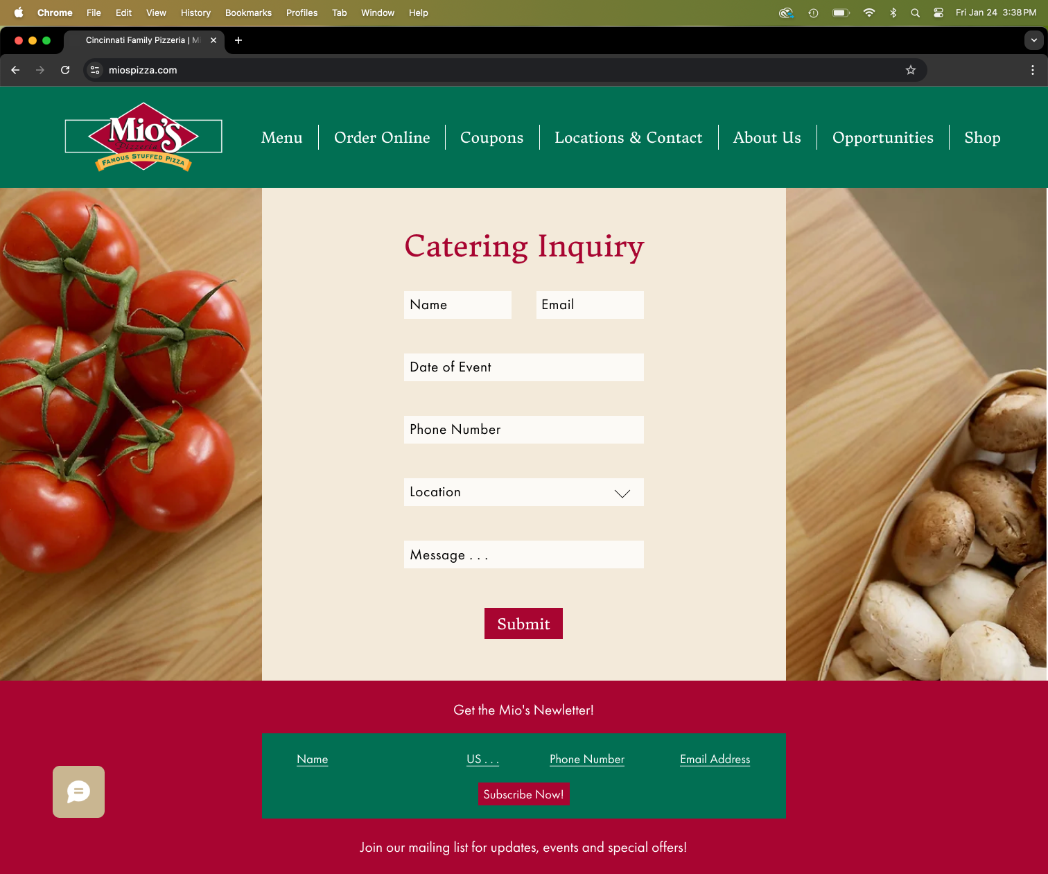
Explored a variety of layouts, button styles, imagery, and other key design elements in Figma for each page to determine what best supported the user experience and visual identity. Tested different combinations to find a balance between accessibility and aesthetics, helping shape a more cohesive and engaging design direction moving forward.
Home


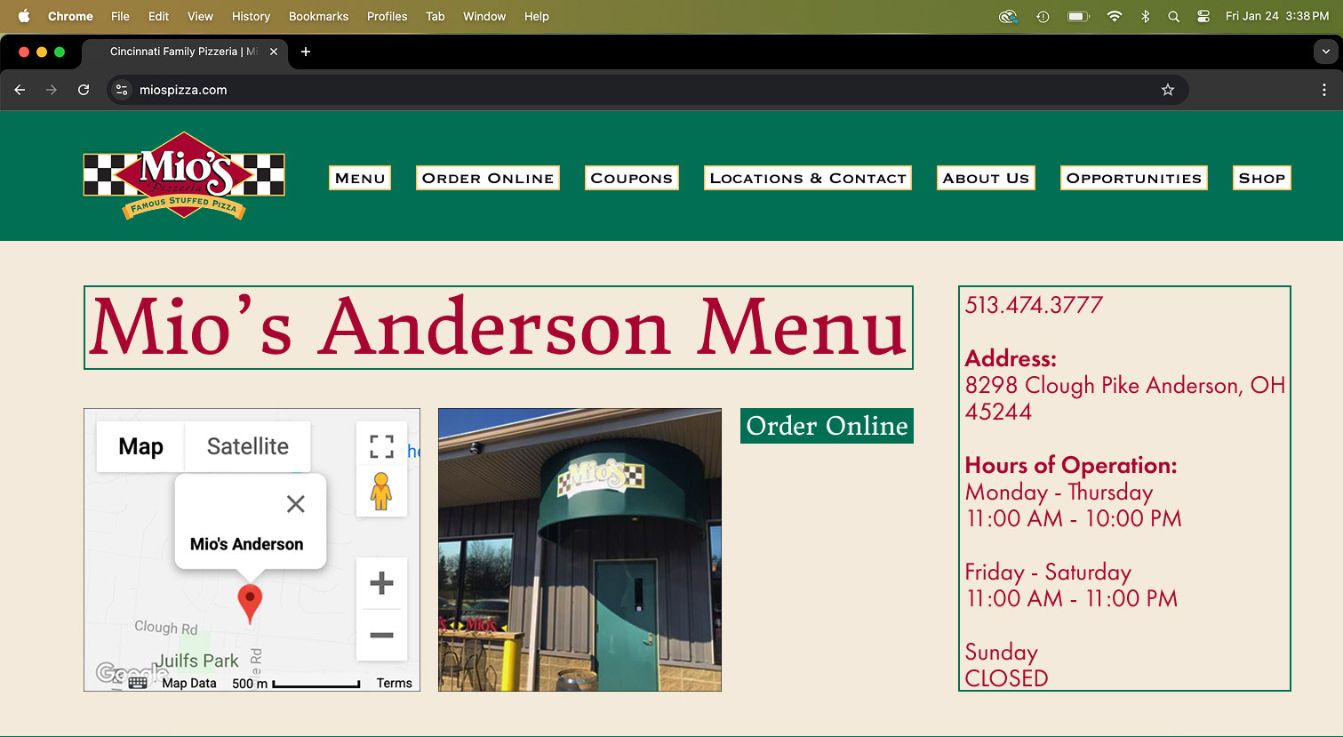
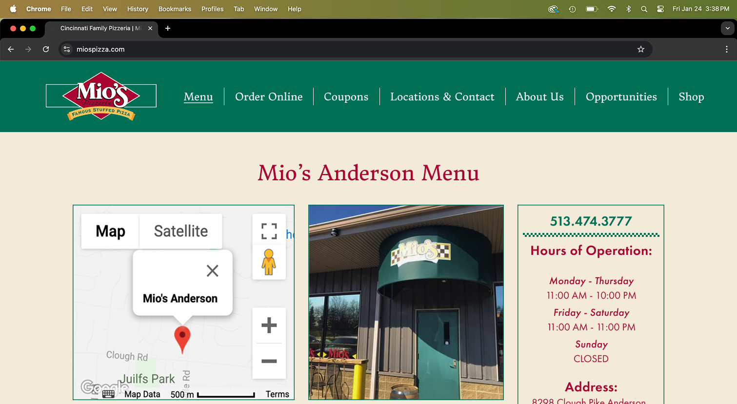
Menu

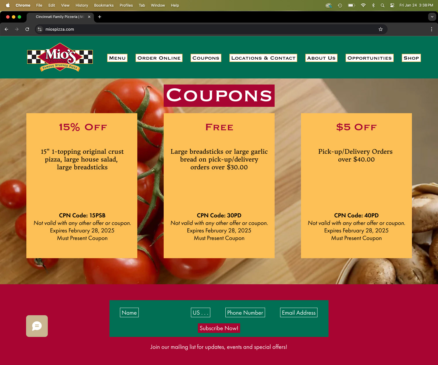
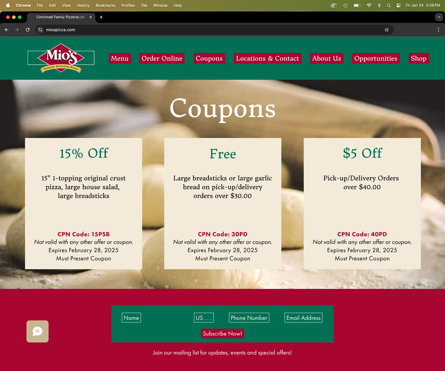
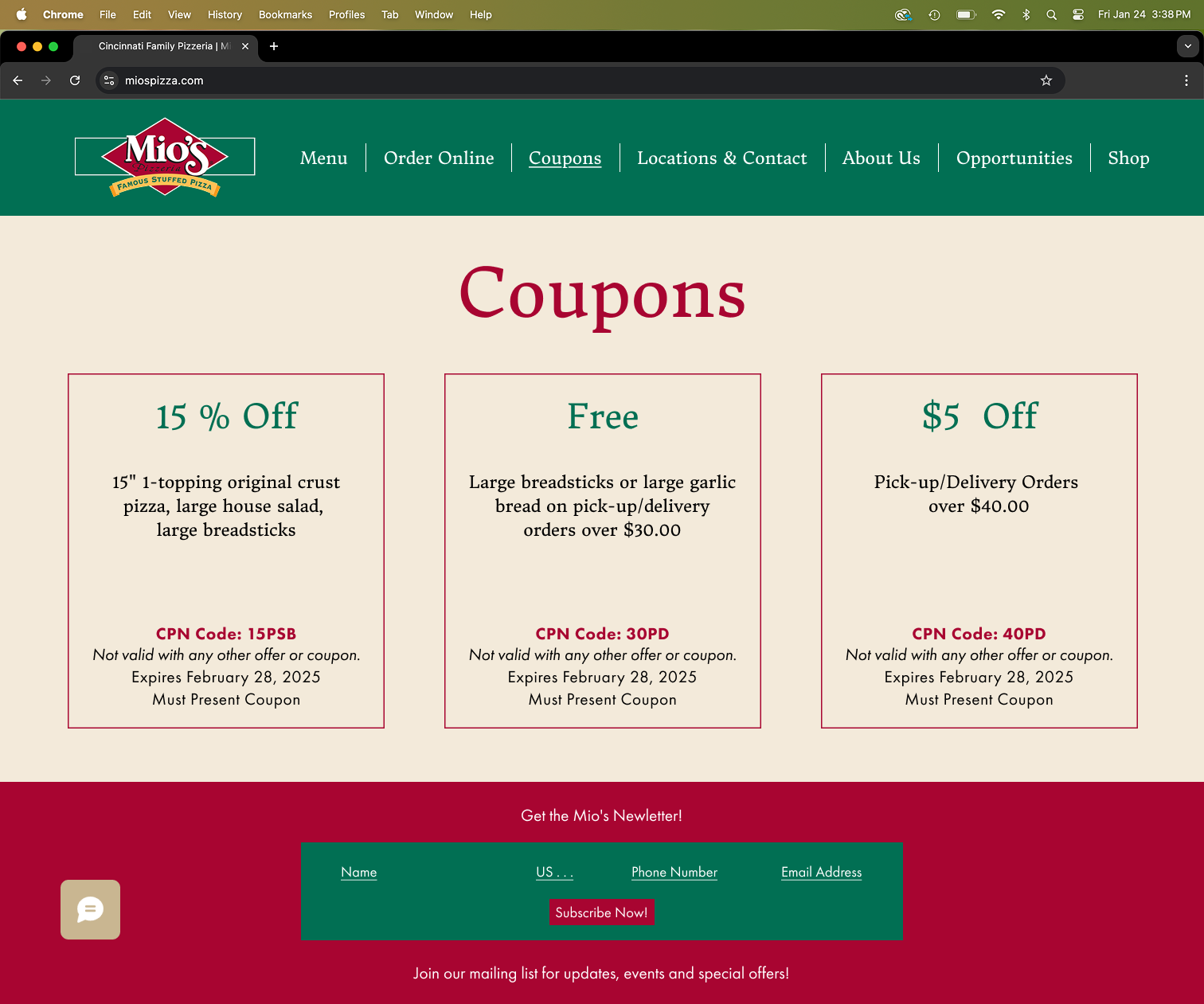
Coupons


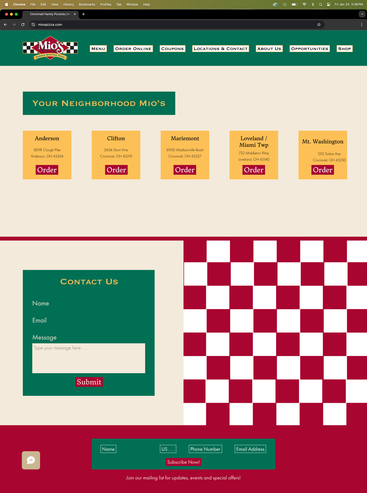
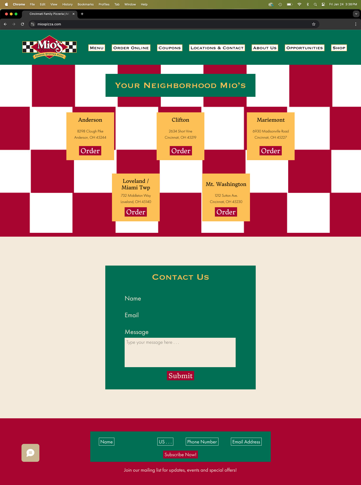
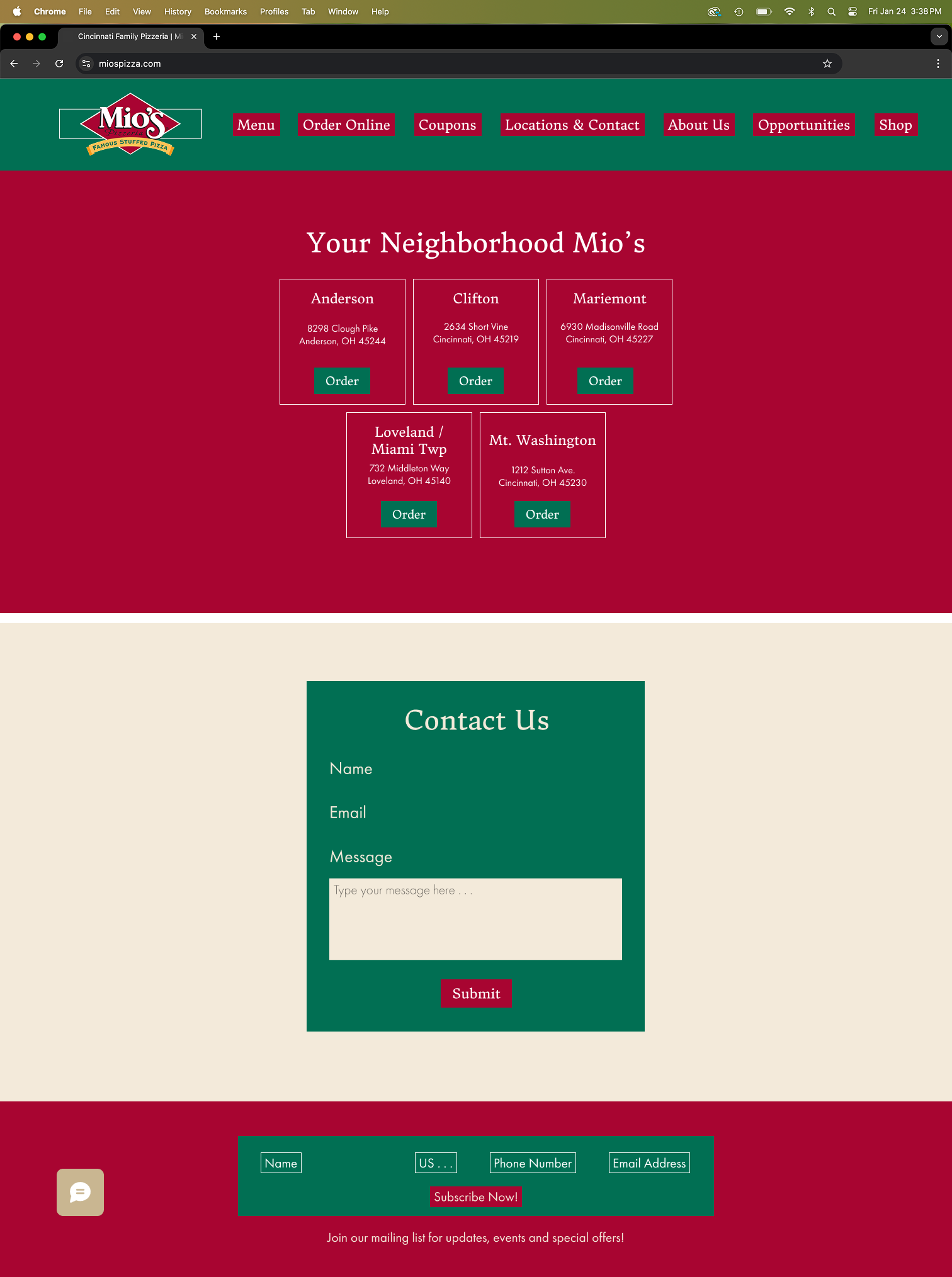
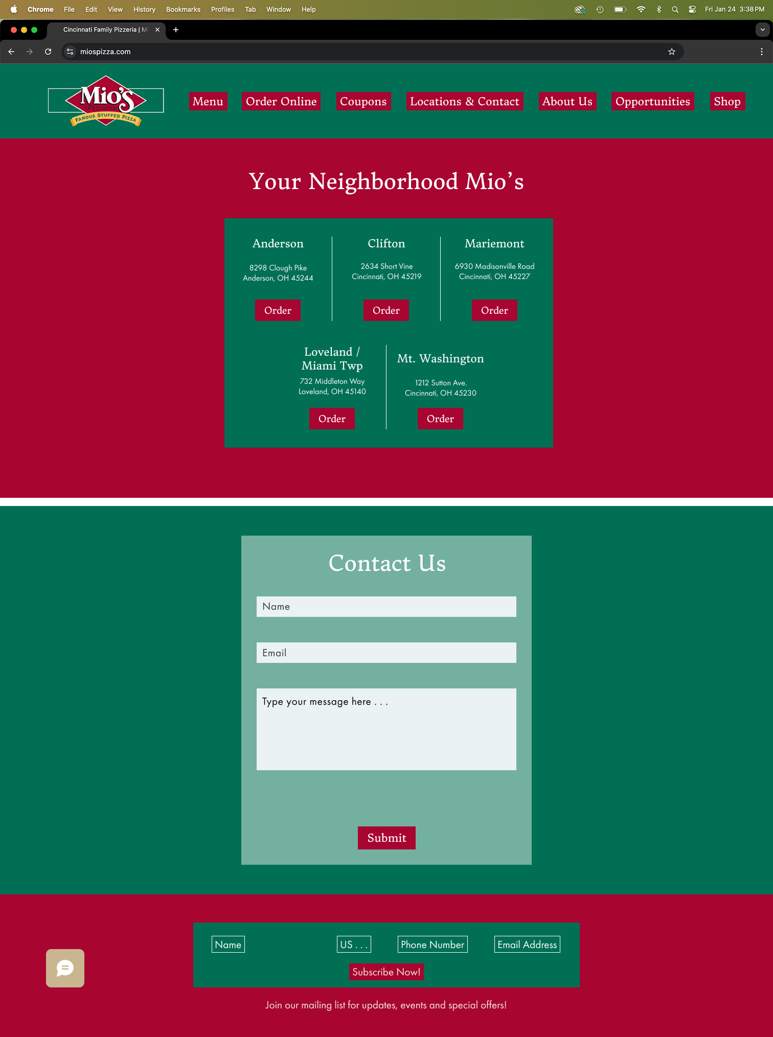
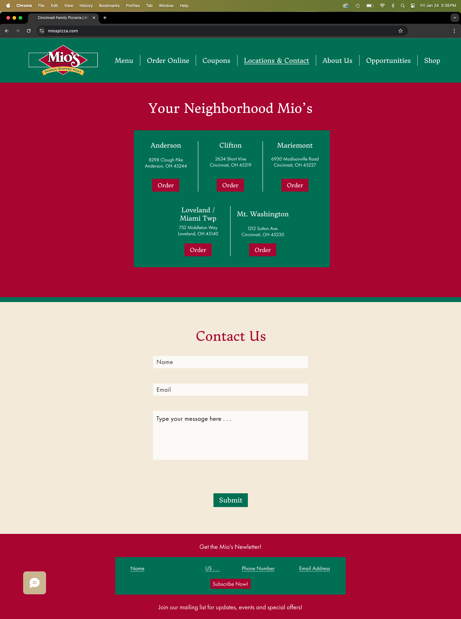
Location and Contact

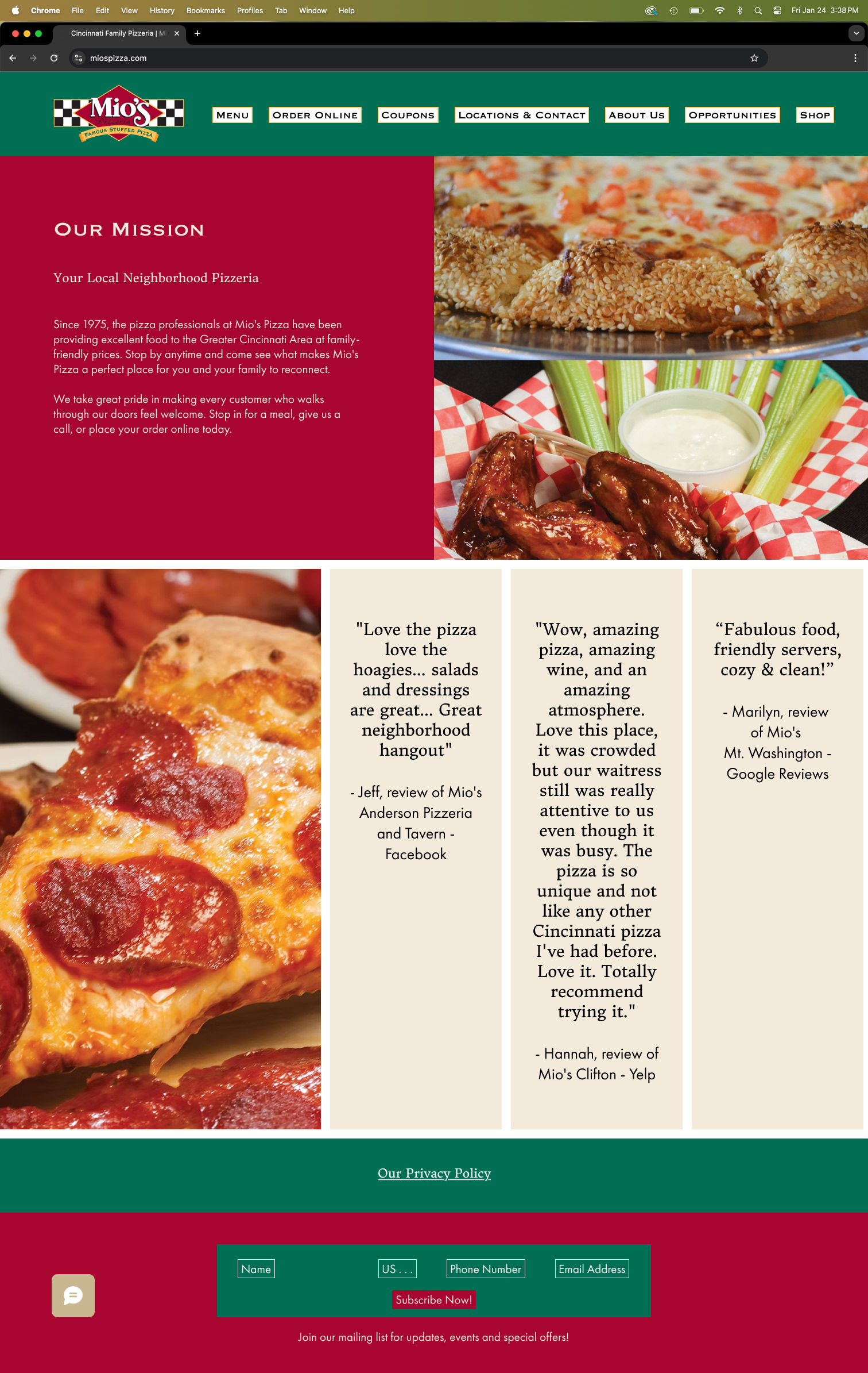
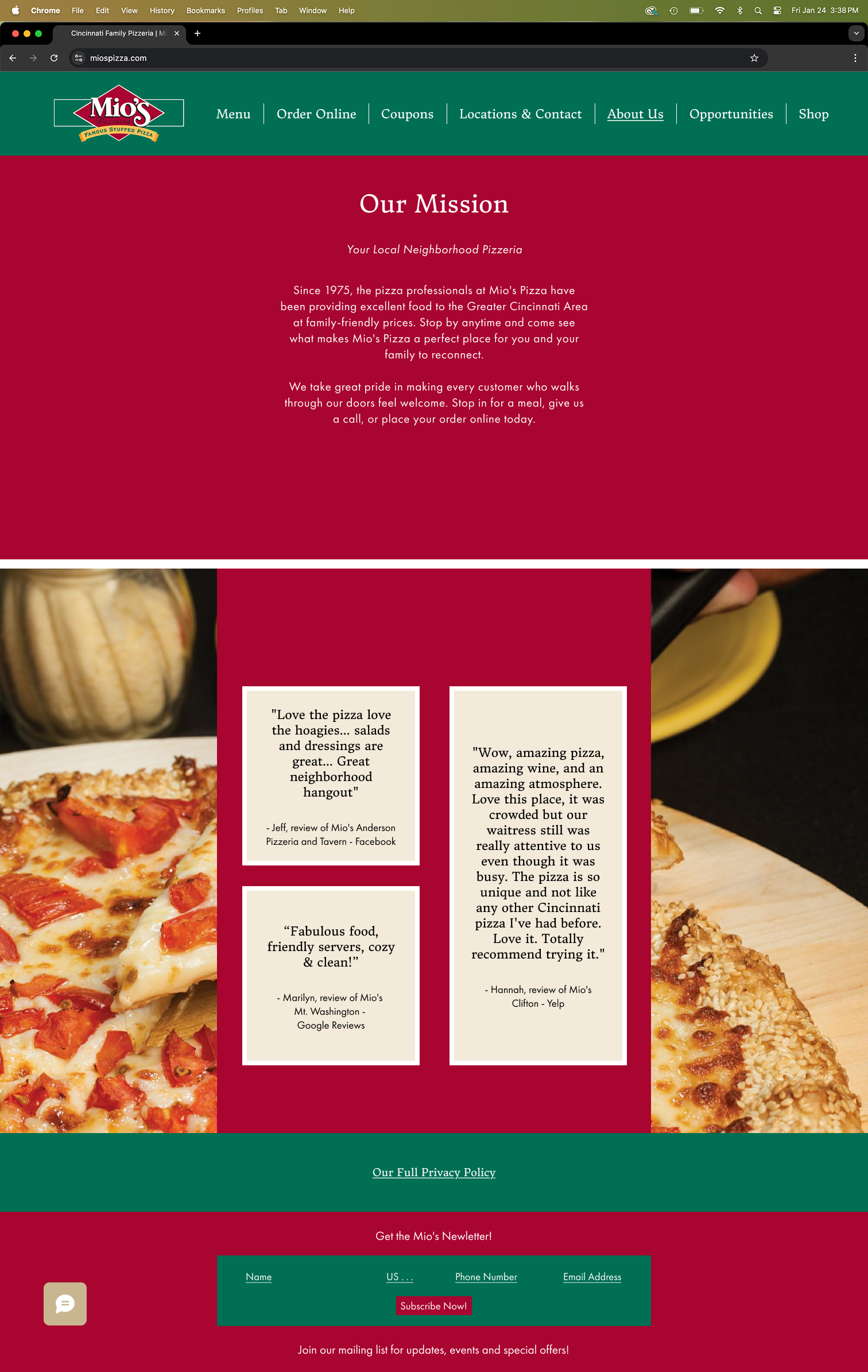
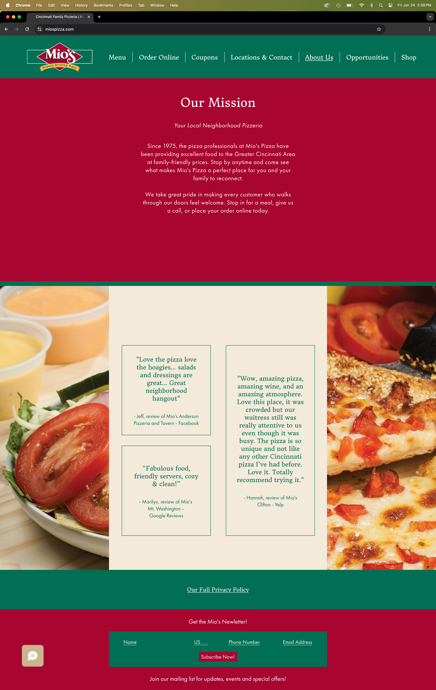
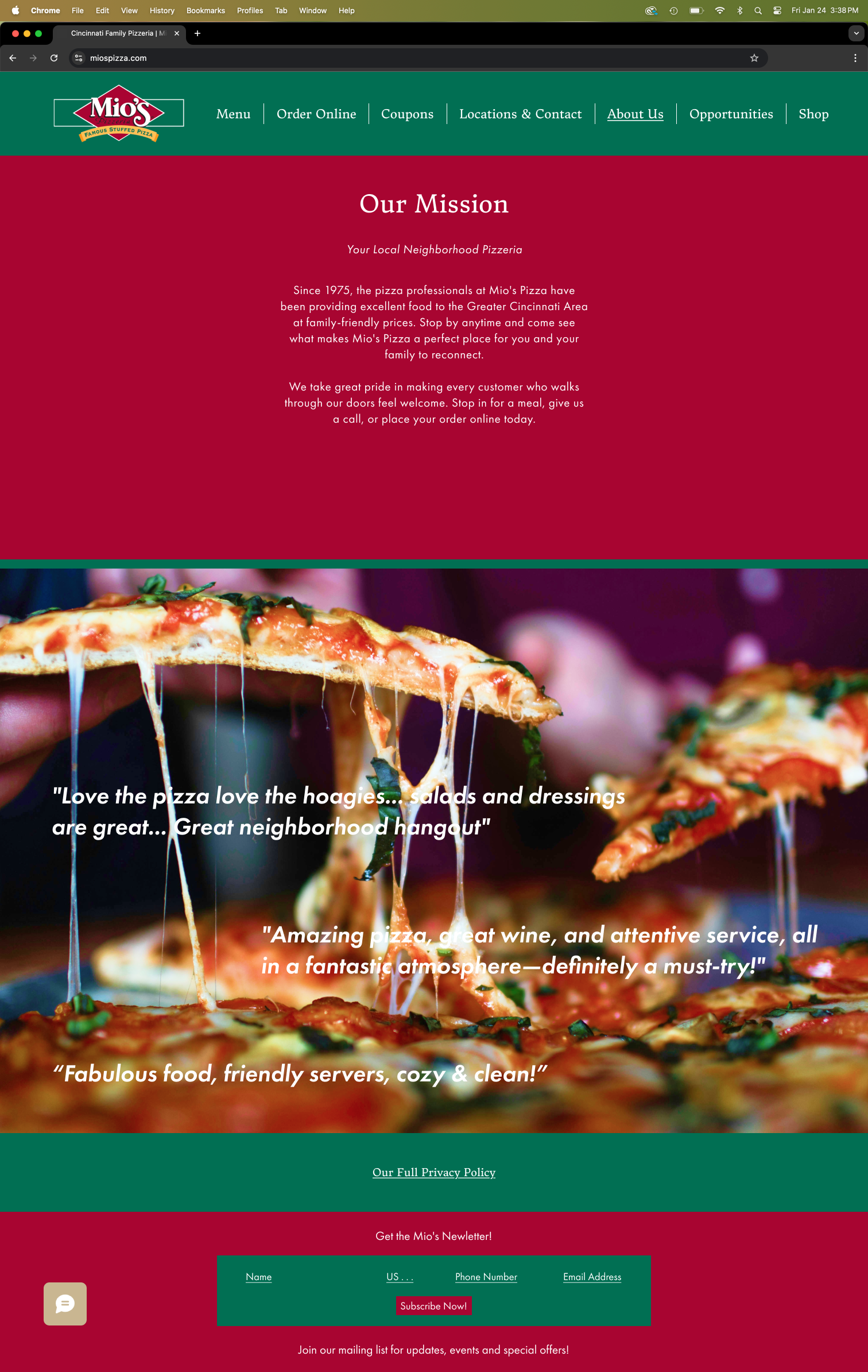
About Us


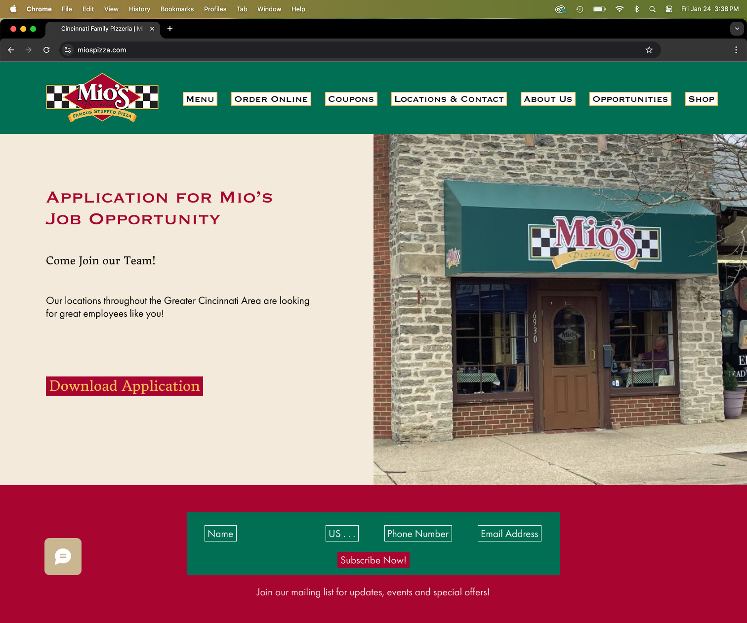
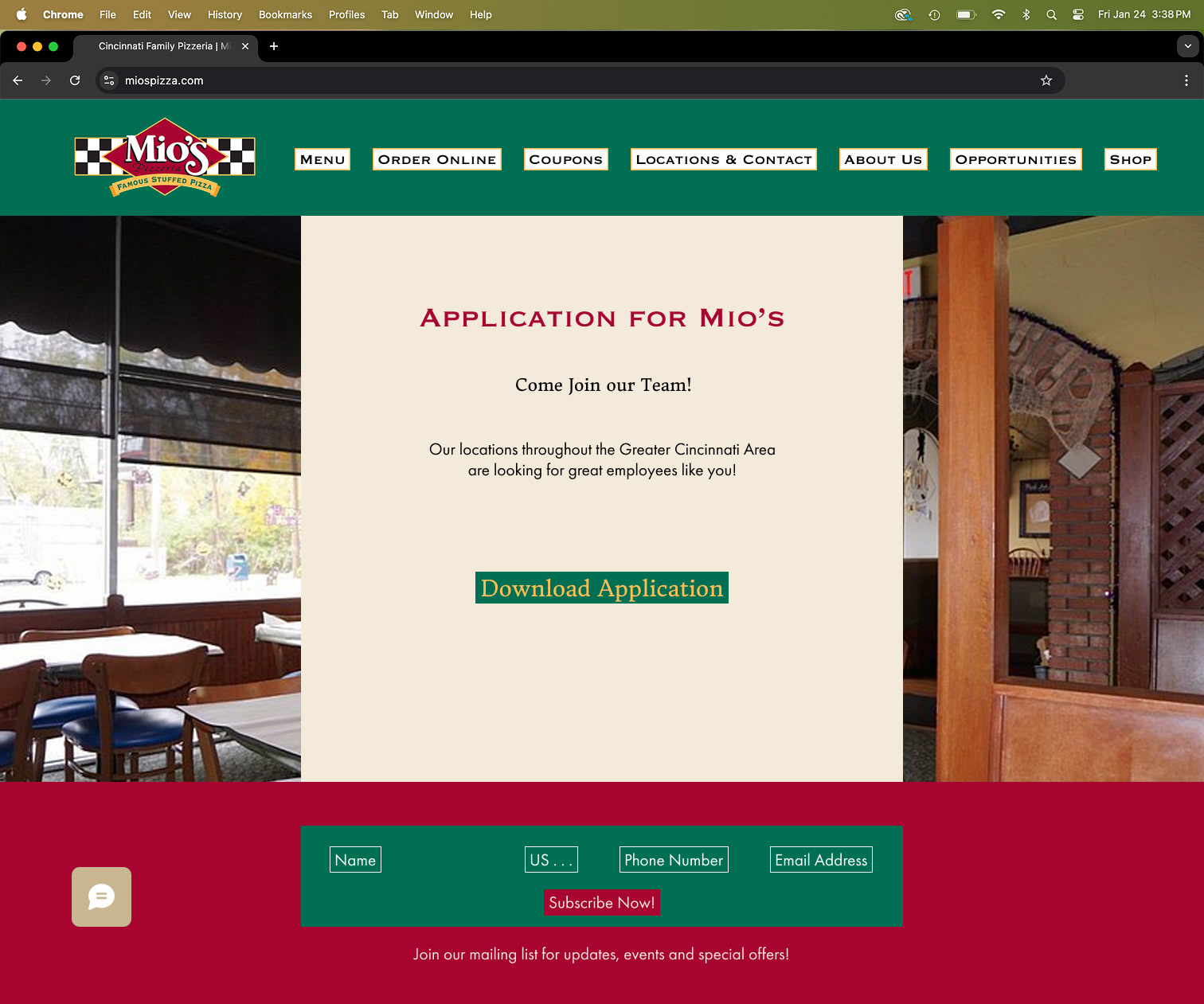
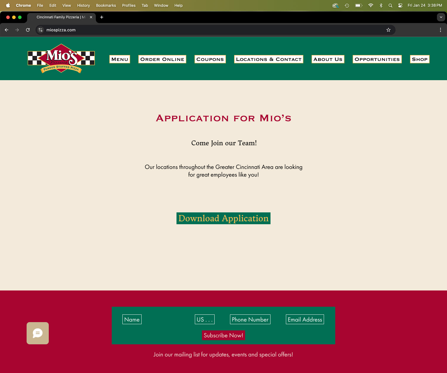
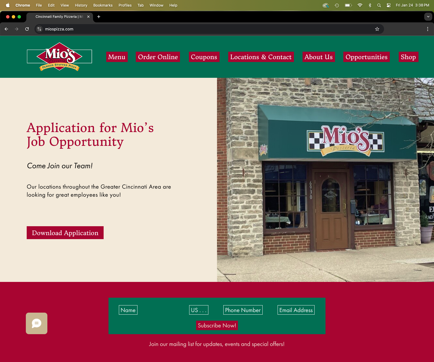
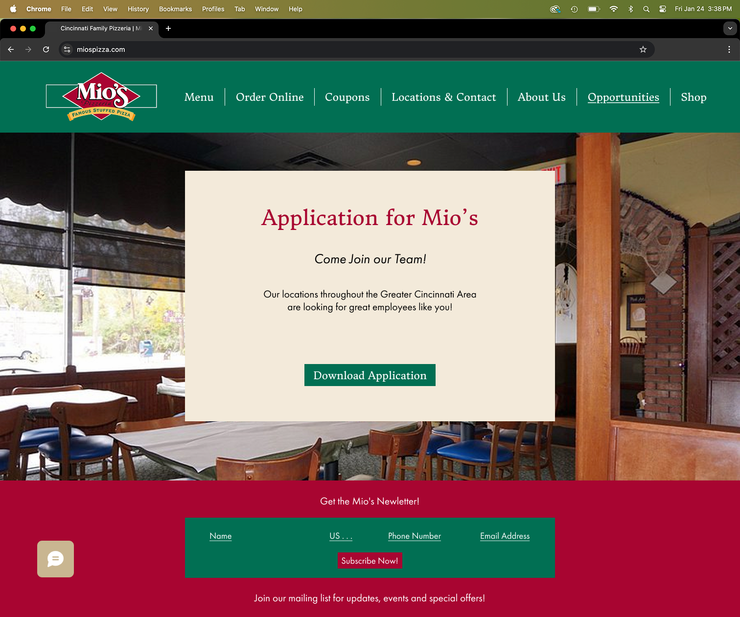
Jobs

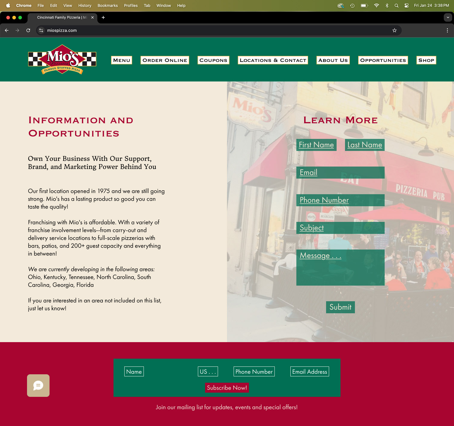
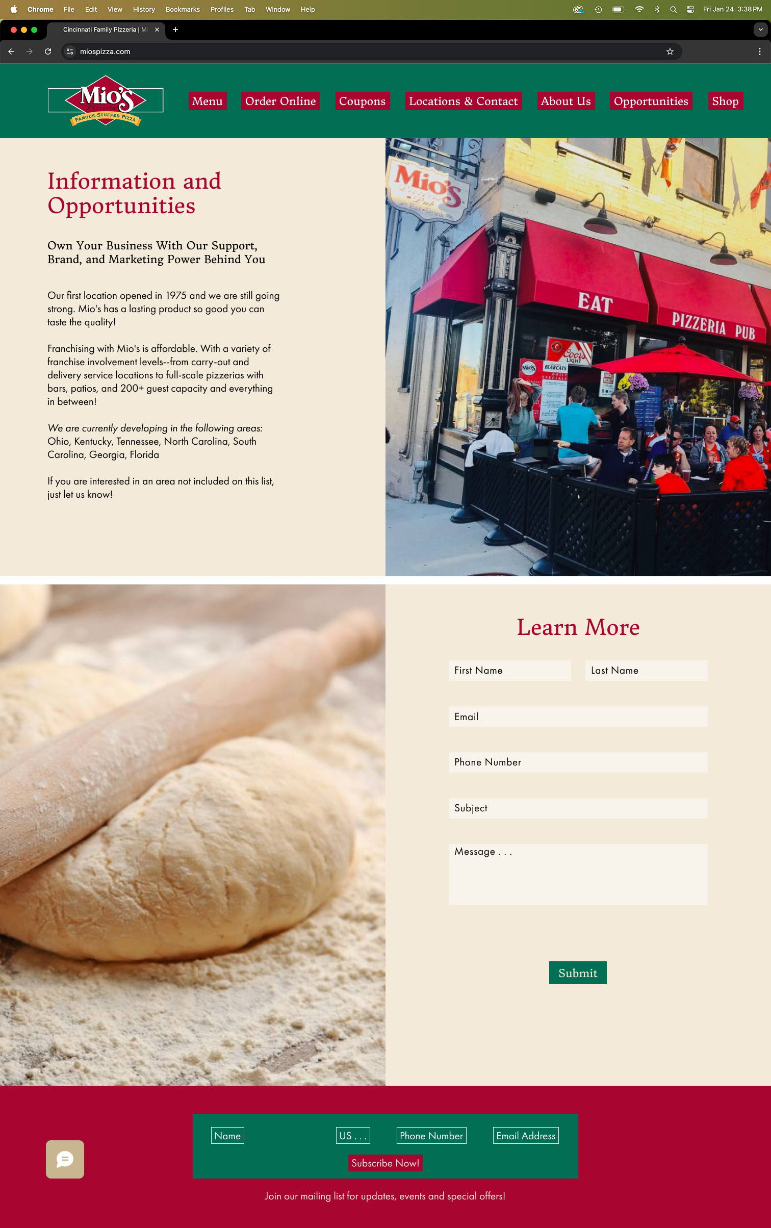
Franchise

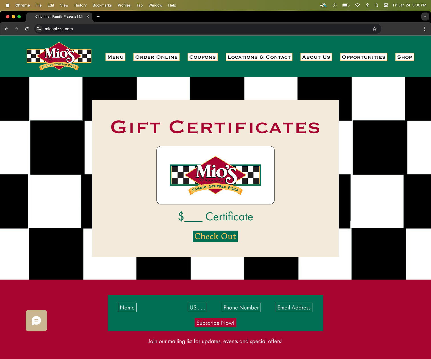
Shop

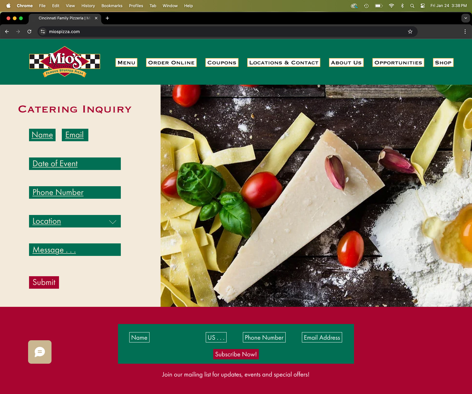
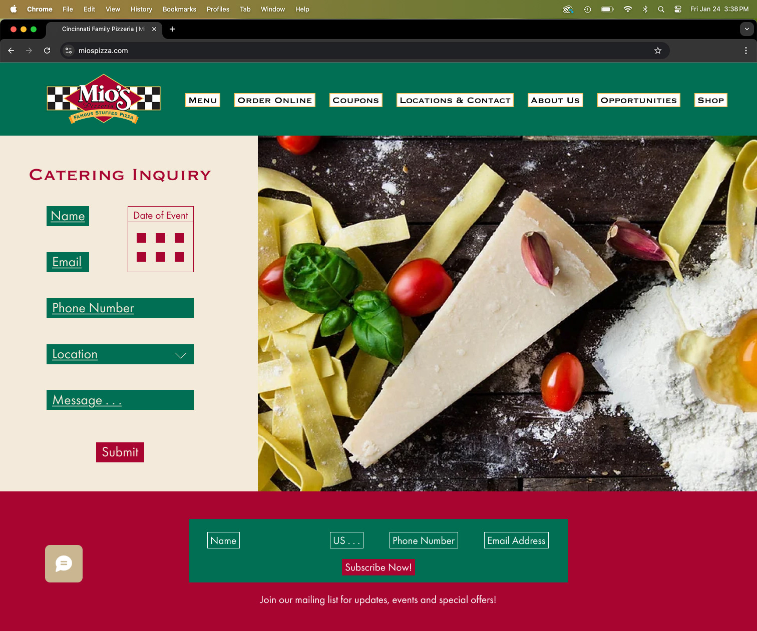
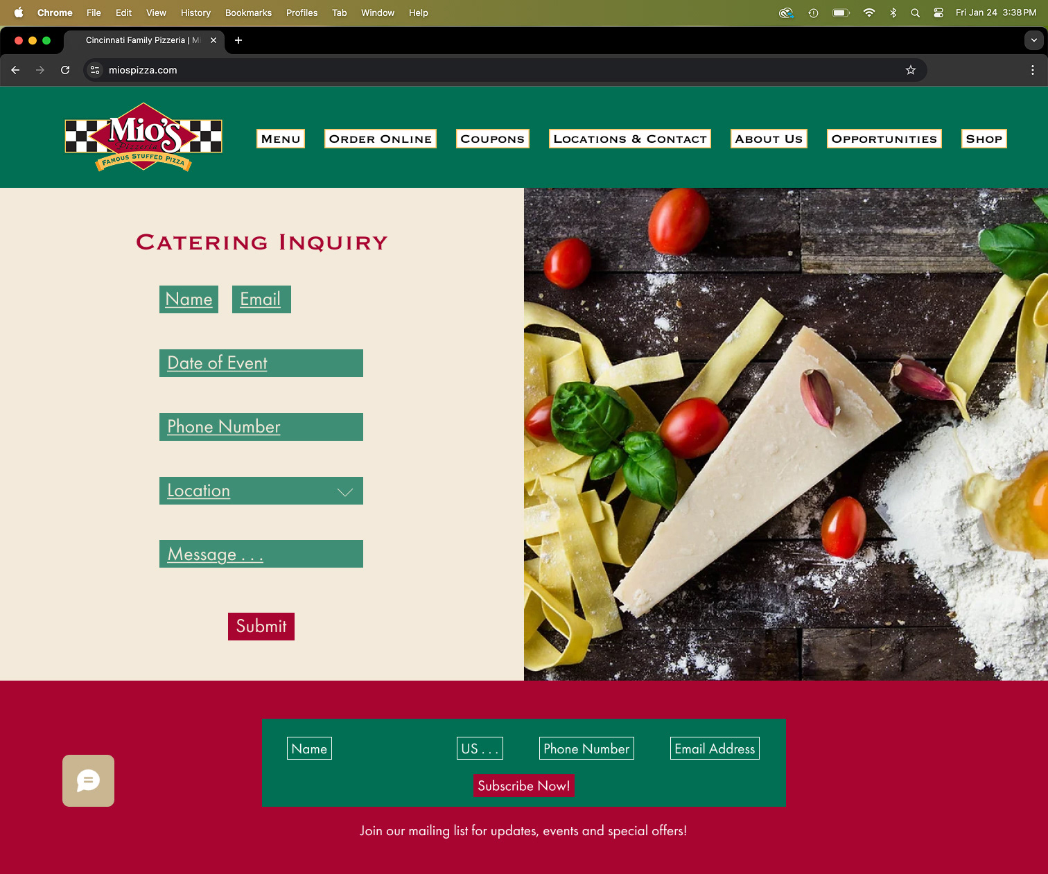
Cater my Event

Color and Typography
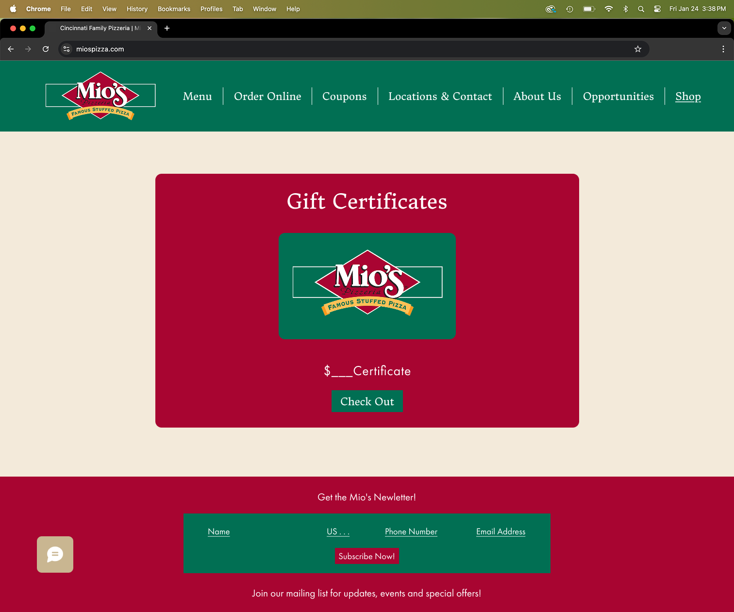
To maintain brand identity consistency, I chose to use the same color palette from the original website design.

Final