Objective
Neapolitan Swirl is a fictional cereal brand and flavor designed to inspire creativity in children, appeal to parents seeking a trustworthy option for their kids, and evoke nostalgia for older generations who remember the classic Neapolitan flavor.
Research
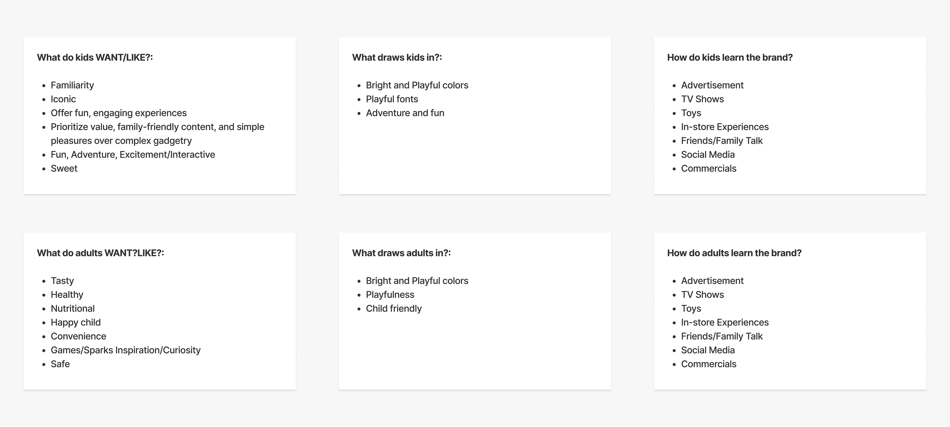
The first step was to figure out what each of my target audiences look for when purchasing a cereal. Identified the wants, needs, and means of learning about the cereal.
Inspiration
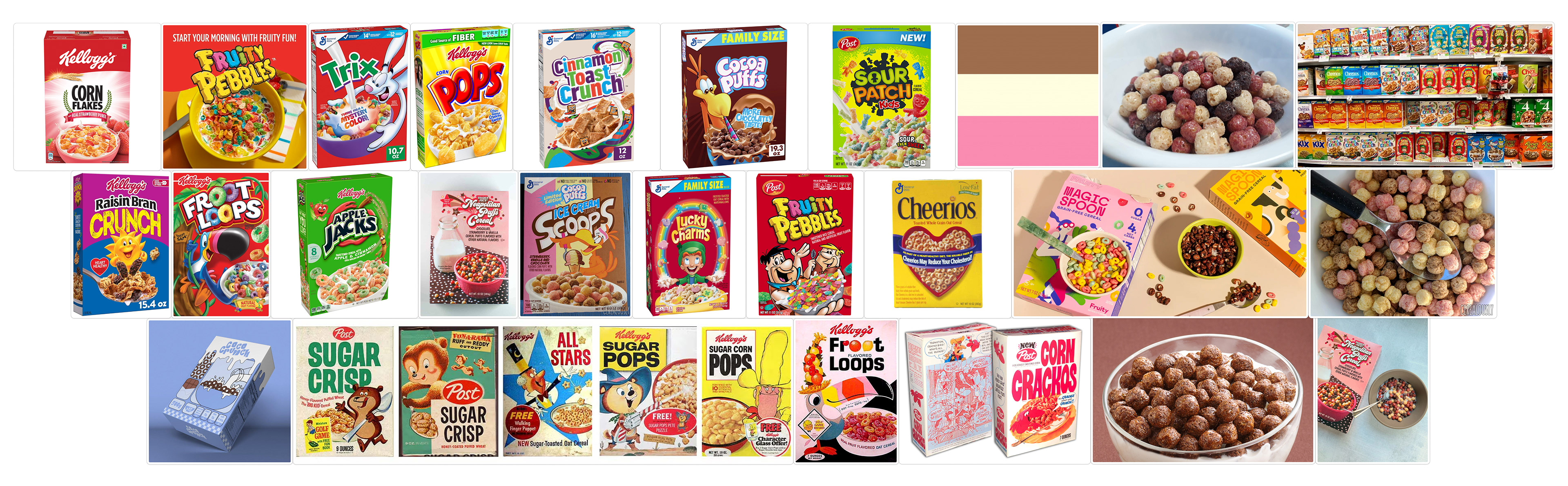
Immersed myself in analyzing typography, color, and composition to understand how popular cereal brands design their boxes for shelves and market their products.
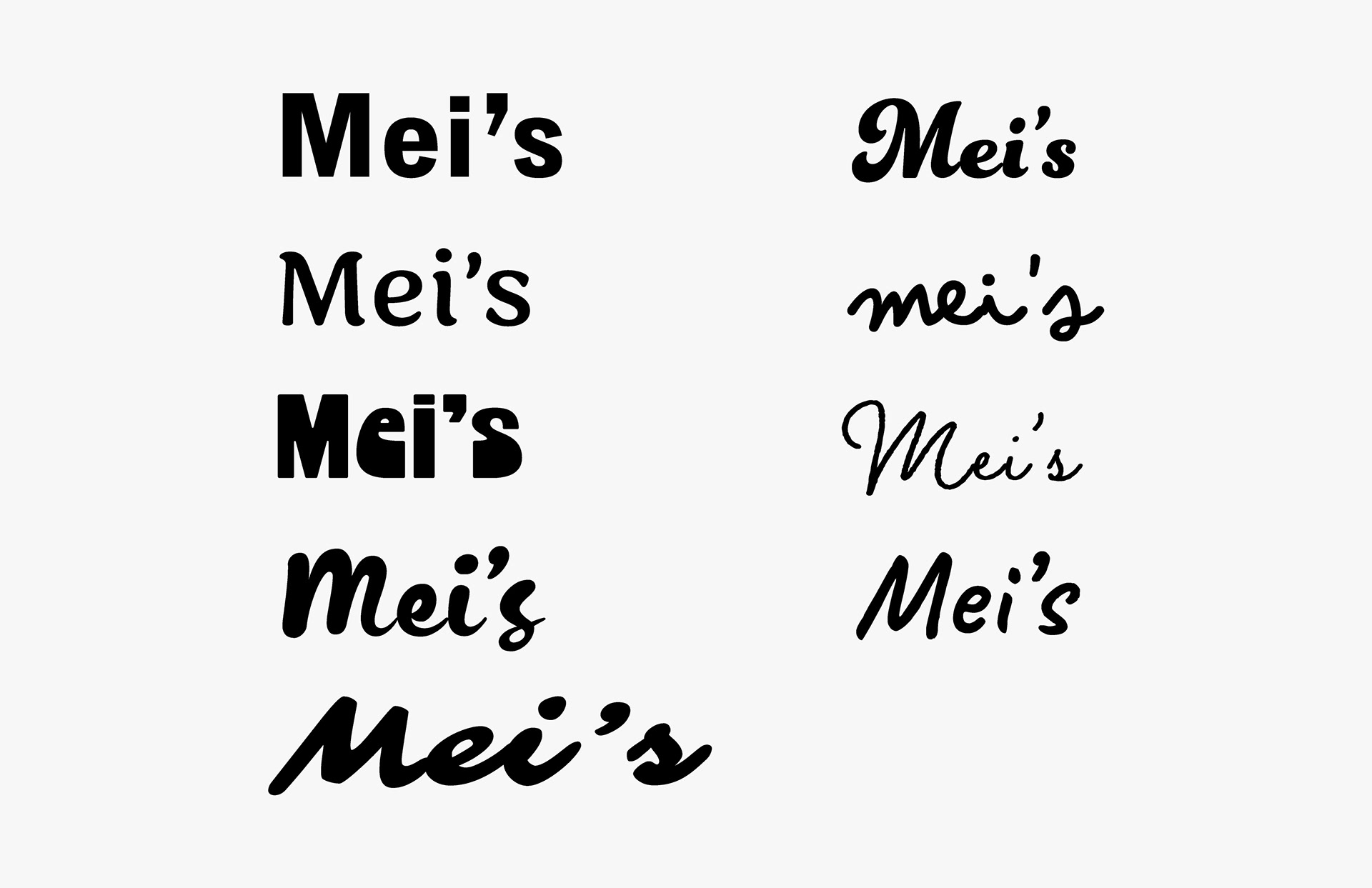
Typeface Exploration
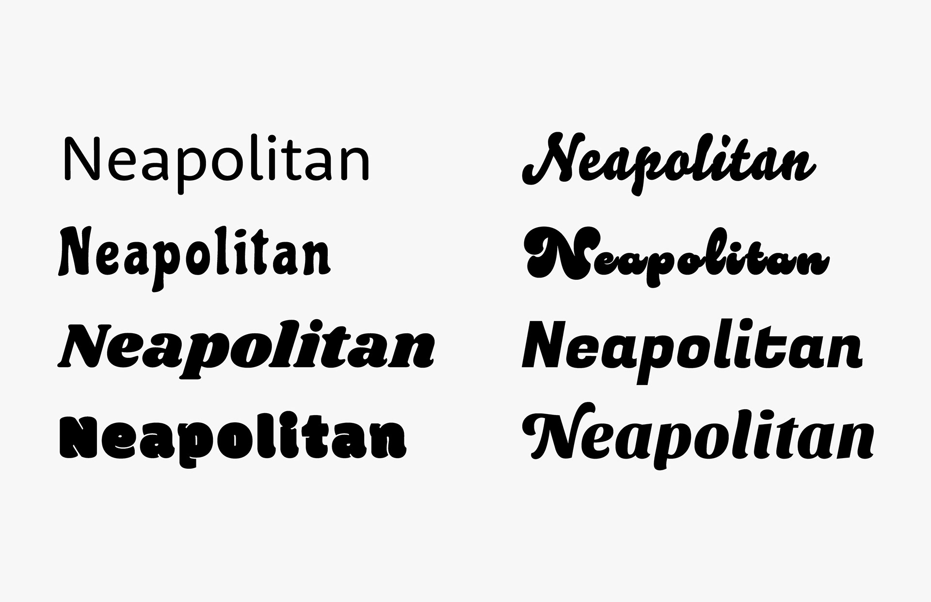
Explored typefaces that reflected the fun, retro style of the cereal while bringing attention to the playful 'Swirl' element.

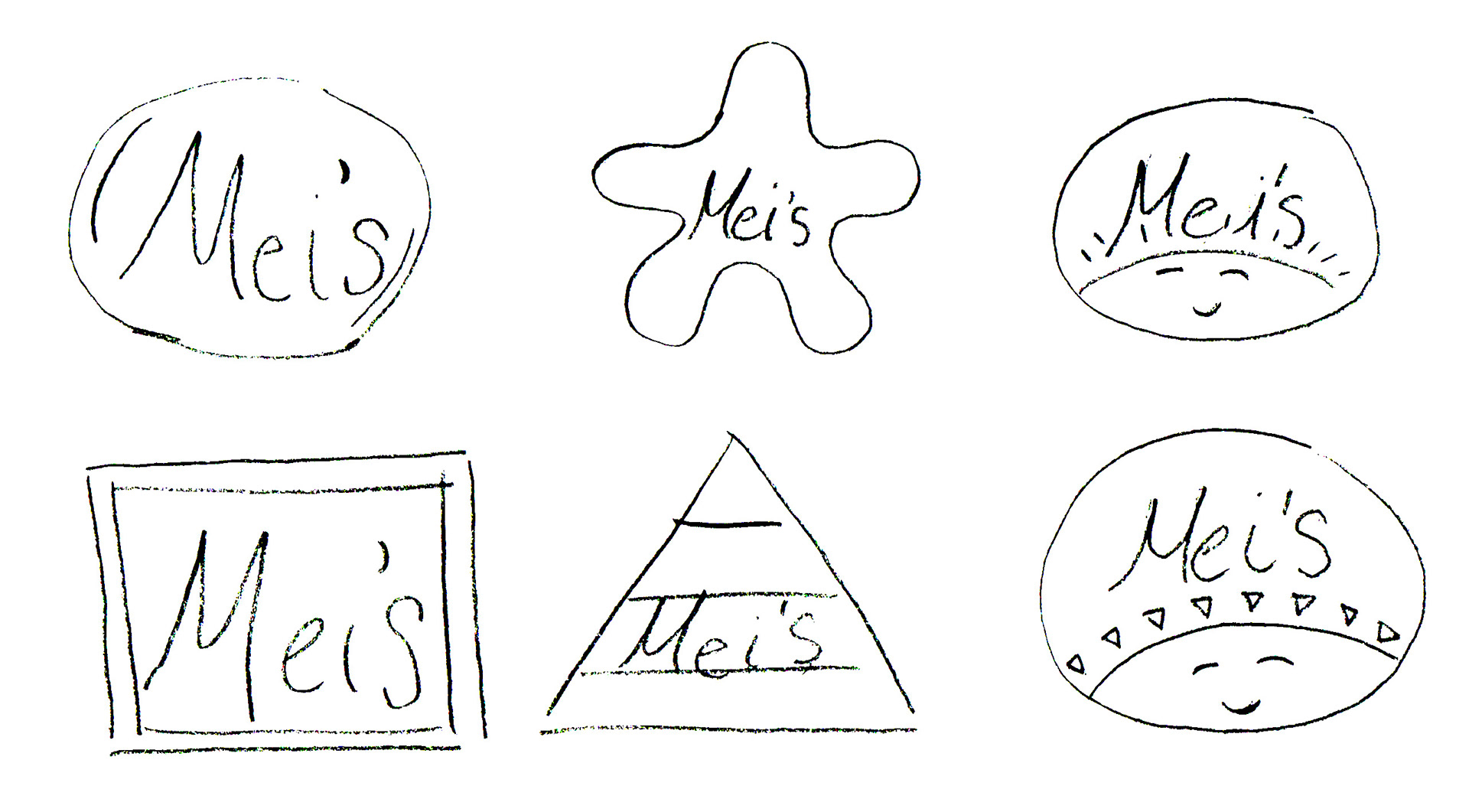
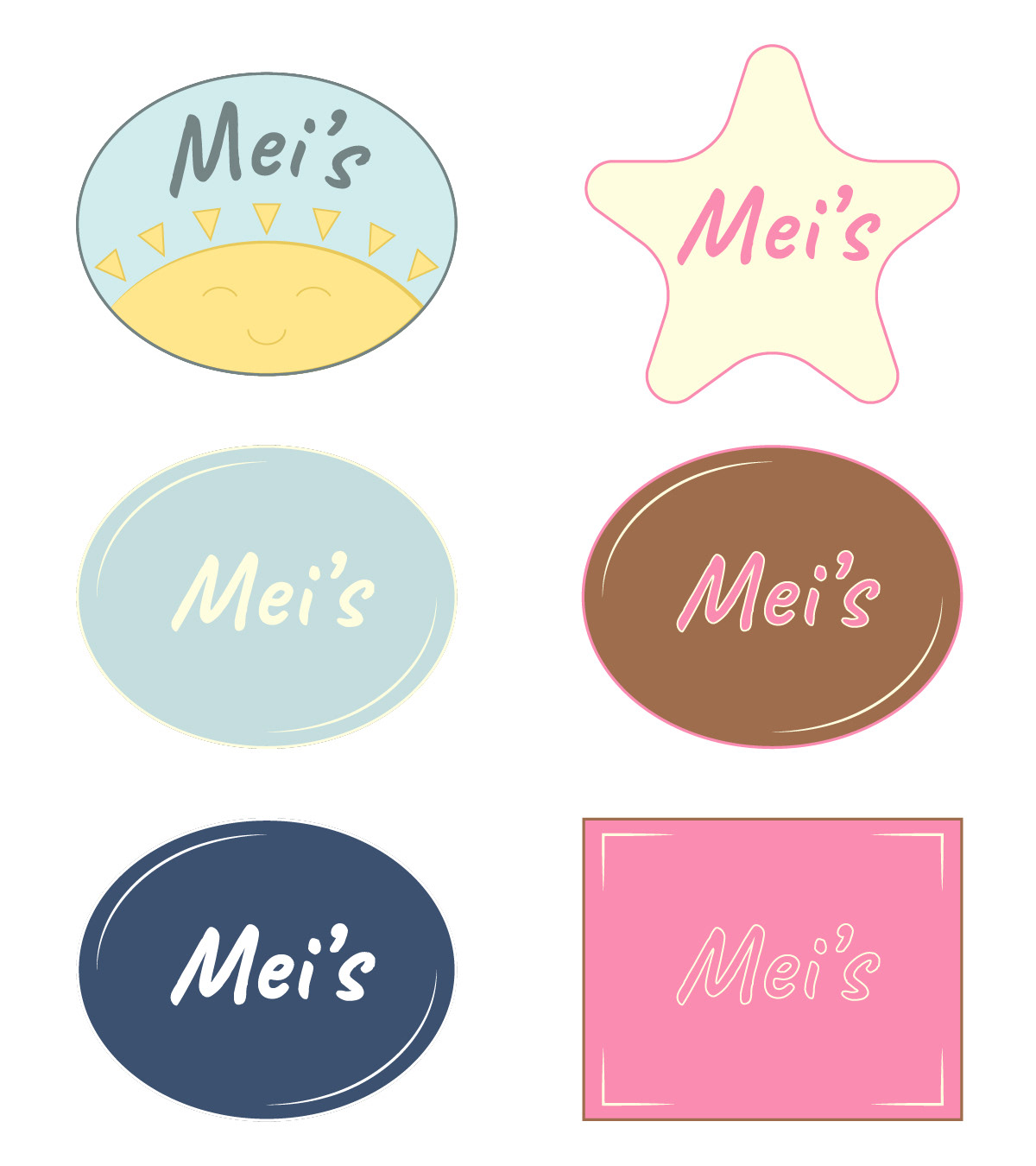
Master Brand Logo Development
Sketched different compositions for the brand name 'Mei's,' then digitized each sketch and explored color and composition throughout the development process.
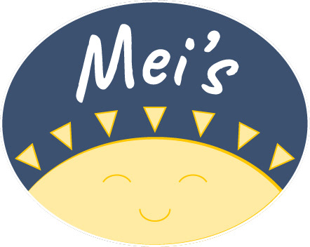
Final Master Brand Logo
Flavor Wordmark Development
Started to explore compositions and visual styles for the flavor name 'Neapolitan Swirl,' experimenting with layouts and cohesive elements to capture the brand’s playful, retro inspired feel.

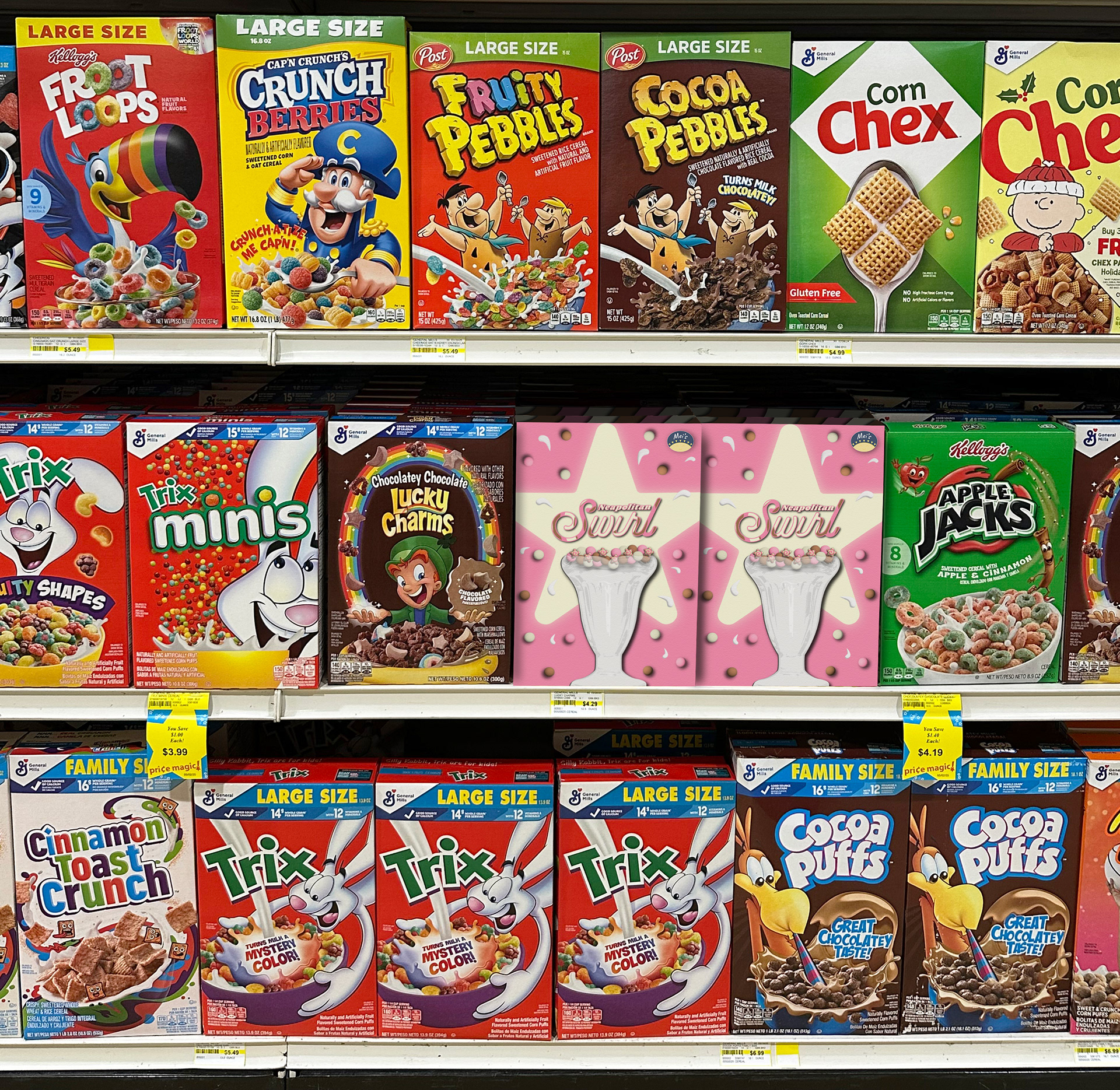
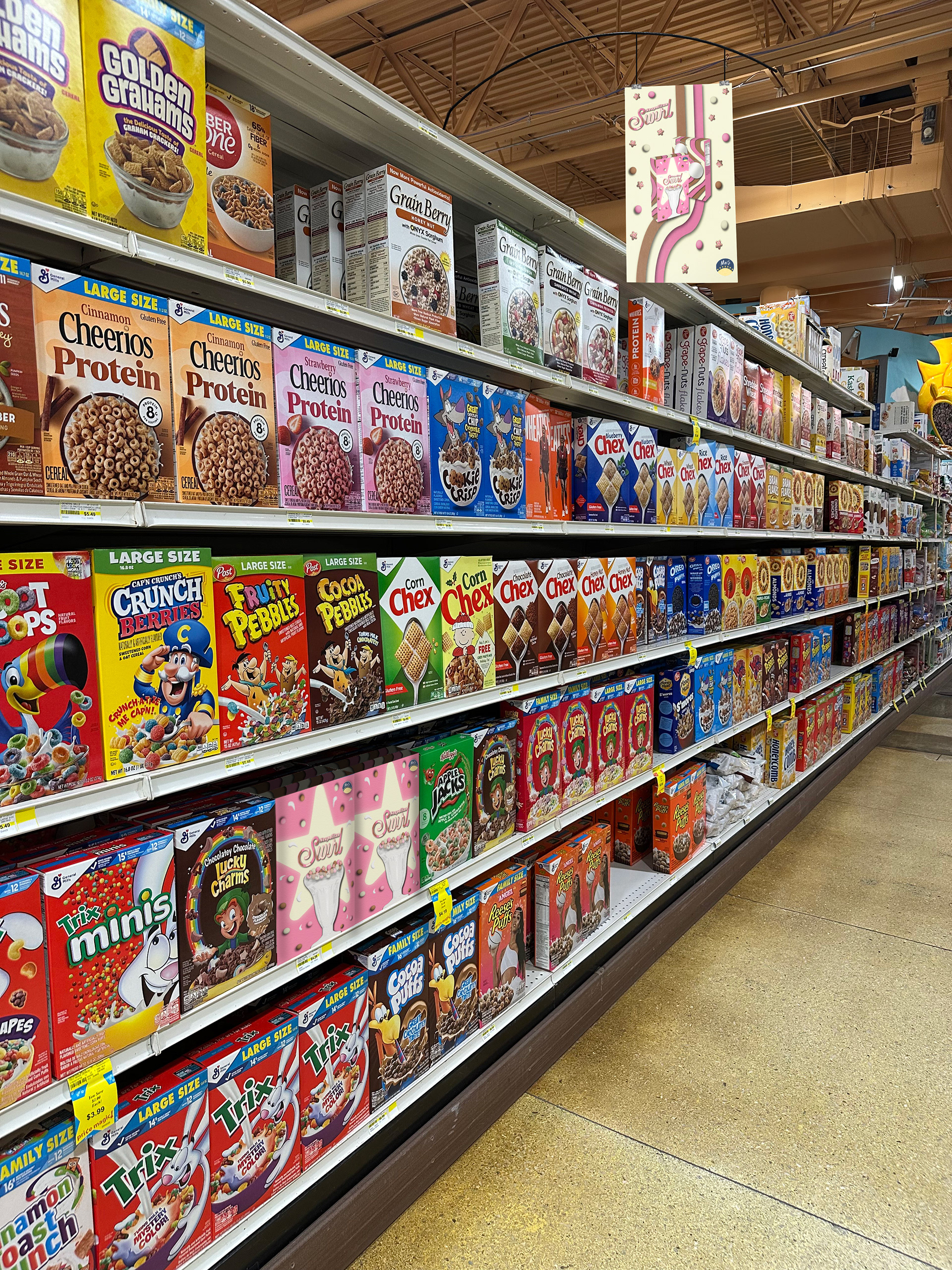
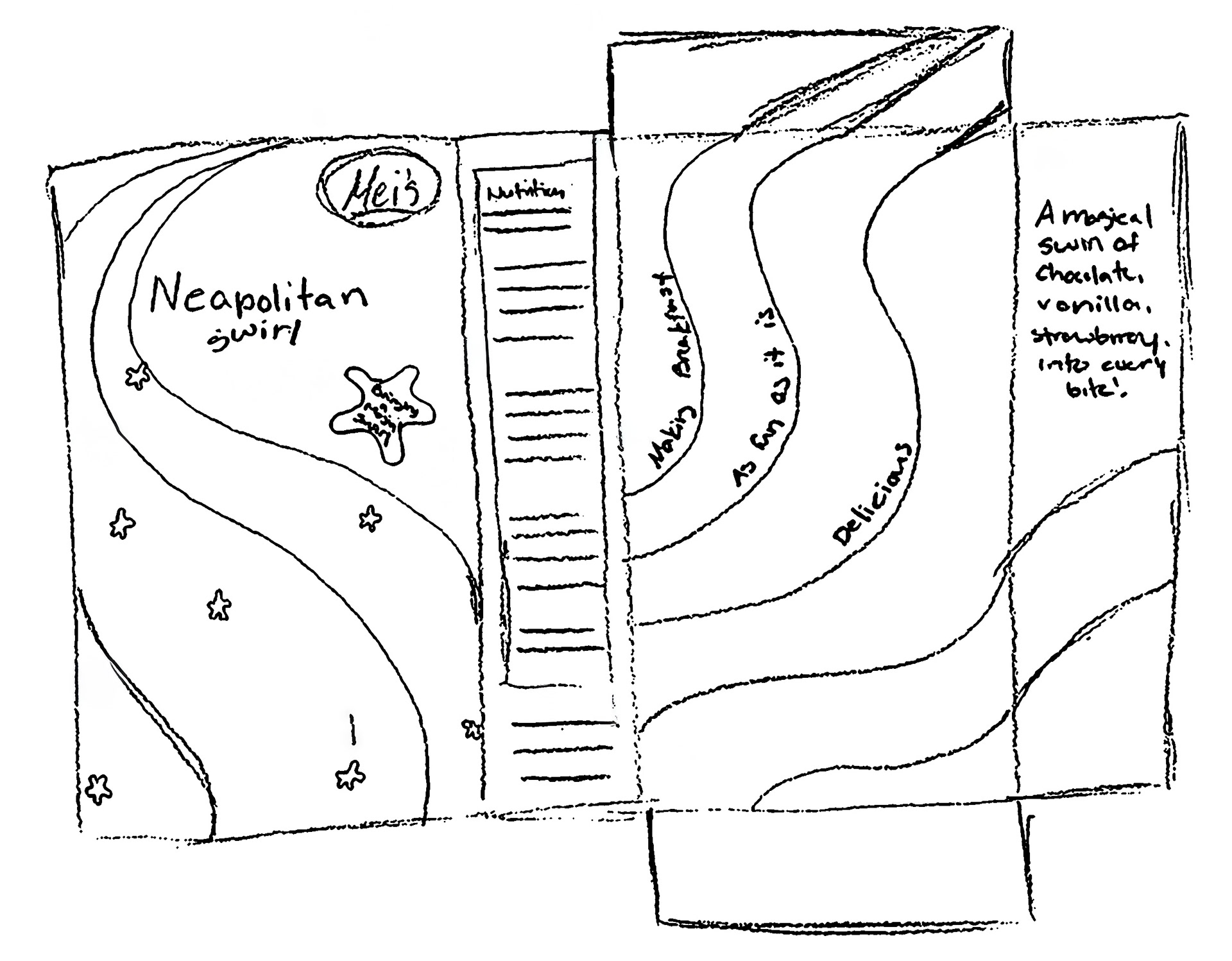
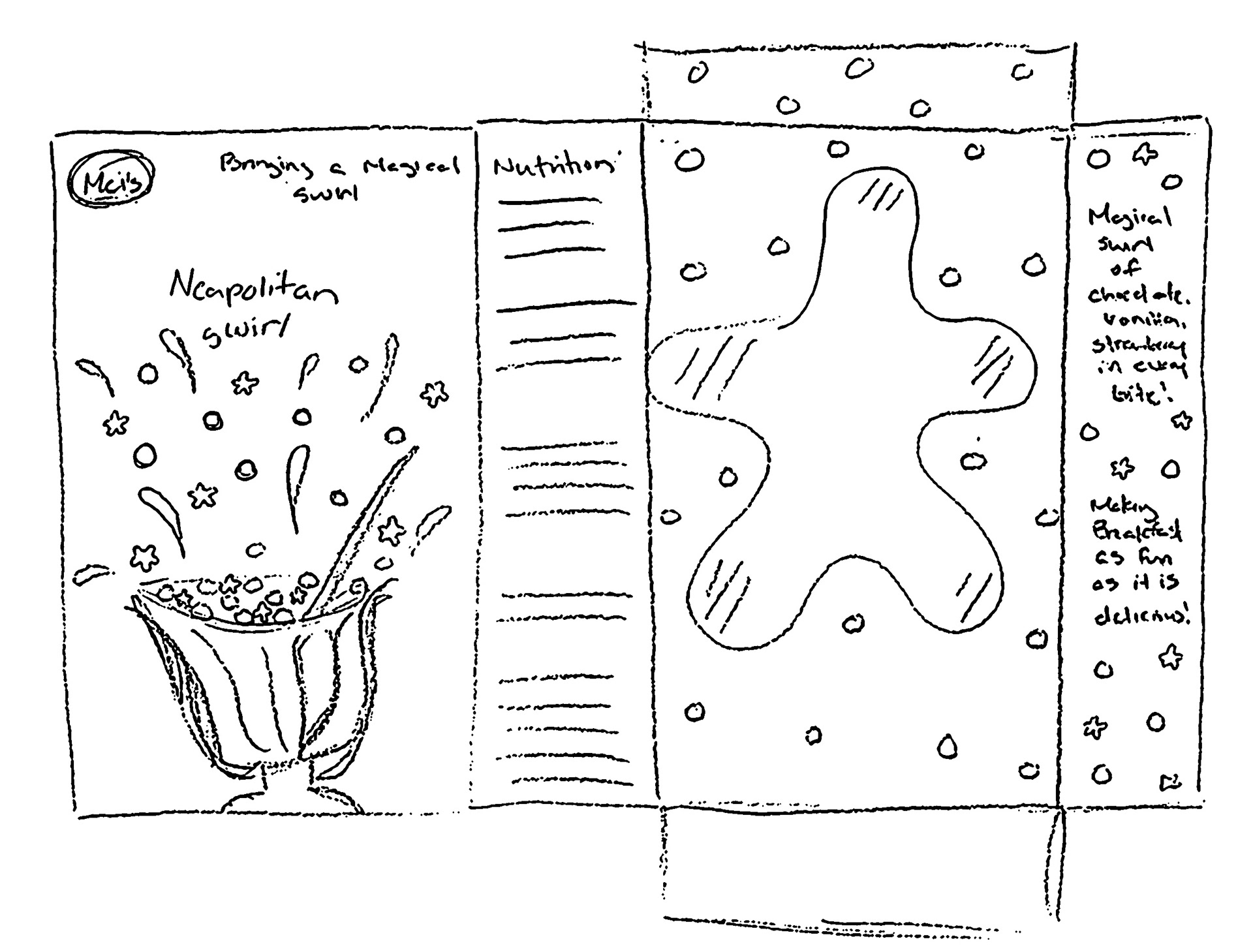
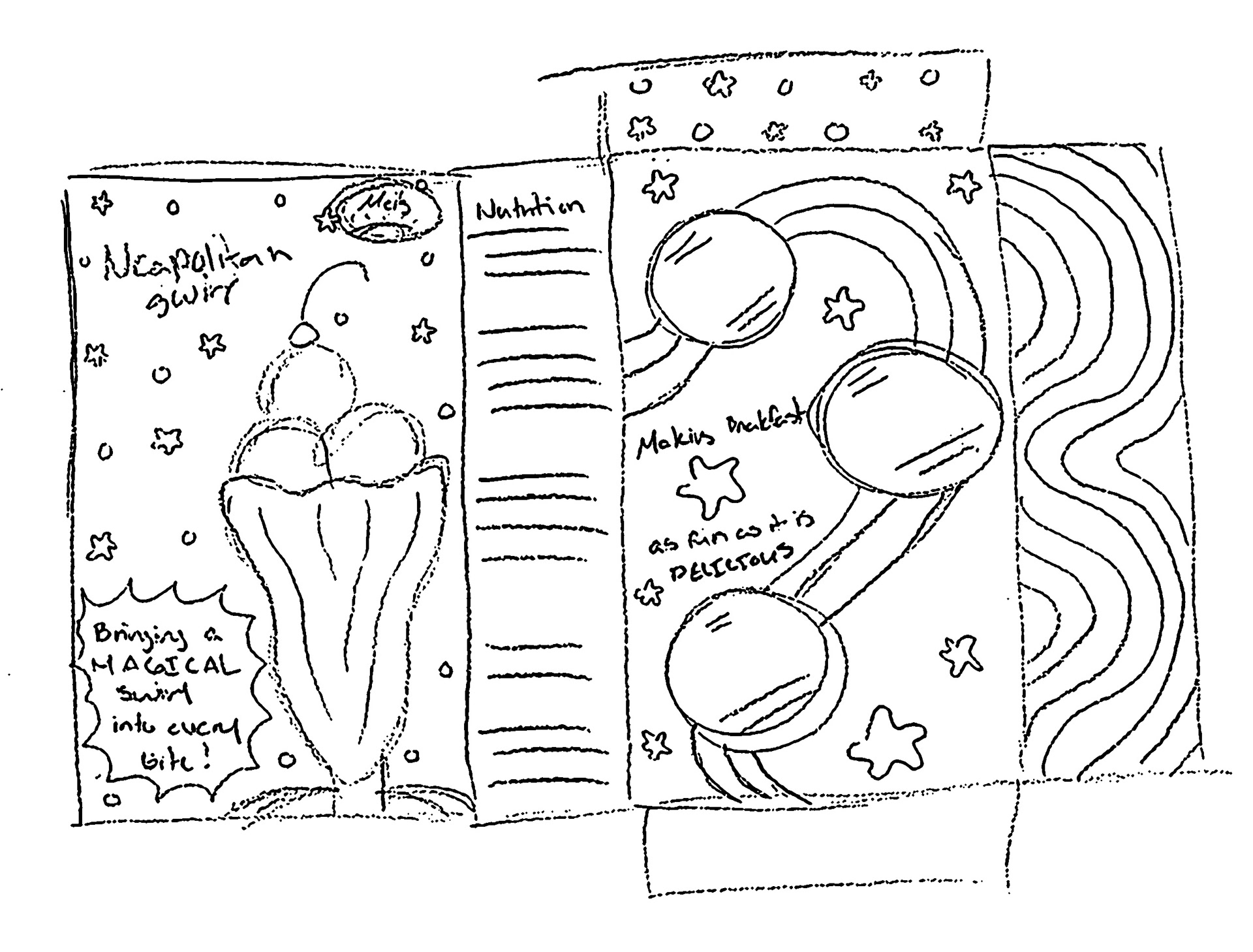
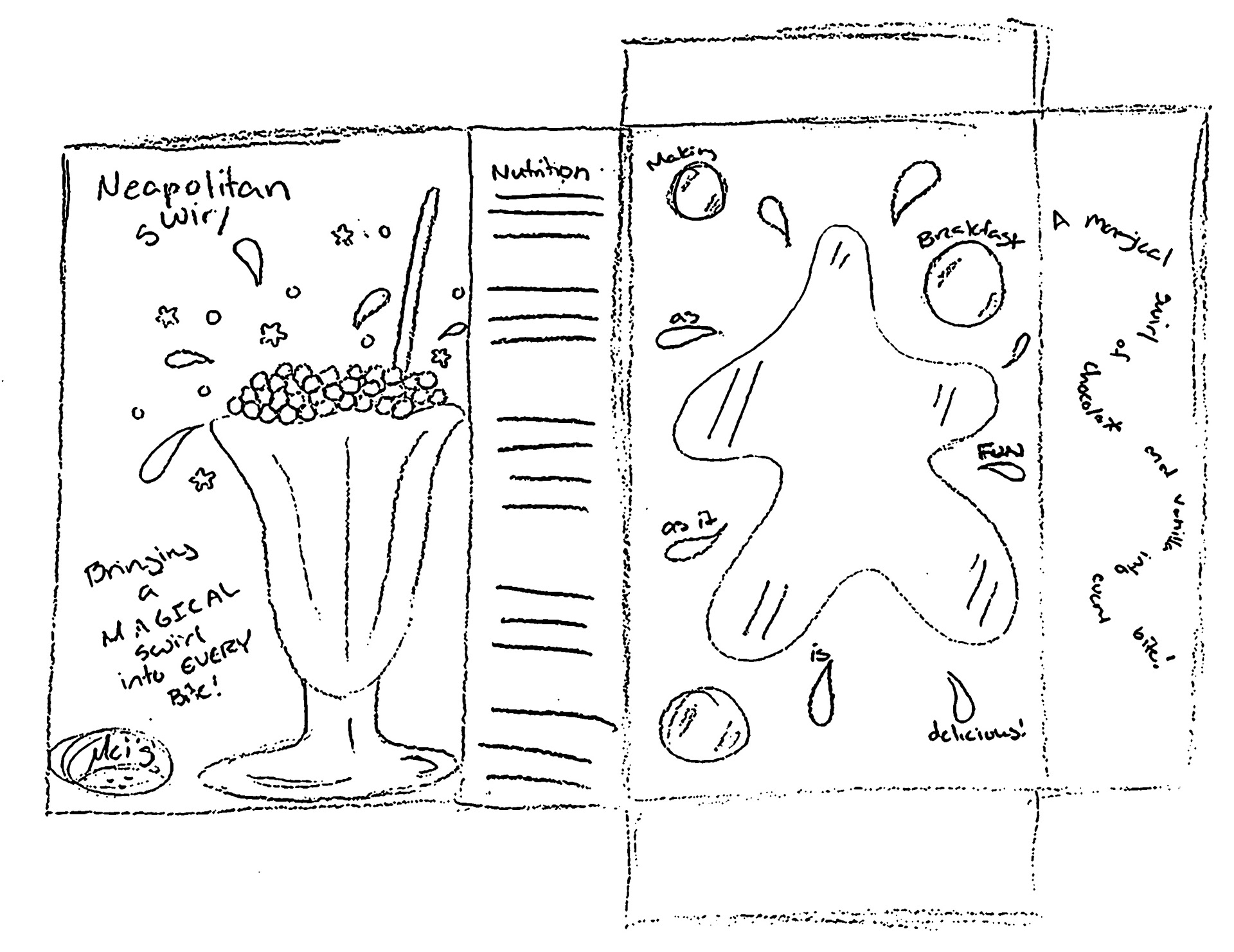
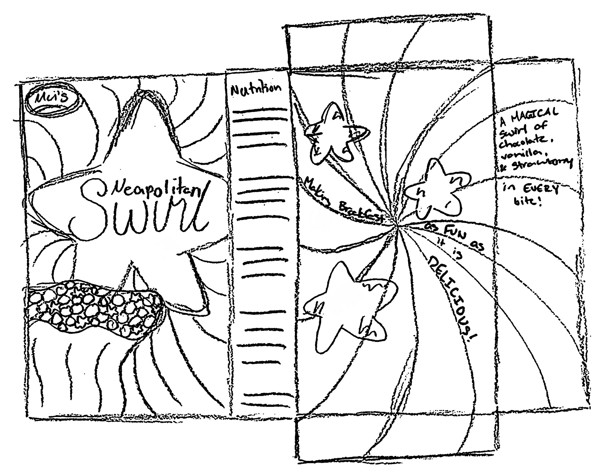
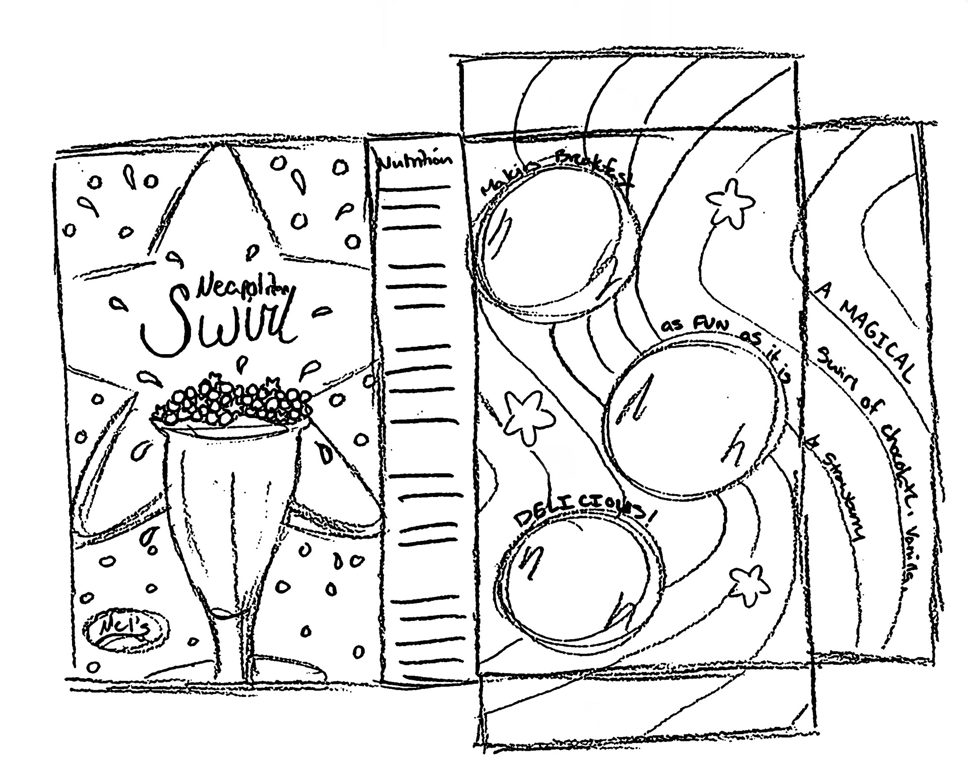
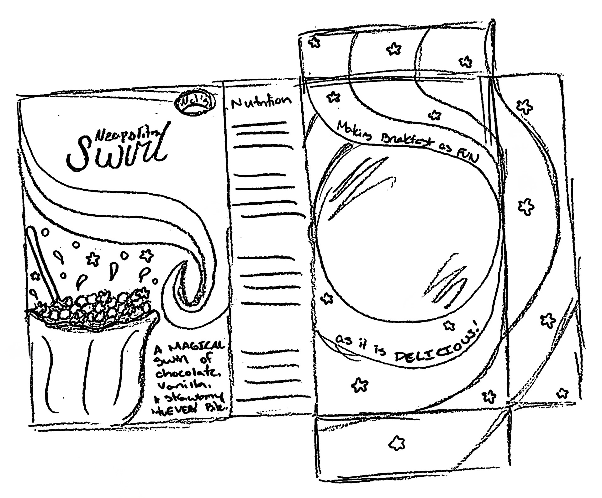
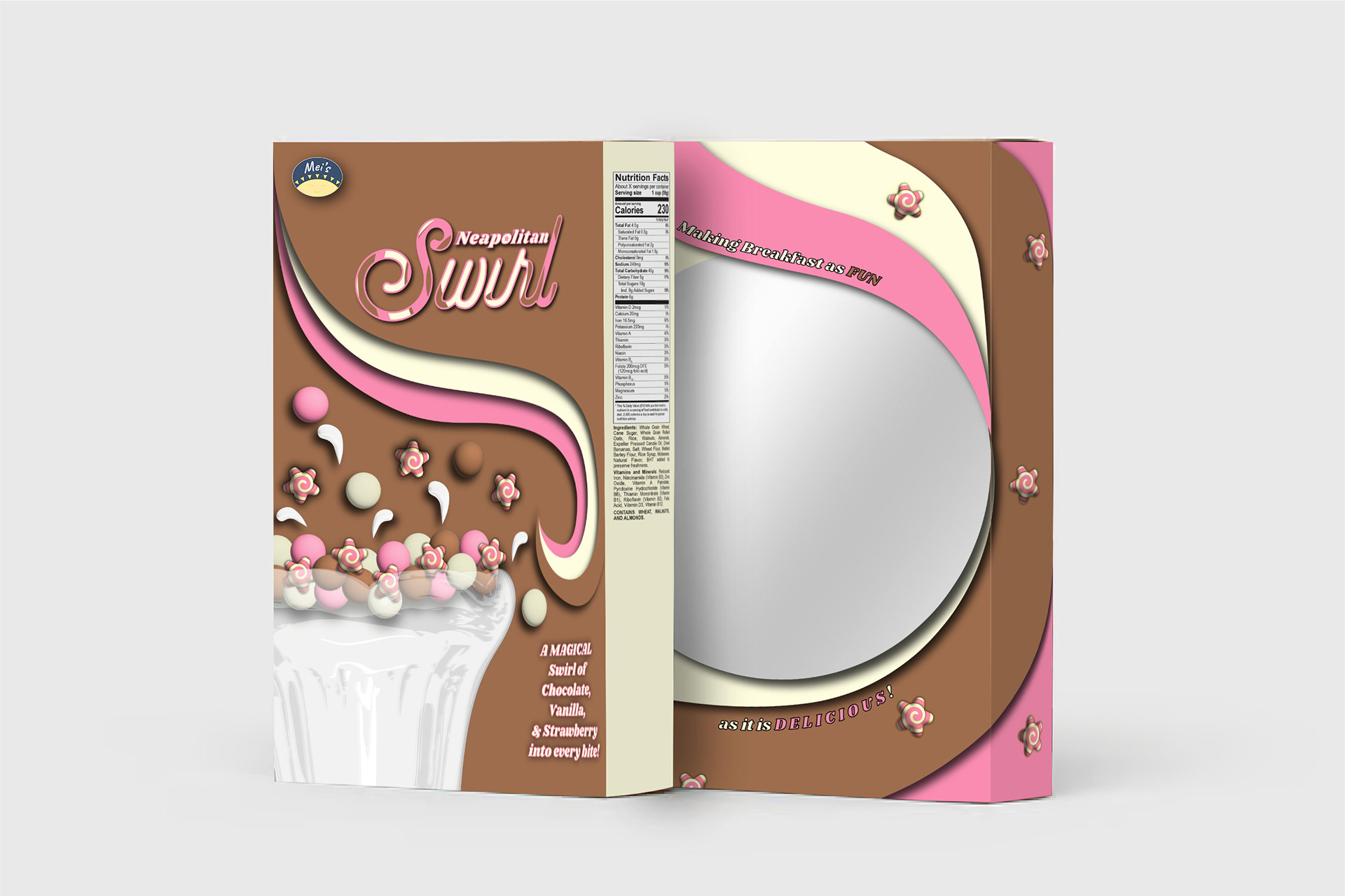
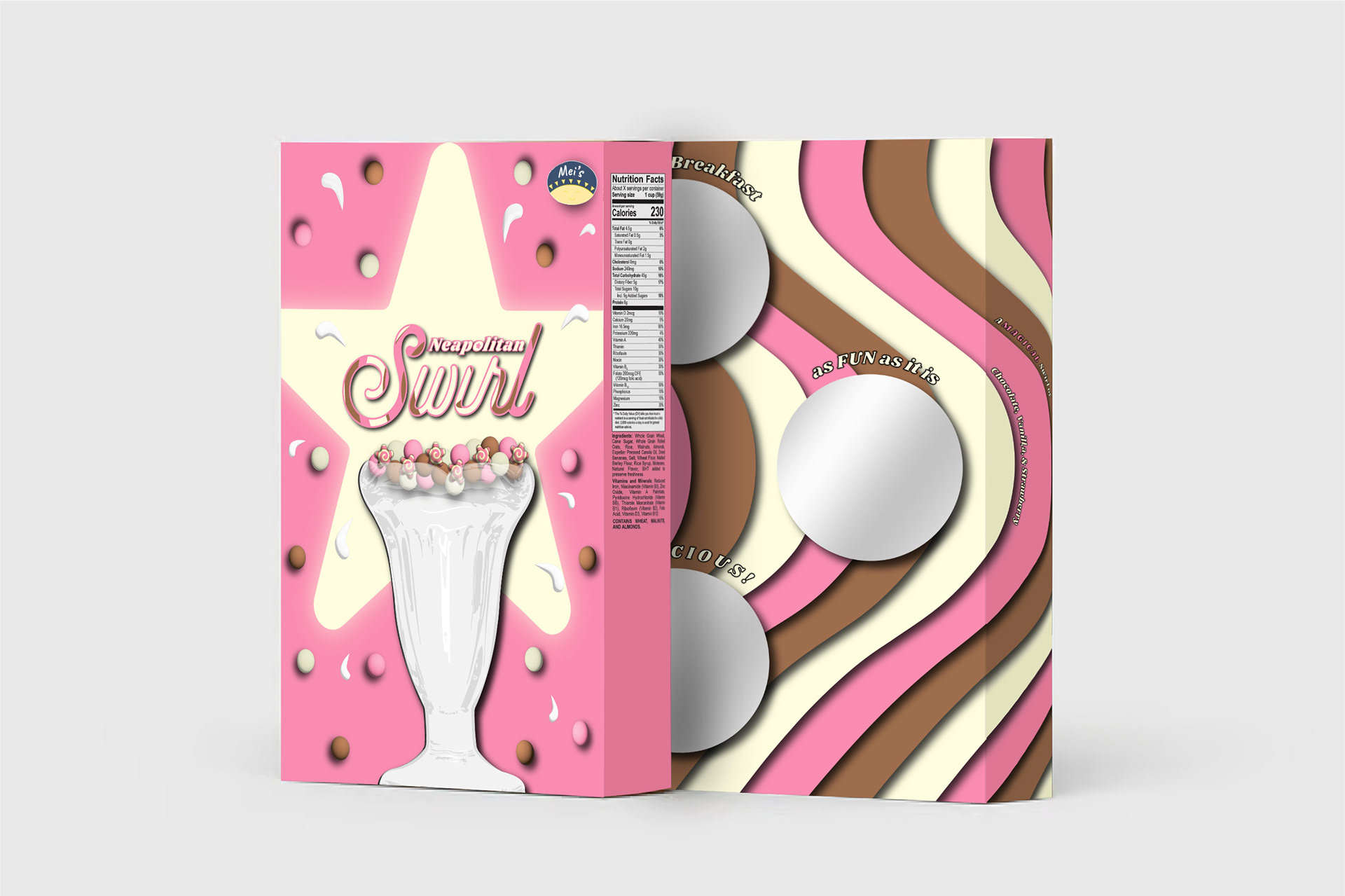
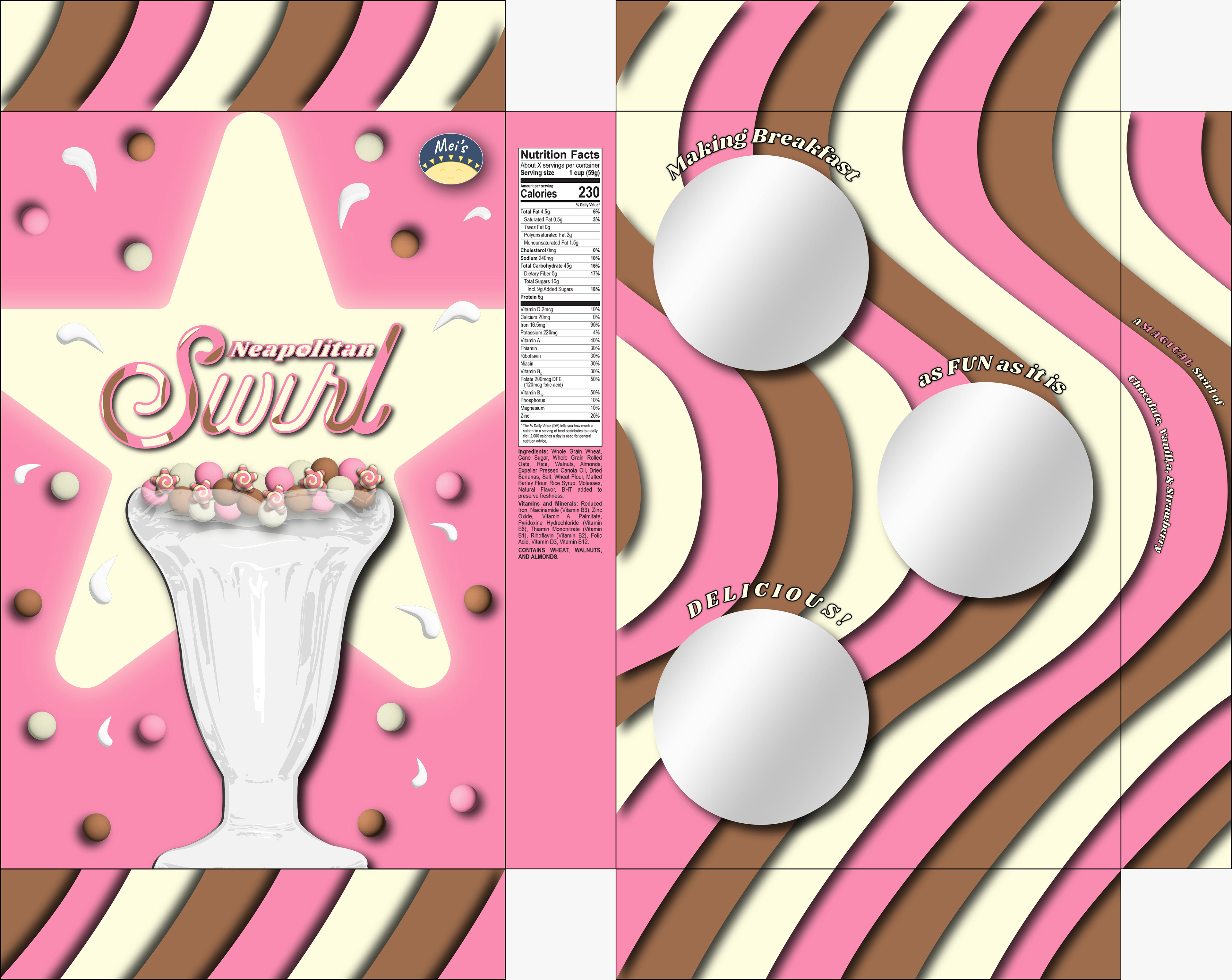
Box Design Sketches
Sketched different compositions and layouts for 'Neapolitan Swirl,' focusing on emphasizing the cereal’s chocolate, vanilla, and strawberry puffs paired with star swirl marshmallows. I continually aimed to highlight the fun, playful swirl, the importance of the star shape, and a retro inspired style that reflects the brand’s nostalgic personality.


Digitalization
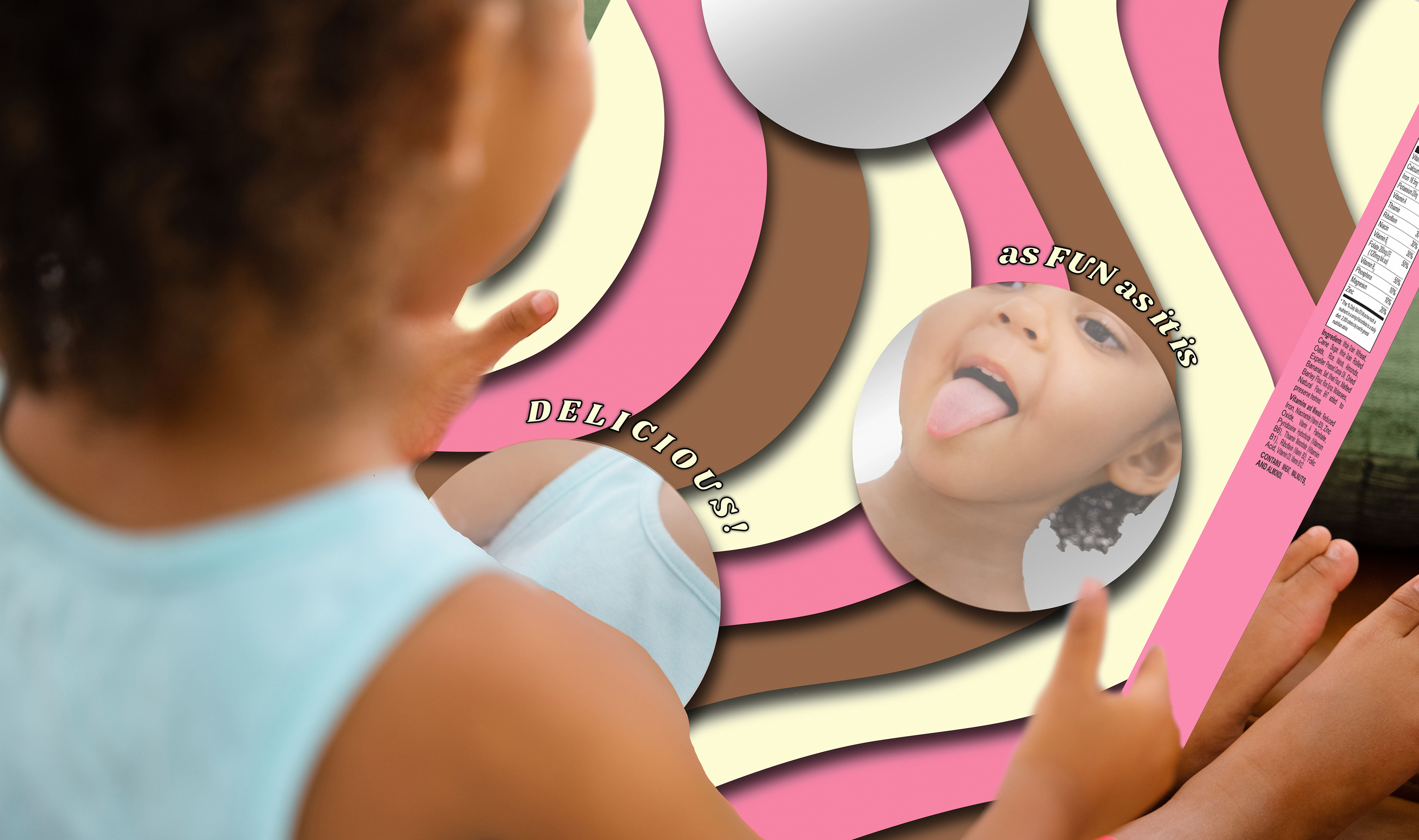
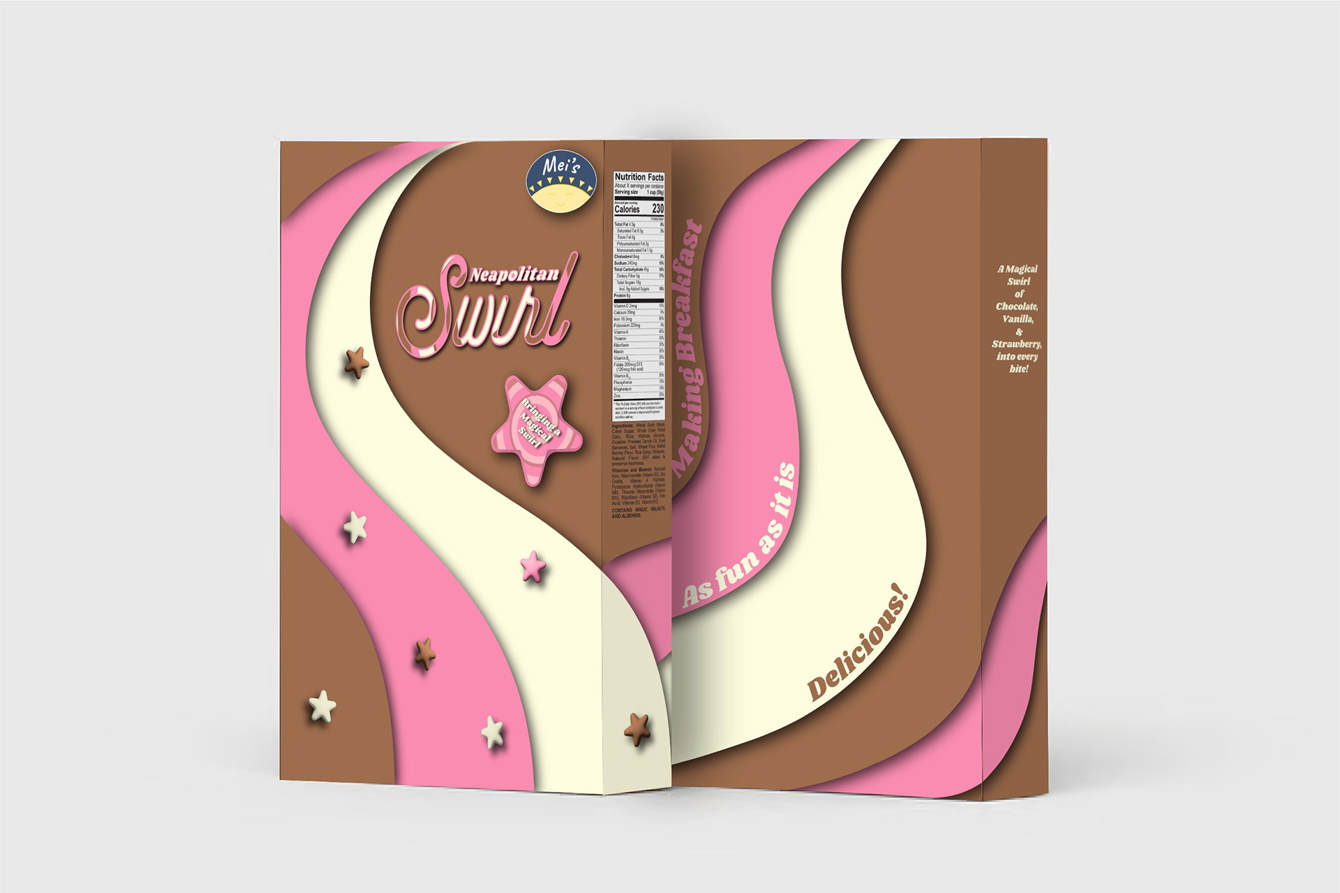
Digitized three sketches in Illustrator and created composited mockups in Photoshop. Applied the chocolate brown, vanilla cream, and strawberry pink palette throughout each design. This created a consistent, playful look that captured the essence of Neapolitan Swirl cereal. Added a mirror on the back for interactivity with the younger audience.
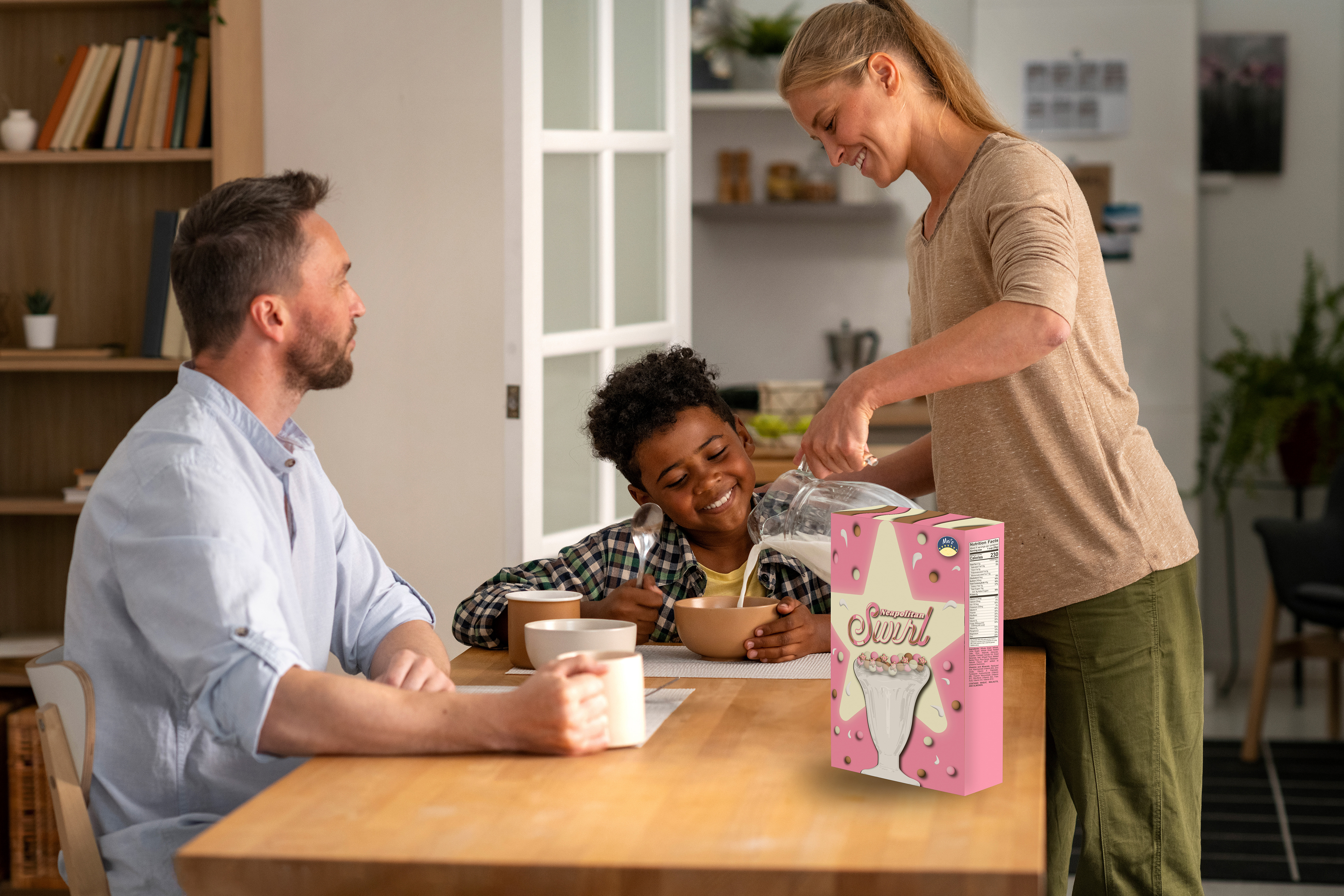
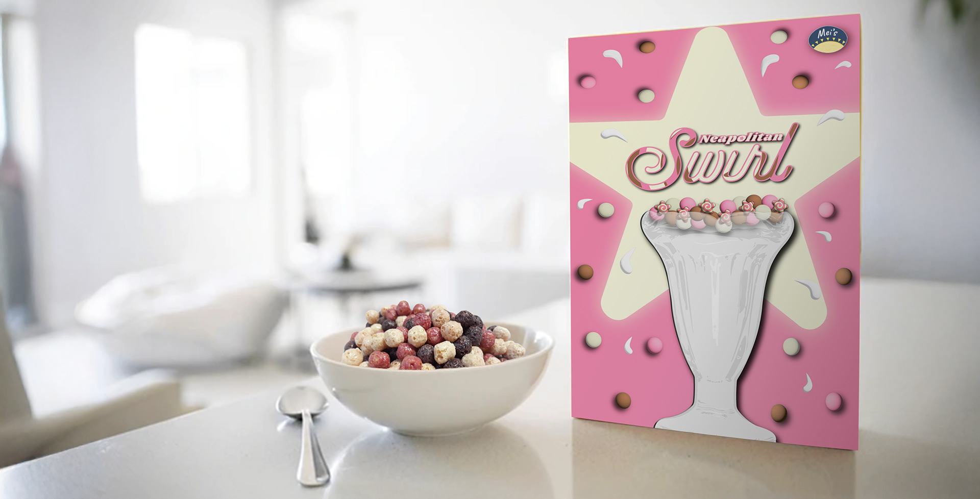
Final Decision
3D rendered the refined digital boxes and selected the final design. Chose this design to move forward with as it balanced retro and modern elements, while being fun, engaging, and aligned with the original objective.
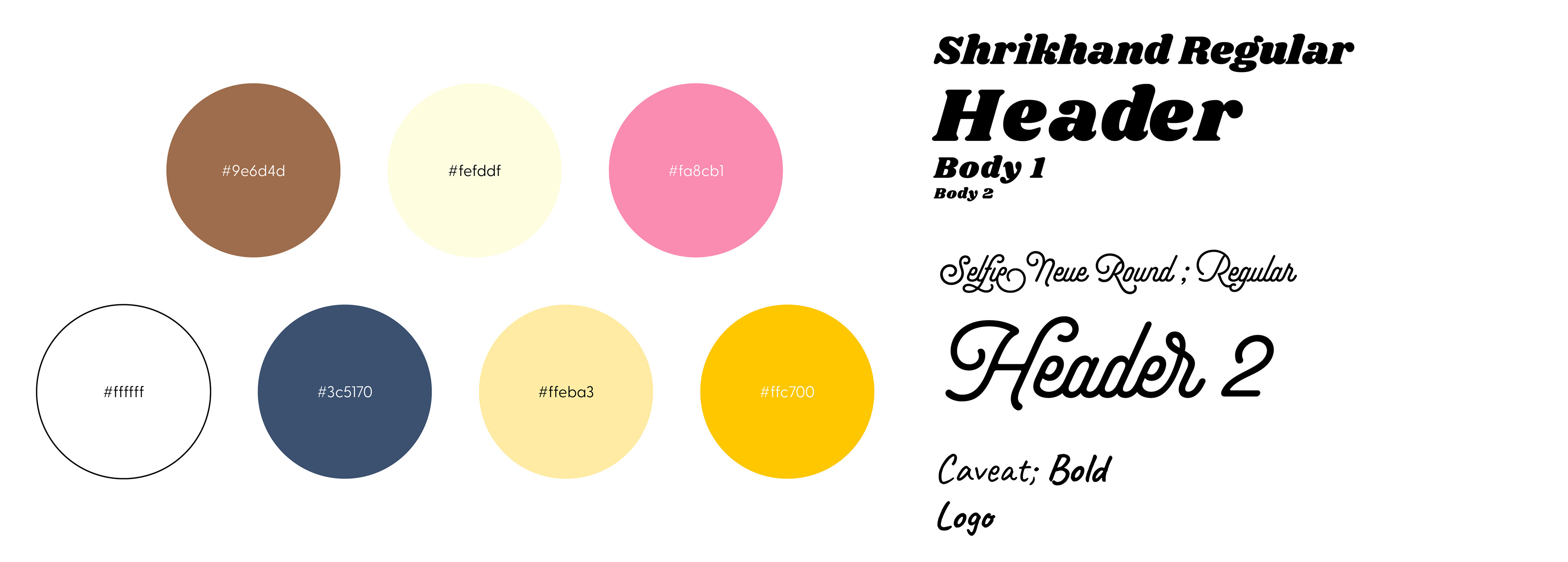
Color and Typography
Final
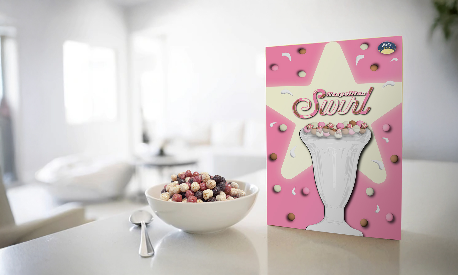
Application