Objective
QuickBite is a mobile app for fast food delivery that prioritizes speed, simplicity, and personalization. Unlike other delivery platforms, it lets users customize orders from multiple restaurants and receive smart meal recommendations for a smooth and efficient experience.
Research
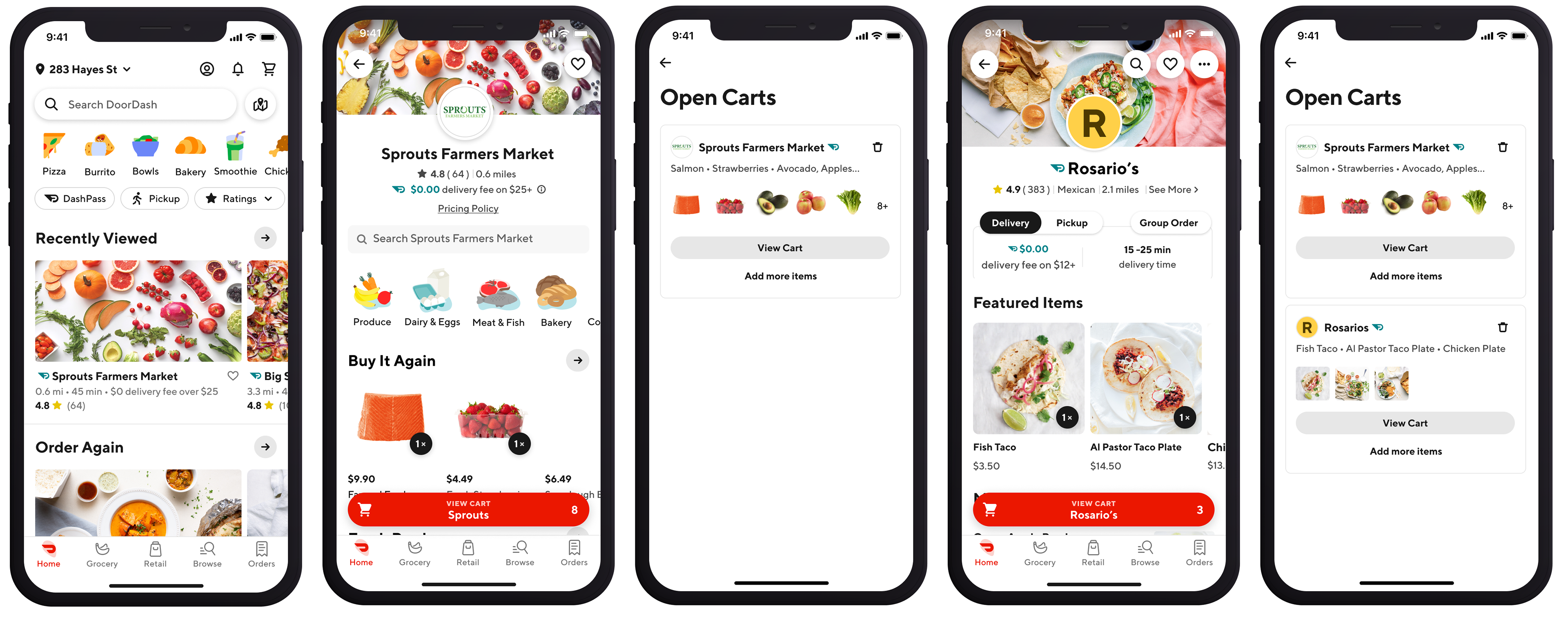
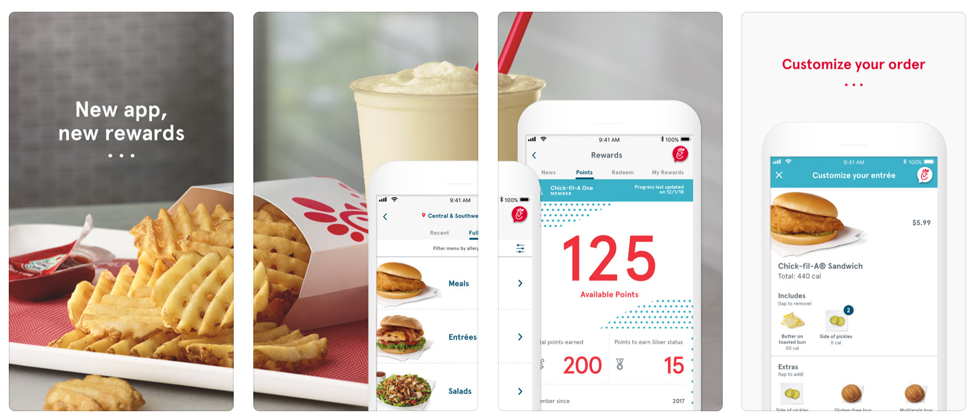
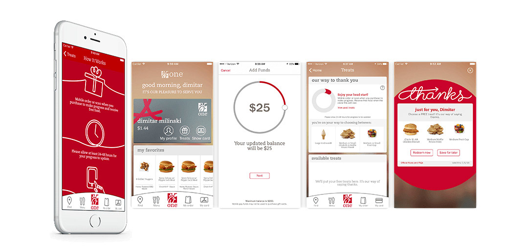
I began by benchmarking mobile apps such as Chick-fil-A and DoorDash to understand what makes their interfaces effective and engaging. I analyzed their layout structure, type hierarchy, and use of imagery to support quick decision making. These apps demonstrate how clear navigation and appealing visuals can simplify the ordering process. This research not only informed the structure of QuickBite but also reinforced the importance of designing for speed, clarity, and user confidence.
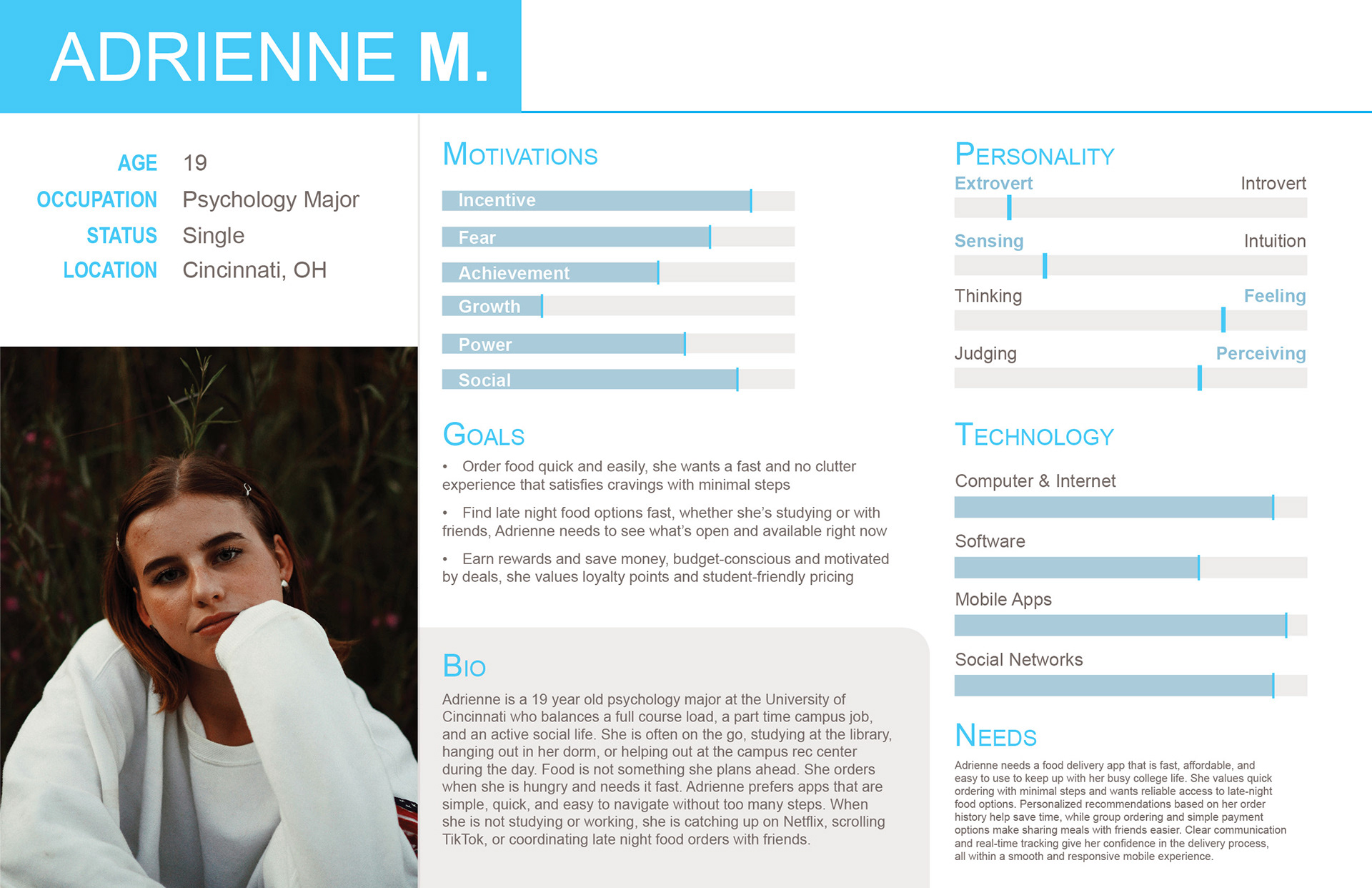
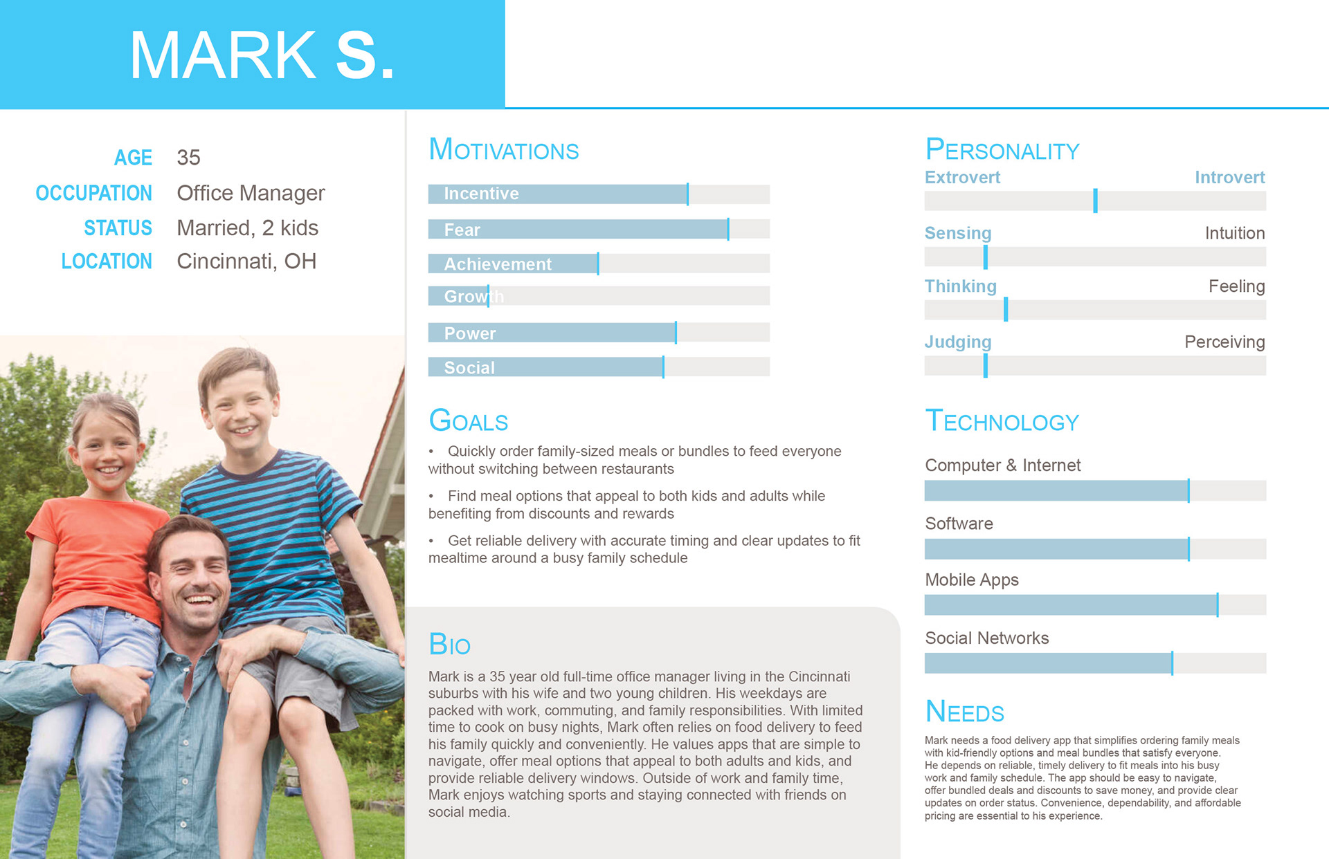
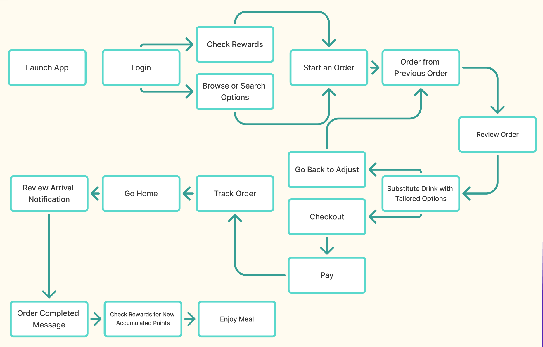
Personas and Task Flow
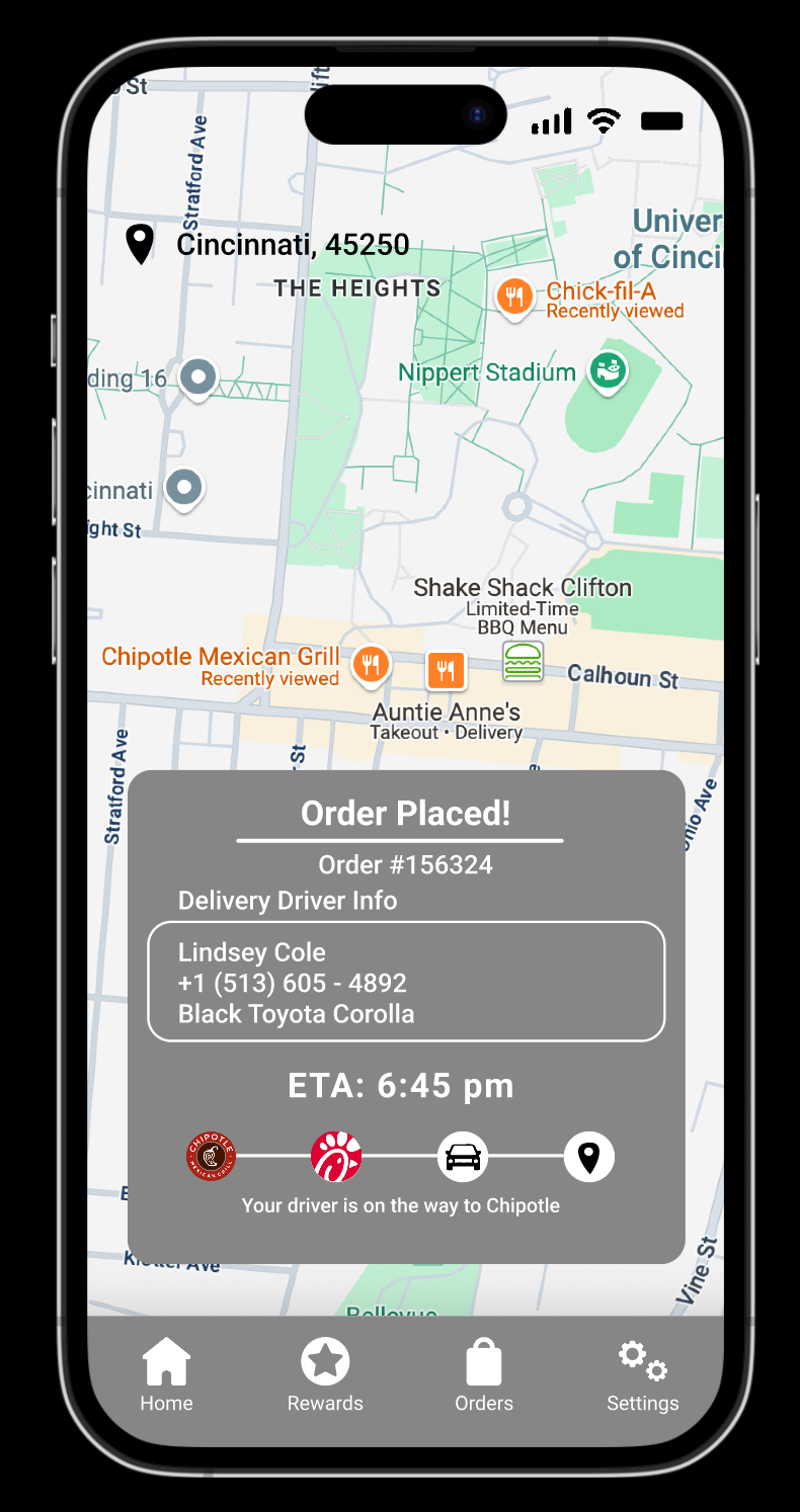
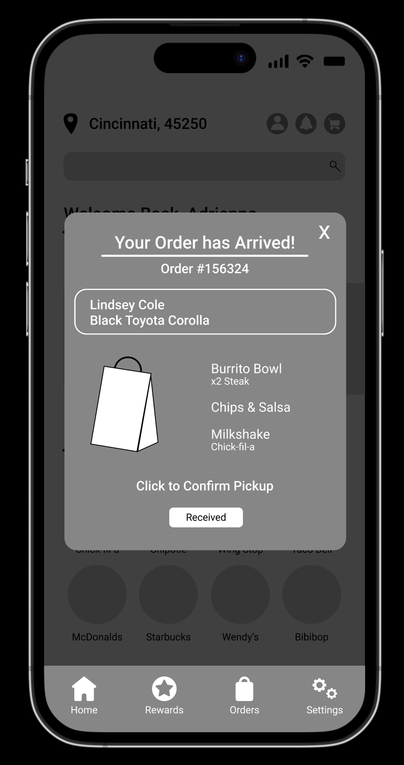
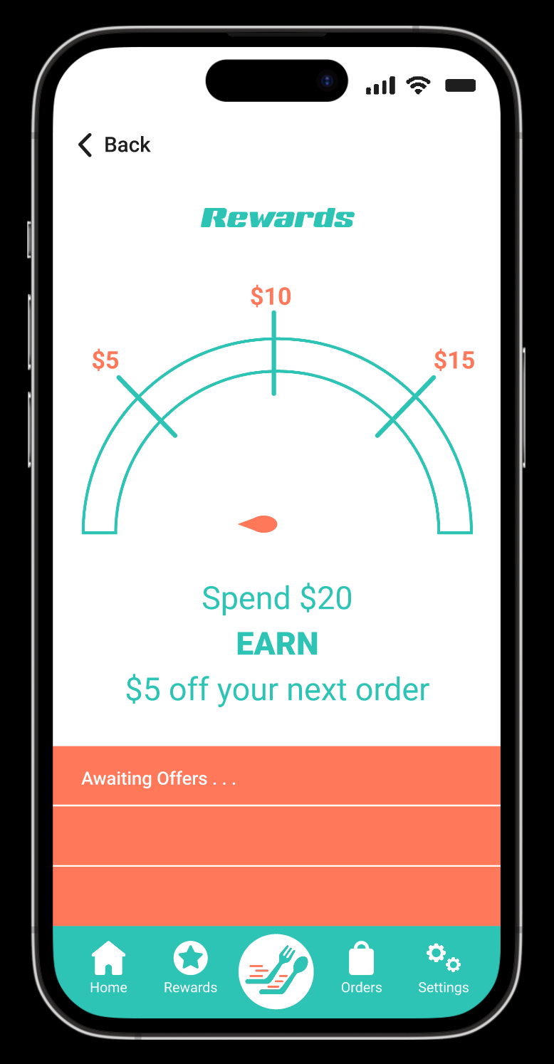
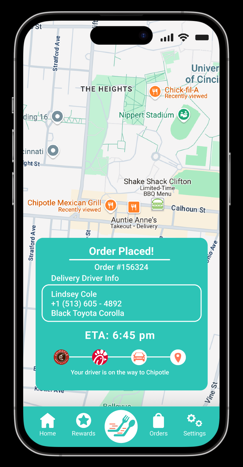
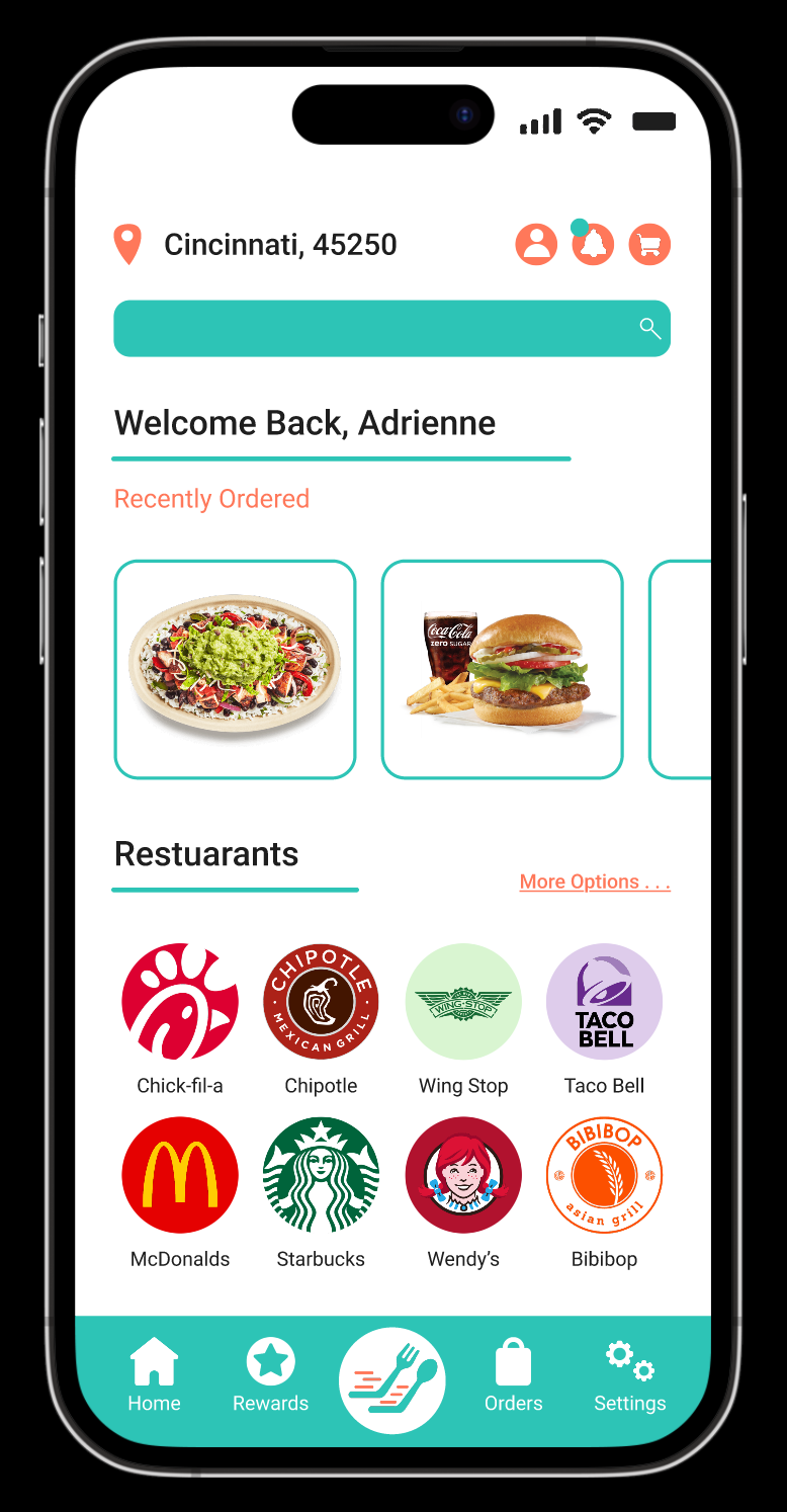
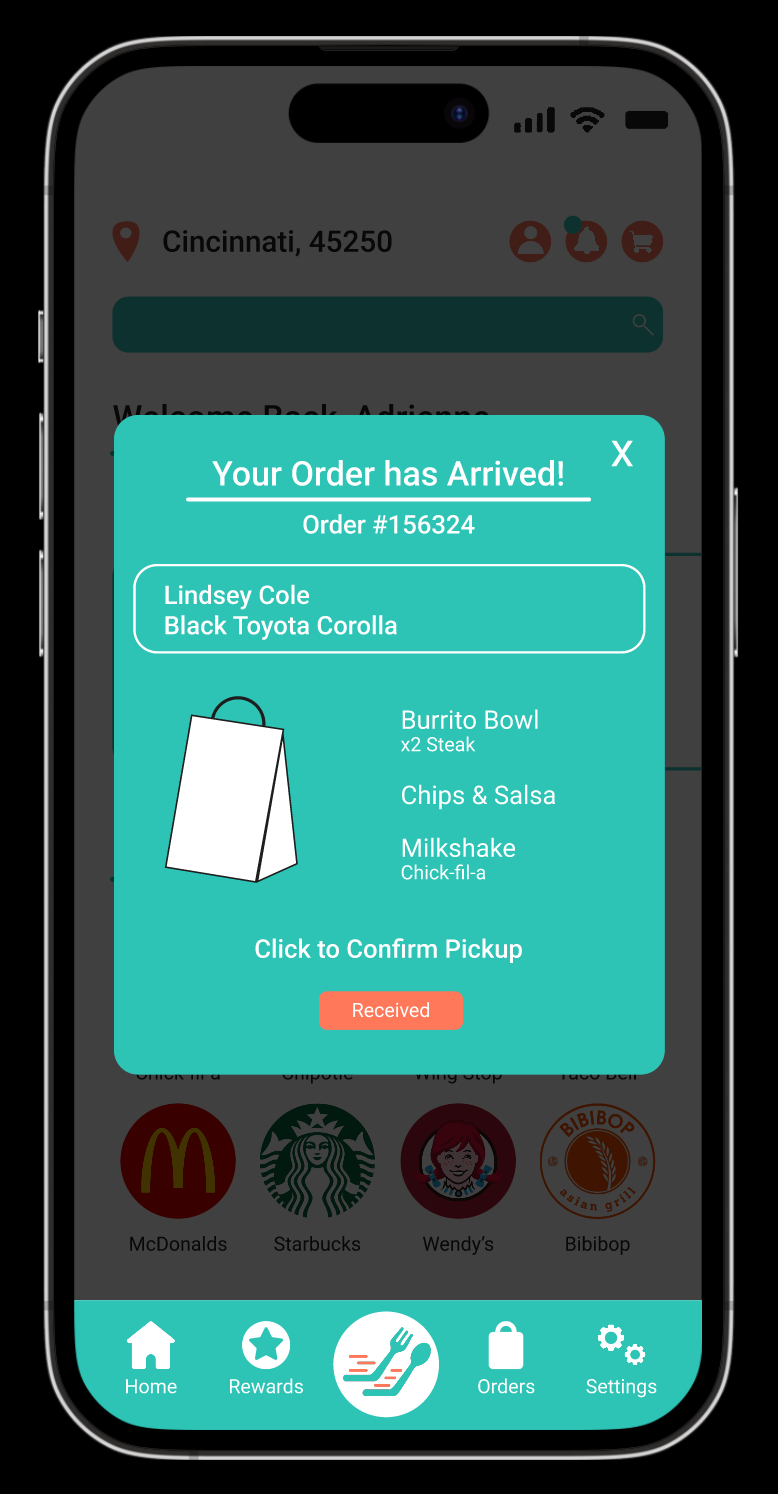
I created two user personas to represent QuickBite’s audience. Adrienne is a busy college student who values fast, affordable meals with clear tracking. Mark is a working parent who needs convenient and affordable family dinner options. The task flow created was guided by these personas and simulates a realistic ordering experience through reordering favorites, customizing items, and receiving real time updates to keep the process quick, convenient, and personal.
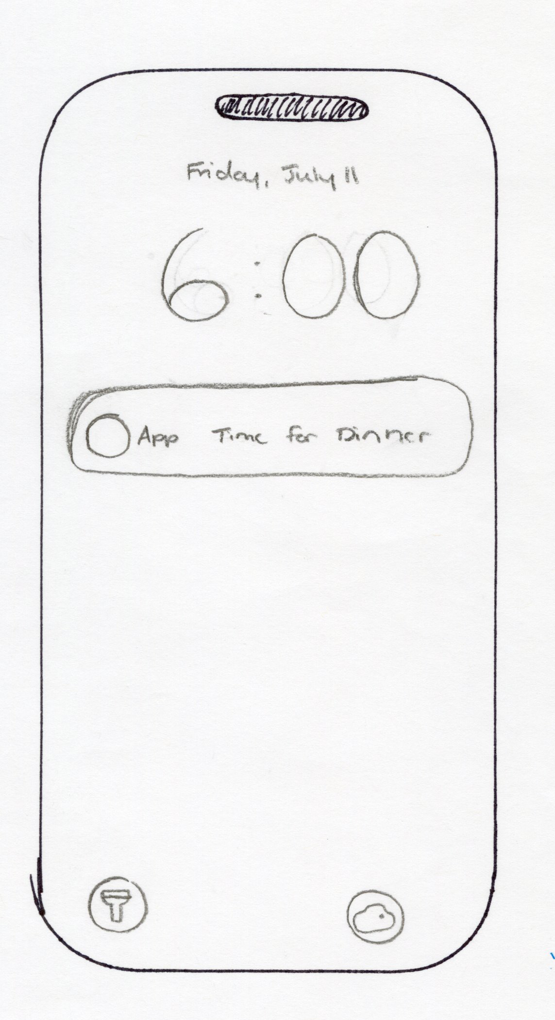
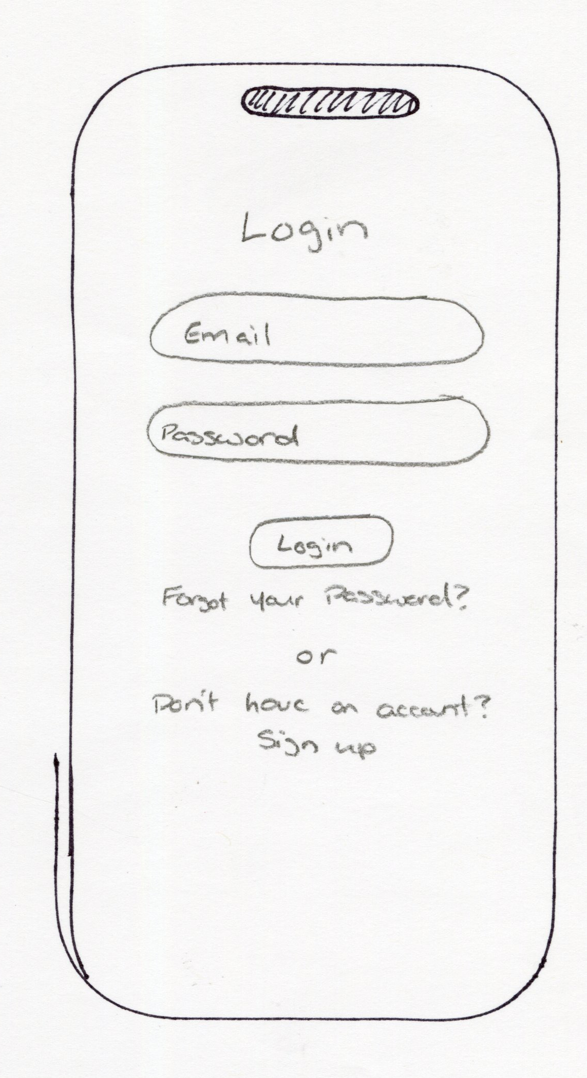
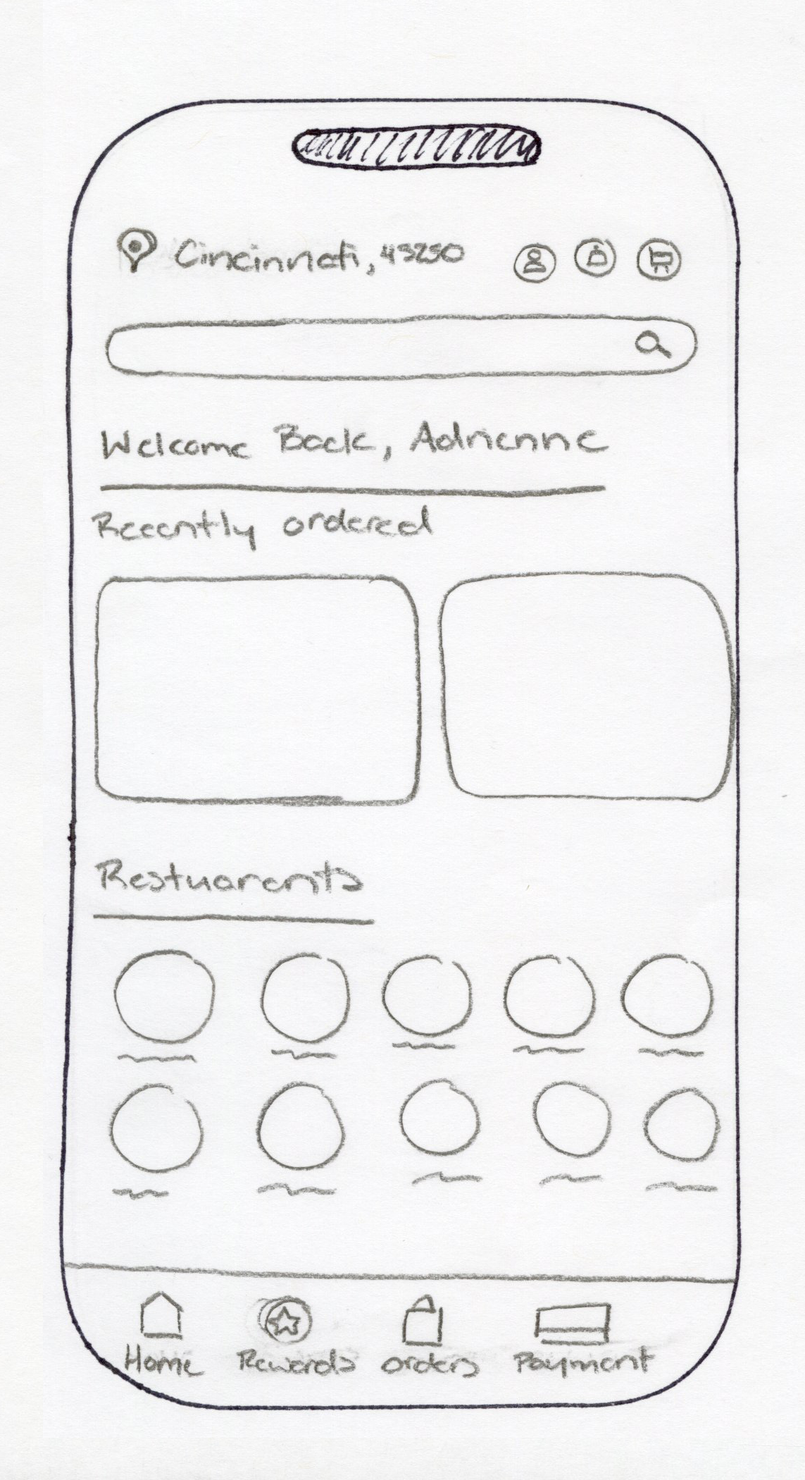
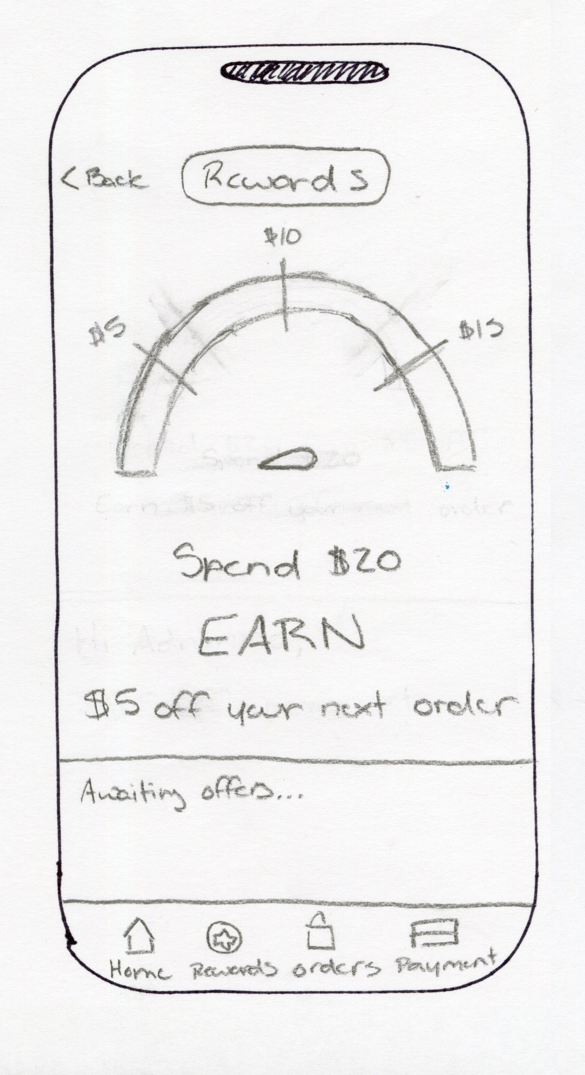
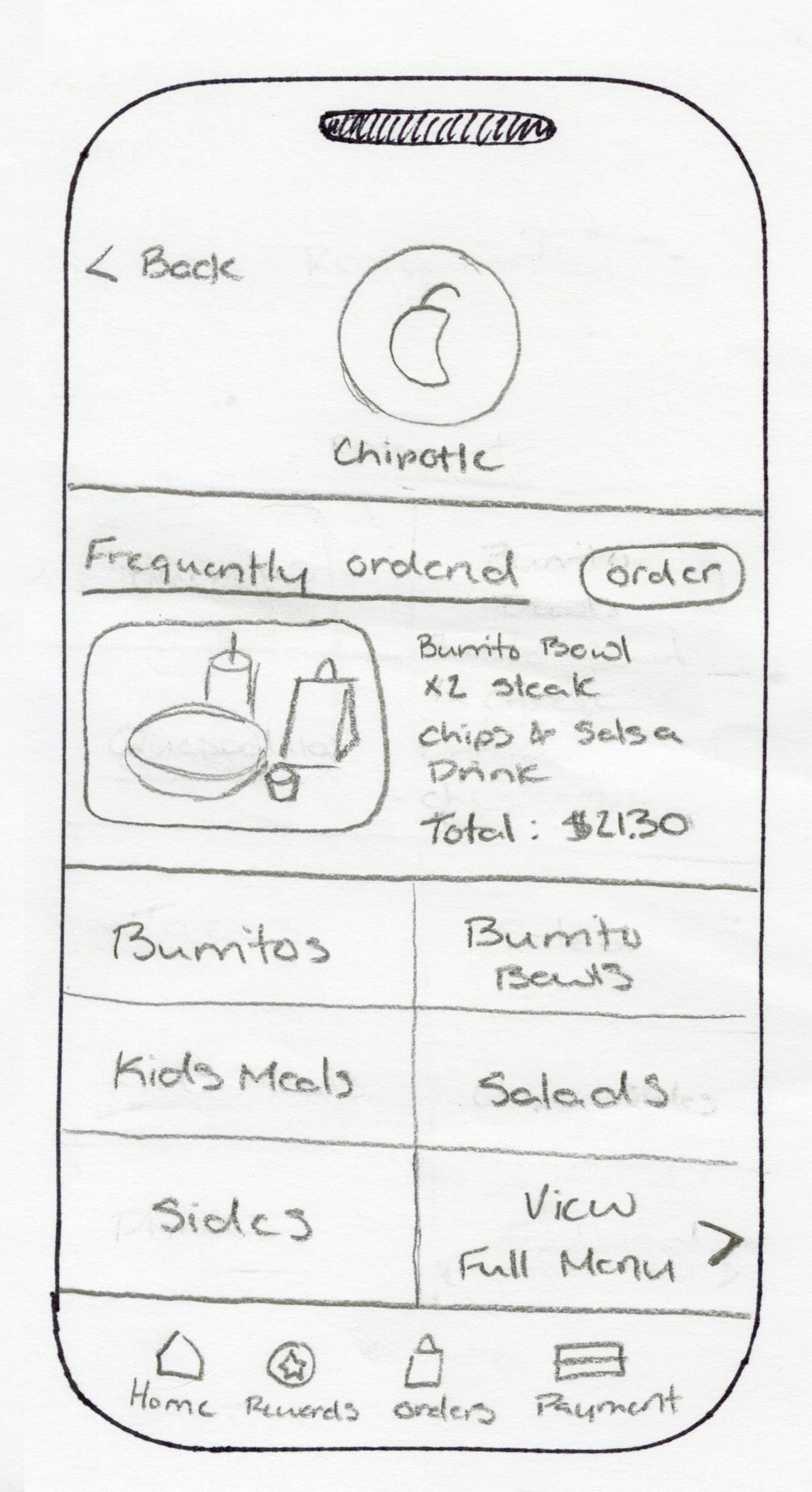
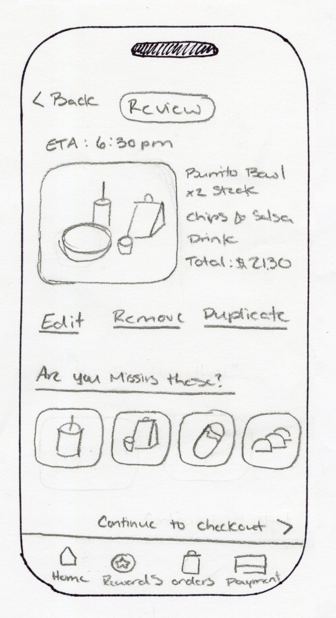
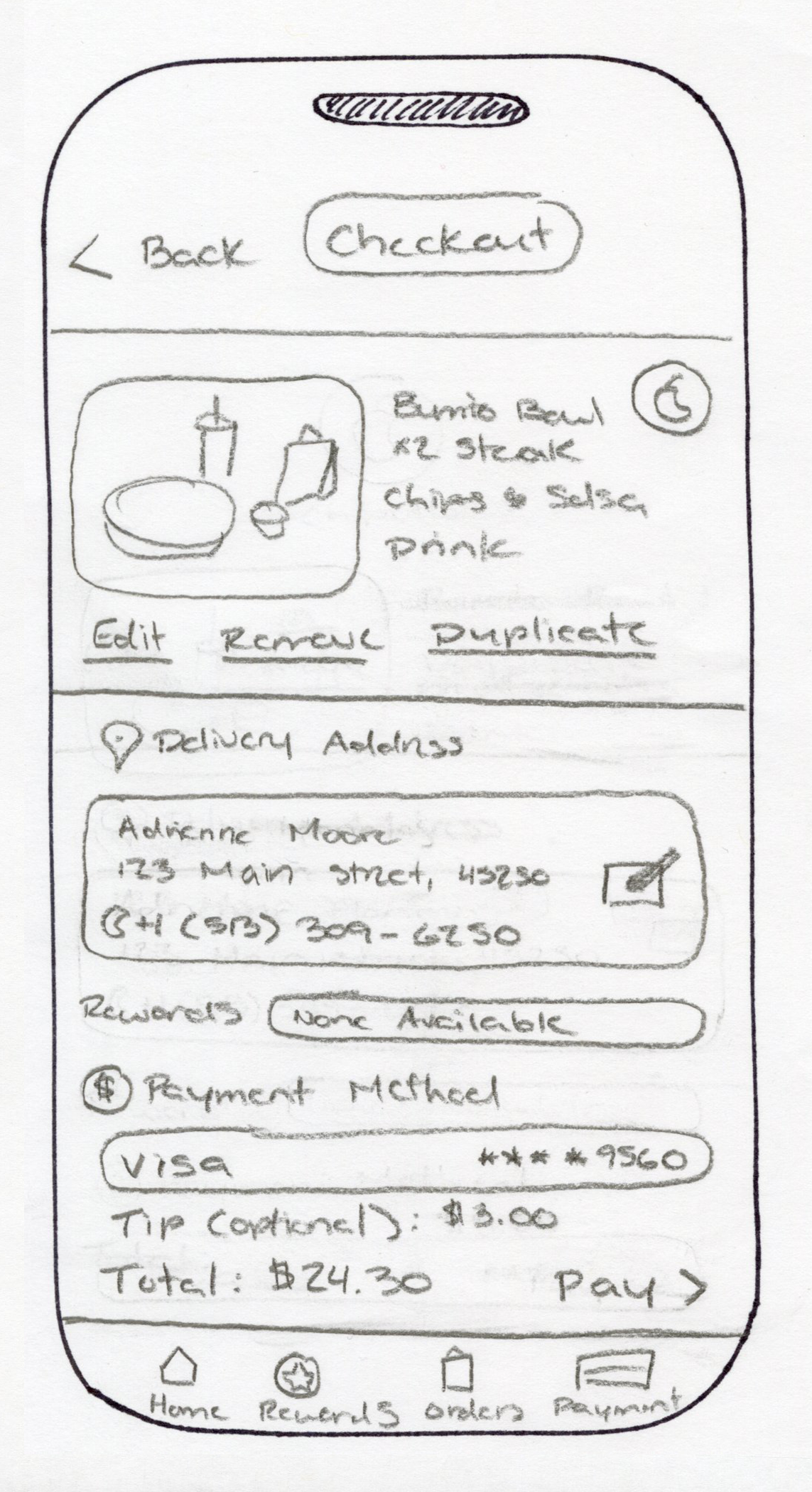
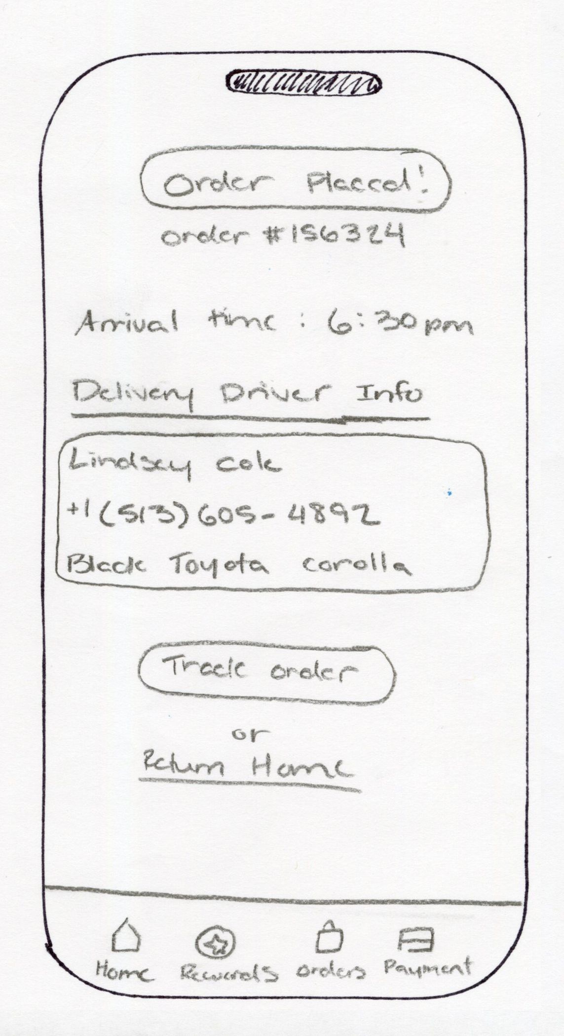
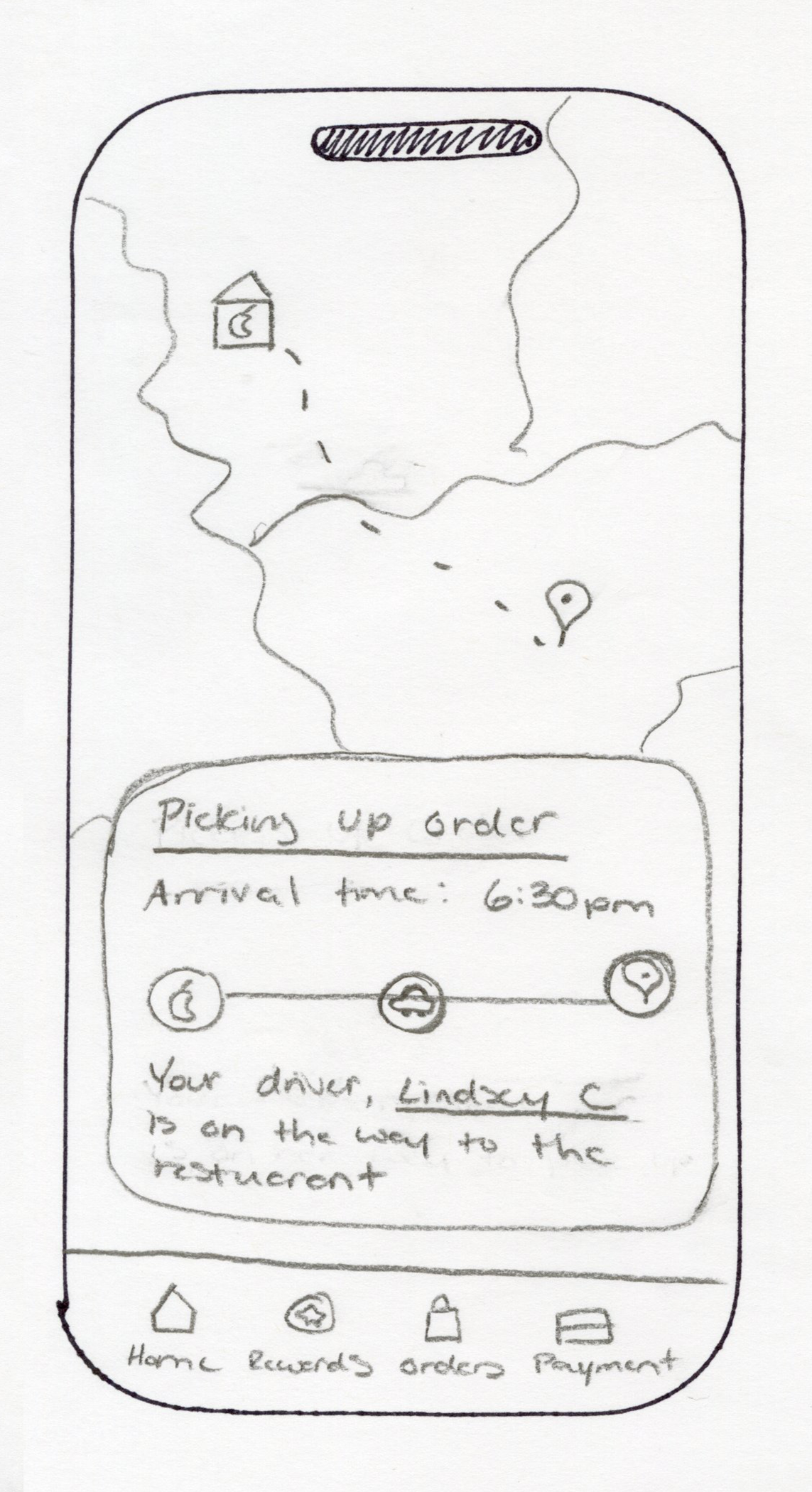
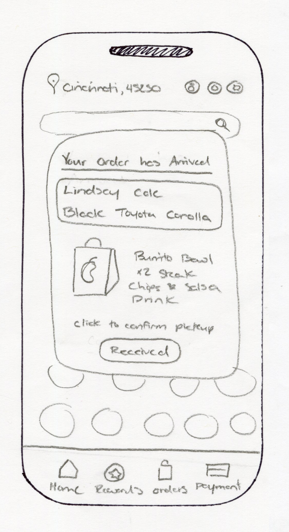
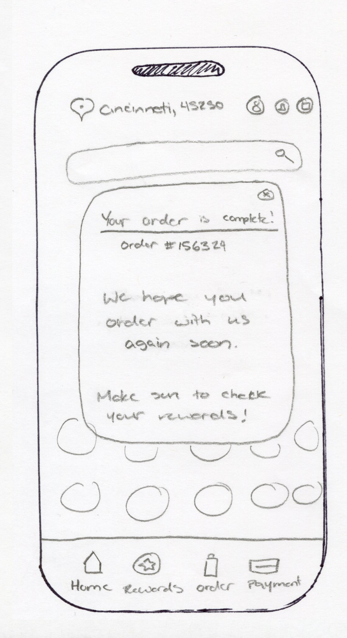
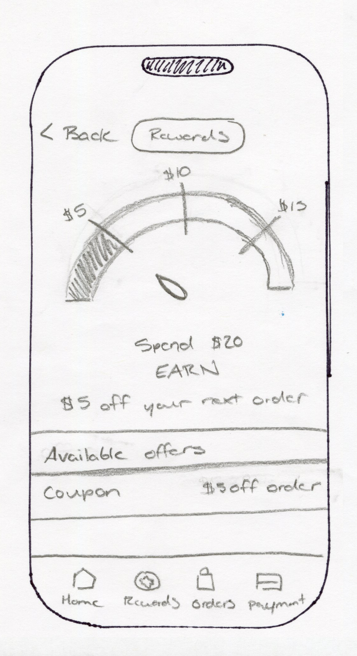
Sketches
I started with a paper prototype to map out the app’s layout and flow. Sketching helped me test button placement, navigation, and usability, allowing me to refine the design for a clearer and smoother ordering experience.
Digitalization
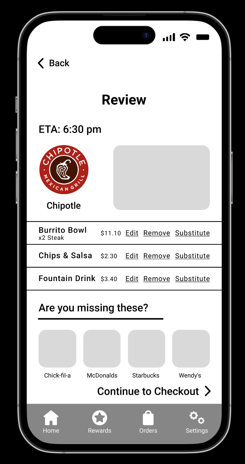
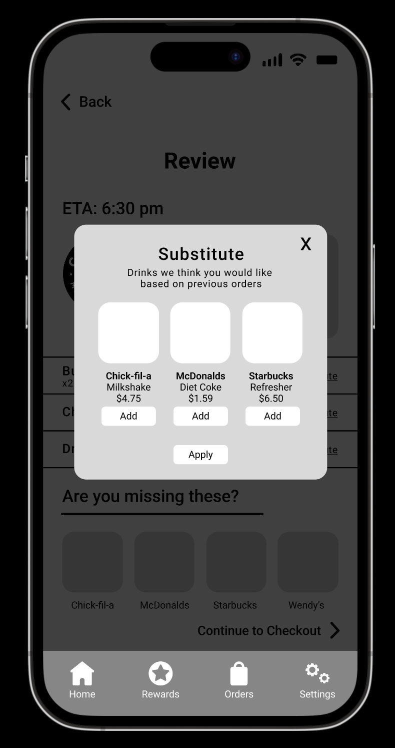
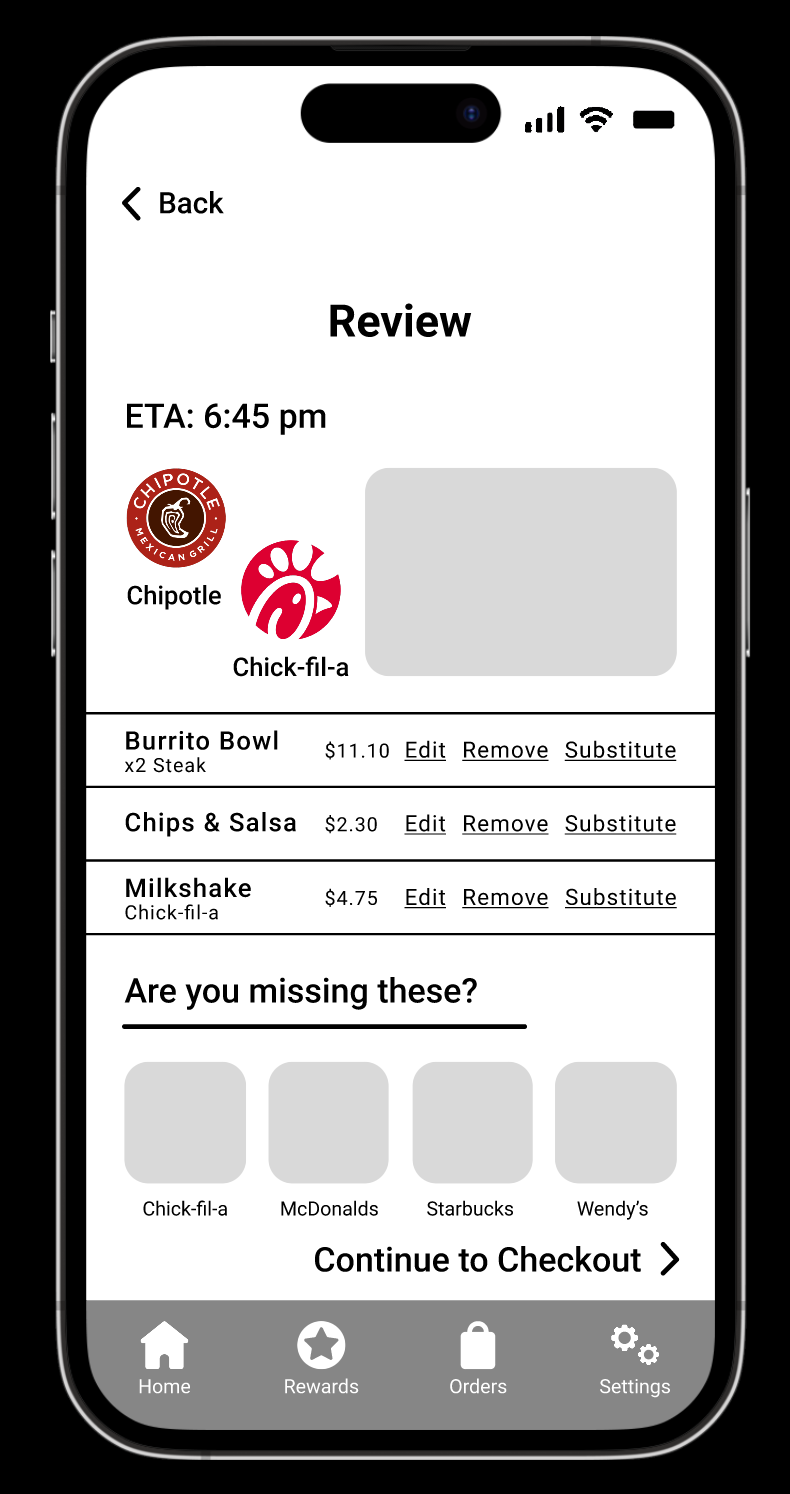
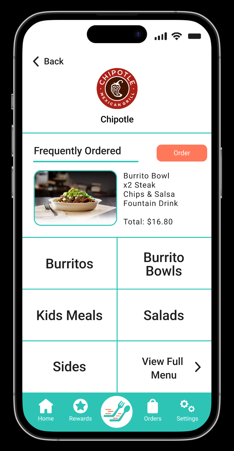
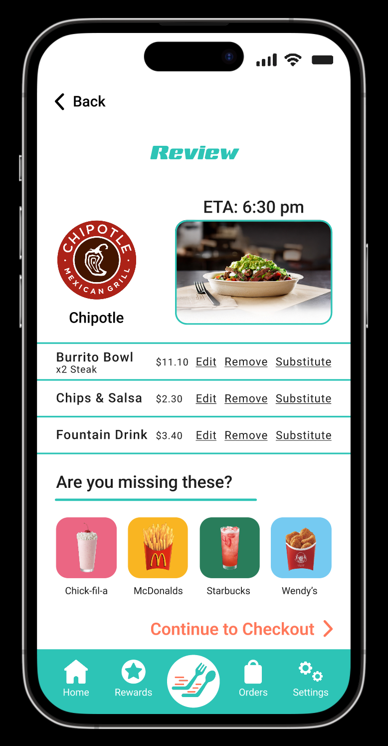
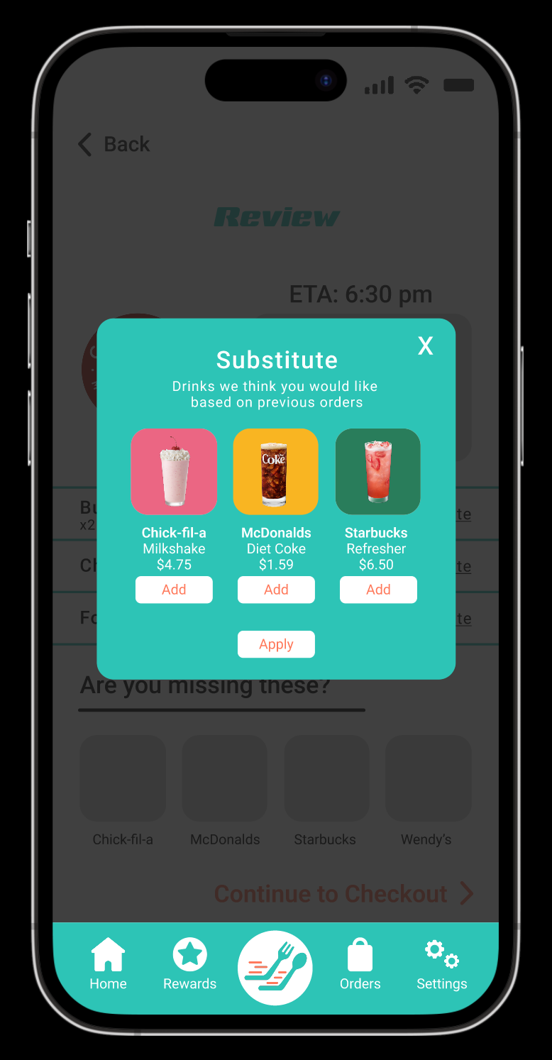
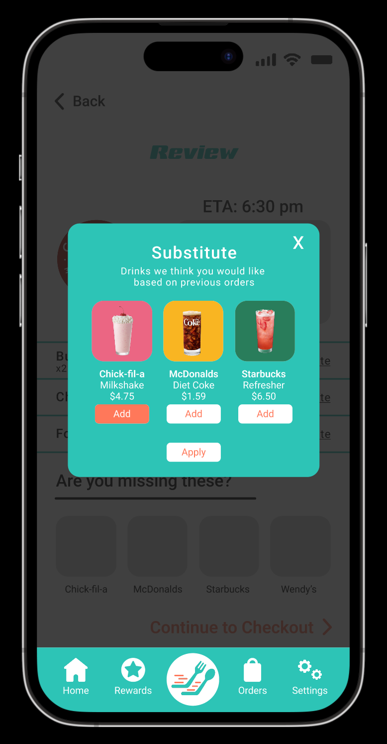
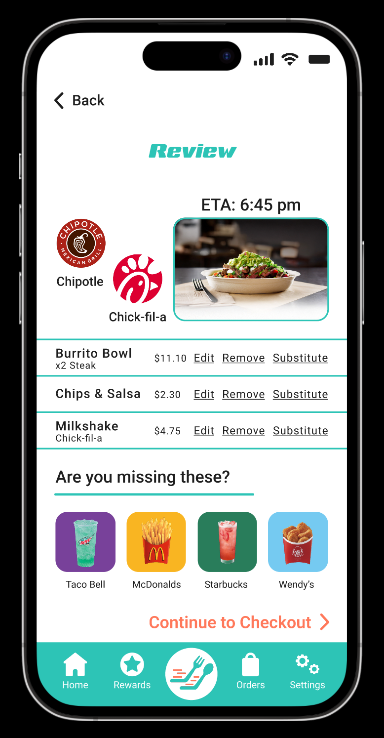
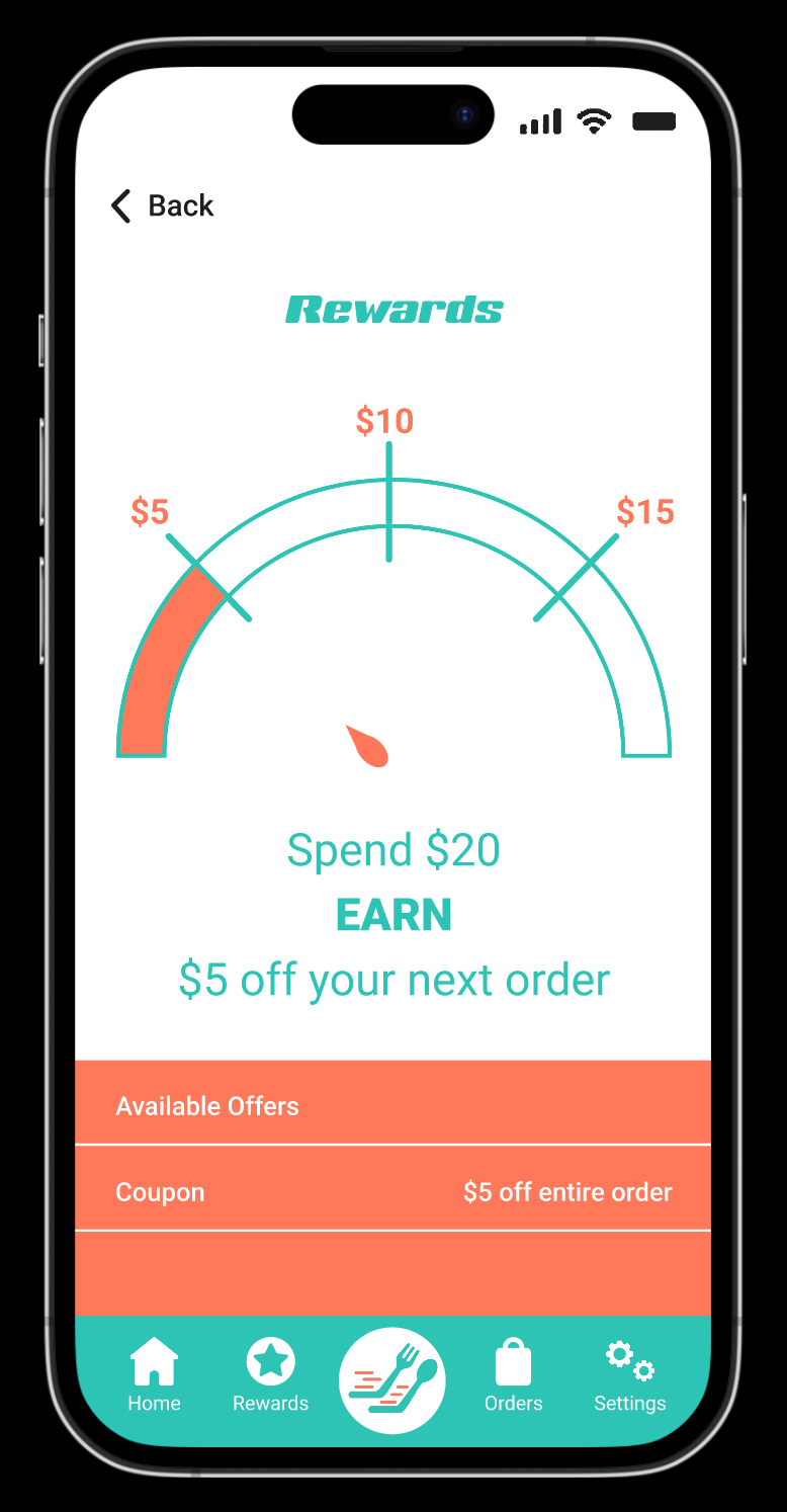
After testing the paper prototype, I created low fidelity wireframes in Figma to map the user flow and refine navigation. Feedback inspired a personalization feature that lets users substitute items from multiple restaurants. Working in low fidelity helped focus on structure and usability before moving into visual design.

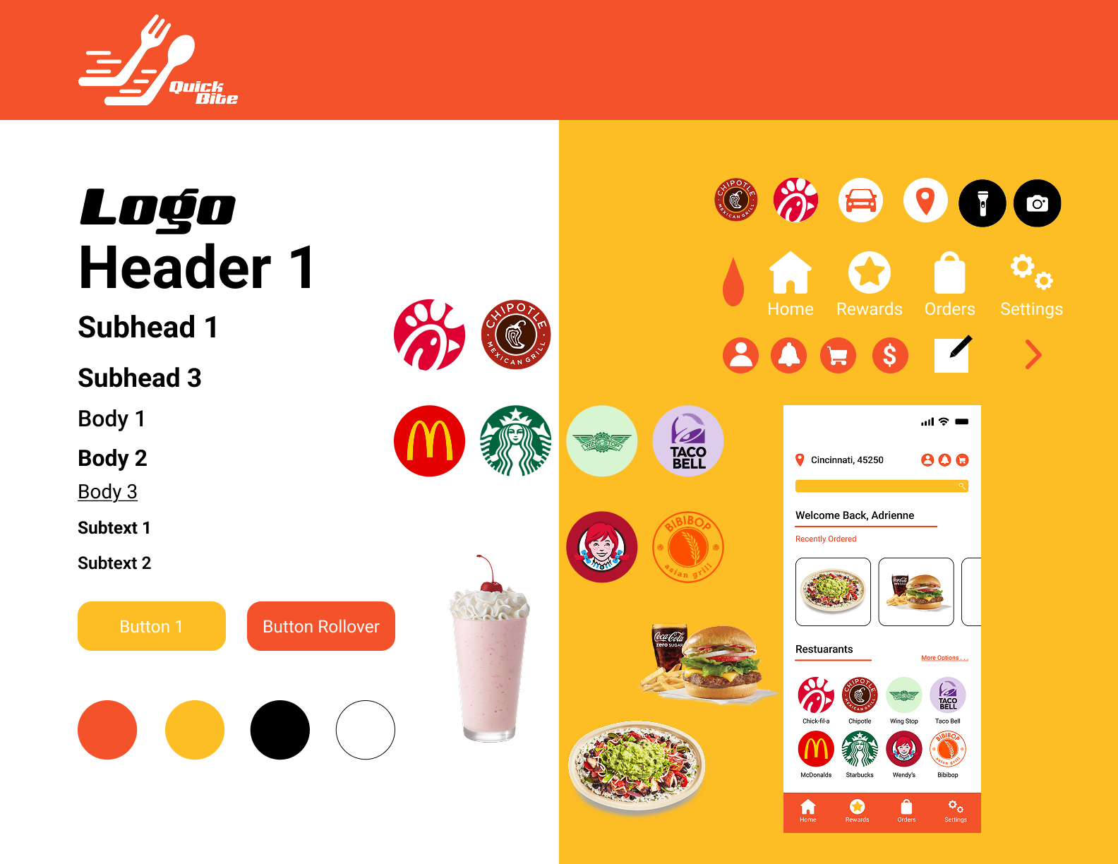
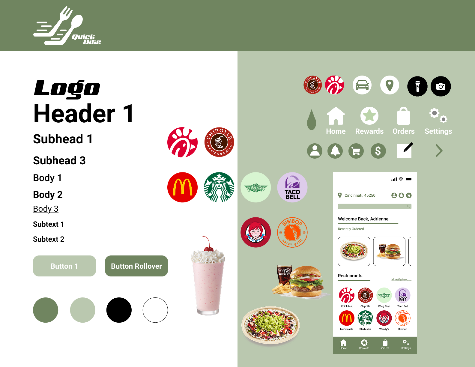
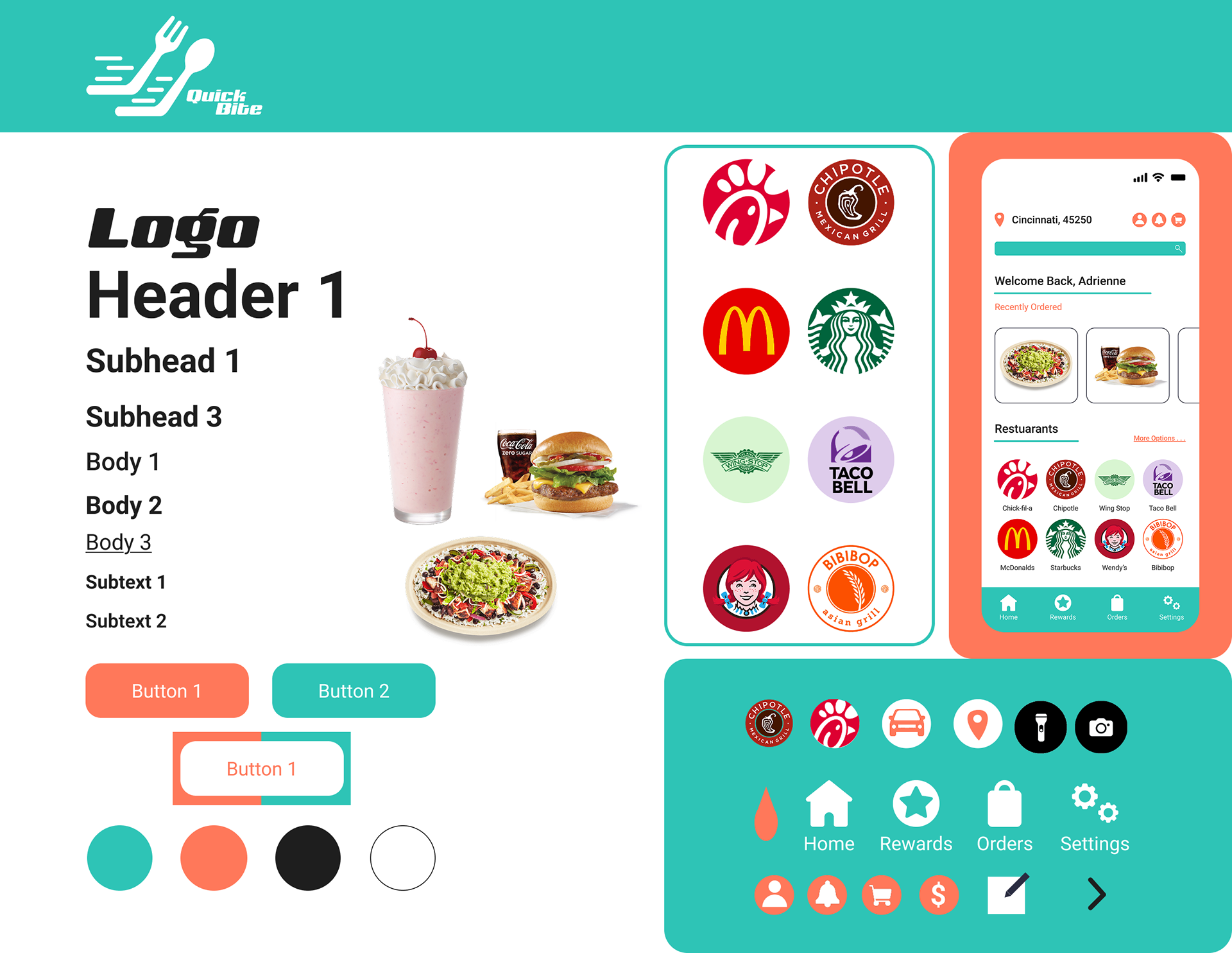
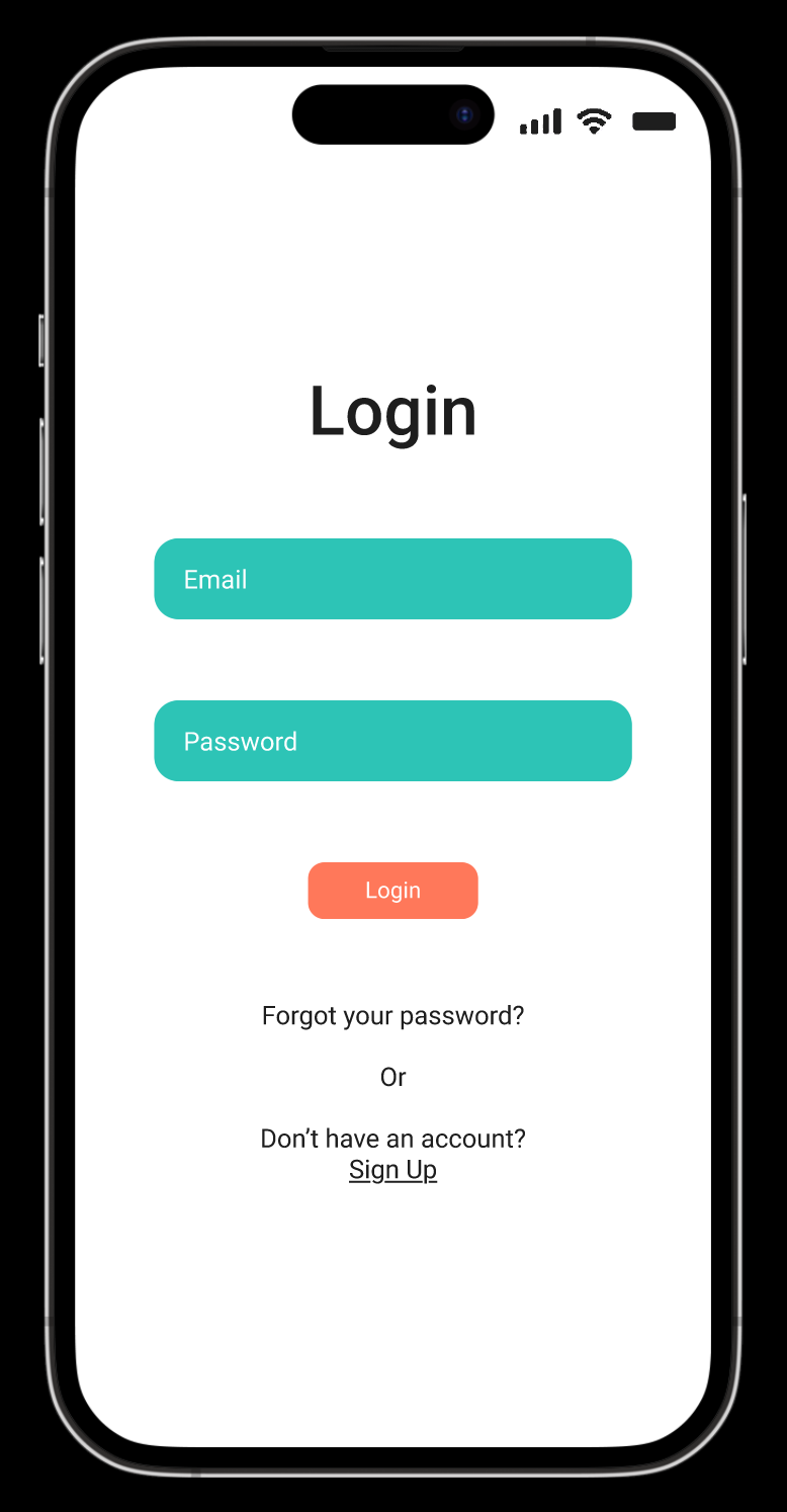
Color and Typography Style Tile
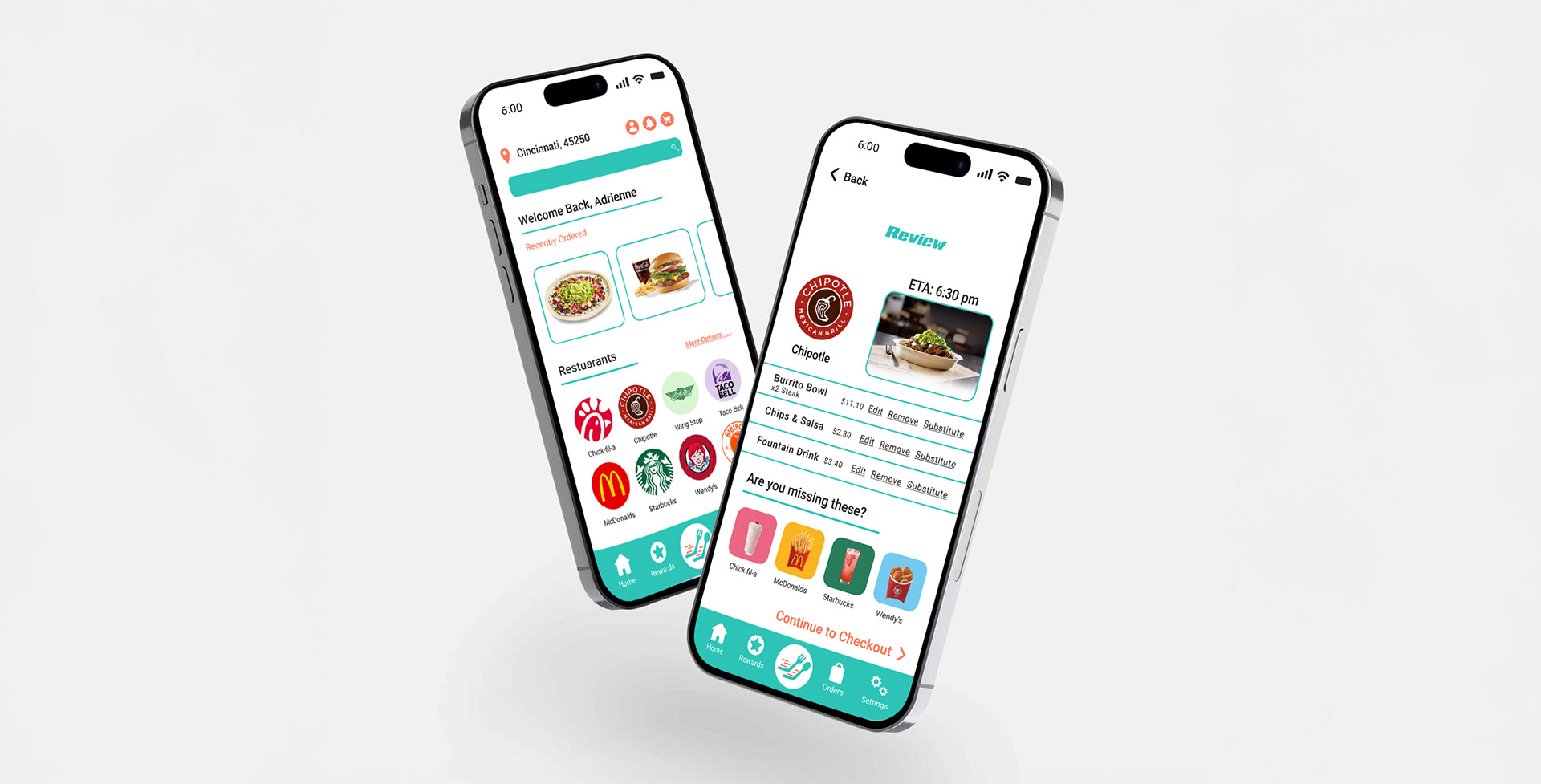
I explored several color directions before choosing turquoise and coral. A red, orange, and yellow palette felt too similar to competitors, while green seemed too fresh and healthy for the fast, energetic vibe of the app. Turquoise conveys speed, clarity, and efficiency, while coral adds warmth and friendliness. Together, they create a fresh, modern, and approachable look that reflects QuickBite’s focus on fast, personalized, and enjoyable ordering.
Digital Prototype
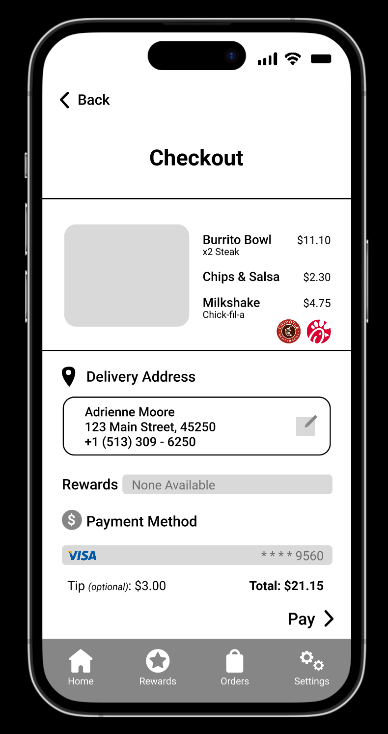
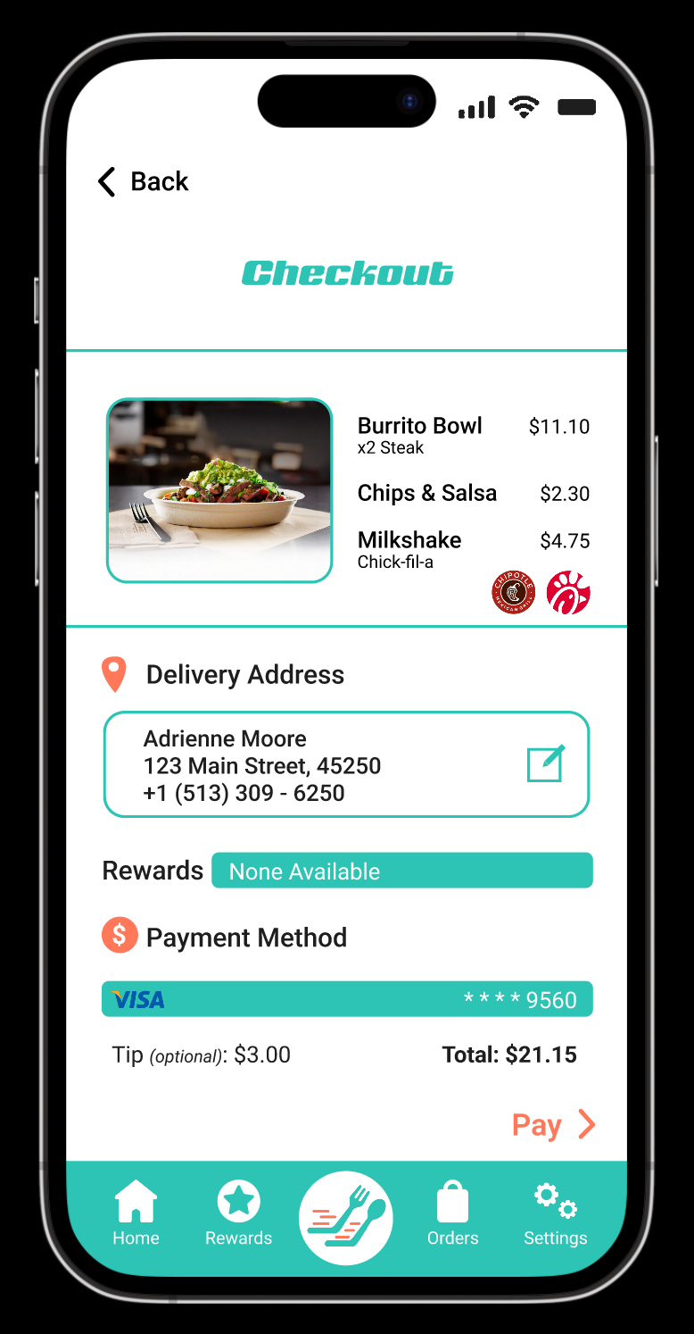
Moving from sketches to the digital prototype, the overall layout and vision remained consistent. Adding color helped strengthen visual hierarchy and improve the flow and clarity of the interface. I refined typography, spacing, and interactive elements to guide users efficiently through the app.

Final